The Cameo Issue of 1962-1967 Part Two
Today's post continues my discussion of the Cameo issue, and will explore the following aspects of this issue:


The above scan shows the front and back of a repair paste-up strip. These can be found on all four values of the series, and it may be possible to find strips that contain one of more of the additional varieties identified here.


- Plate blocks.
- Booklet panes and complete booklets.
- Cello paqs and miniature panes.
- Coil stamps.
- Official stamps.
Plate Blocks
Inscription Blocks

This is the first issue printed by the Canadian Bank Note Company in many years for which no order numbers appear on any block, nor do any position dots appear on any of the plate blocks that I have seen. However, I have come across blank blocks of the 5c that occasionally show a position dot in the lower selvage. I haven't seen any, but it is possible that some of the blocks may exist with re-entries in the inscriptions themselves. As for the layout and placement of the inscriptions themselves, the inscriptions consist of "Canadian Bank Note Co. Limited" and "Ottawa No. 1" in two lines of text that are centered with respect to one another. On the 1c through 5c, the inscriptions appear in the bottom or top selvage tabs, while on the 7c through $1 values, the inscriptions are located in the side margins.
There are not a huge number of plates for this issue, so that a basic collection of plate blocks can be put together fairly quickly. However, adding perforation, paper, gum and shade varieties into the mix can increase the scope of a collection quite significantly. The following is a list of the plate numbers and total number of blocks known for each value:
- 1c brown - plates 1-3 - 12 blocks.
- 2c green - plates 1-4 - 16 blocks.
- 3c purple - plates 1-3 - 12 blocks.
- 4c scarlet - plates 1-5 - 20 blocks.
- 5c violet blue - plates 1-3 - 12 blocks.
- 7c jet plane - plate 1 - 4 blocks.
- 8c jet plate - plate 1 - 4 blocks
- 15c violet blue - plates 1-2 - 8 blocks.
- $1 carmine rose - plate 1 - 4 blocks.
So a basic set of plate blocks of this issue consists of just 92 blocks.
Blank Corner Blocks
Although not technically plate blocks, many collectors are interested in the blank corner blocks, because this is they only way that the Winnipeg tagged stamps can be collected in corner blocks, since the post office trimmed all inscriptions off the tagged sheets. The 8c on 7c jet plane definitive is also known only in blank corner blocks, so that these have become quite collectible in place of plate blocks.
One thing that Unitrade does not distinguish, that I feel is just as collectible, is the position in the sheets that these blocks come from. As I stated in the overview article about this issue, these stamps were printed in sheets of 600 stamps that were arranged in six panes of 100 stamps each. This means that the outer selvage of all six panes would be wide, but the lower selvage of the top three sheets, and the side selvage of the two middle panes would all be narrow. Thus, it is possible to distinguish a corner block that has come from an outside pane from one that has come from an inside pane, by looking carefully at the widths of the selvage on each side of the block in question.
The following scans will illustrate what I mean:

This is an example of a block that comes from the corner of the lower right pane in the layout of six sheets. This can be determined from the fact that the selvage on the right is the normal width for blocks of this issue, while the bottom selvage, where the inscription would normally have appeared, has been trimmed.

This block comes from the top centre pane in the layout of six panes. I can tell that this is the case because the selvage on both sides is narrow because the panes were guillotined apart, and the right selvage will therefore be narrower than the selvage on a block that comes from one of the outer panes.

Finally, this block comes from upper centre pane in the layout of six panes. Again, I know that this is the case because the selvage on the bottom is narrower than the normal trimmed bottom selvage from the lower panes. It is the same width as the side selvage, which suggests that it comes from where the panes were guillotined apart.
Thus, an advanced collection of these blank blocks, including all the tagging varieties listed in Unitrade, would consist of:
- 1c brown - 3 varieties x 4 blocks x 3 selvage widths = 36 blocks.
- 2c green - 2 varieties x 4 blocks x 3 selvage widths = 24 blocks.
- 3c purple - 7 varieties x 4 blocks x 3 selvage widths = 84 blocks.
- 4c scarlet - 9 varieties x 4 blocks x 3 selvage widths = 108 blocks.
- 5c violet blue - 2 varieties x 4 blocks x 3 selvage widths = 24 blocks.
- 8c on 7c jet plane - 4 blocks.
So, assuming that there are no unlisted varieties of tagging bar widths, which we already know isn't true and spacing varieties between tagging bars, a basic collection of these blocks consists of 280 blocks - over three times the number of inscription blocks!
Booklet Panes and Complete Booklets

For this issue, there were two basic booklet formats issued, both of which sold for 25c, and for which there was no premium over the face value of the stamps inside the booklet. One booklet, shown in red above contained a pane of 5 1c stamps and a pane of 5 4c stamps. The local letter rate (within city limits) at this time was 4c, while the forwarded letter rate (to all other destinations in Canada) was 5c. So a user of this booklet could send either local, or forwarded letters. A second booklet, which had a blue cover, contained 1 pane of 5 5c stamps, and would be bought by someone only intending to send forwarded letters.As we shall see, there are several varieties of covers, though not nearly as many as had existed in the dotted cover die period, which ended in 1956. In addition to the cover varieties, it is possible to find booklets in which cutting guide marks appear on one or more panes, one or more covers, or both. Finally, the panes can also be found on a paper which give a low fluorescent bluish white reaction under long wave ultraviolet light, with a sparse concentration of low fluorescent fibres visible in the paper as well as the normal dull fluorescent paper.
Pane Layouts

All three panes found in these booklets, being the 1c, 4c and 5c appeared as shown in the scan above, with a label in place of what would have been the first stamp in the pane, and 5 stamps arranged in a 3 x 2 format. The label always reads: "Avoid loss use postal money orders" in English and French.
Front Cover Designs
Outside Covers
The first booklets of this issue used the above design, which was a continuation of the design that was used for the last booklets of the previous Wilding issue. The width of the entire design was ordinarily 62 mm. However, a later printing was made in which the design width was 65 mm. This difference can easily be seen in the following scan showing both types of the 5c cover:

The booklet on the top is the normal 62 mm and the bottom one is the scarcer 65 mm design. There was no 65 mm design reported as yet for the 4c+1c booklet, though it is entirely possible that one may exist. Toward the end of the life of this issue, in preparation for Canada's centennial year, the cover design of the 5c booklets was changed to feature the centennial emblem on a lighter blue background, as shown below:

Once again, although this design is known in red and white on the centennial issue 1c+4c booklets, it is not currently known for the 1c+4c booklets of this issue.
Inside Covers

The scan above shows one example of the basic design that was used for the inside front covers of the original design. This one is the latest of three types, on which the words "Give stamps to shut-ins" appears just below the postage rates. The second type is identical to the above, except that the phrase "Give stamps to shut-ins" does not appear. Finally, the first type is identical to the second, but is rubber stamped "local letters" in violet. an error type also exists in which the rubber stamp is missing, so that there is no word "local" on the cover. This error is so far only known on the 5c blue booklets. All three of the types are known on both booklets.
When the 5c blue booklets were changed to the centennial cover design, the design of the inside cover was changed as well:

Back Cover Designs
Outside

The above scan shows the design of the outside back cover that was used for the original, non-centennial booklets. The centennial cover 5c booklets had a different back cover design as follows:

Inside

The above scan shows the inside of the back cover that was used for all booklets using the original cover design. No varieties have been recorded so far with respect to this design. However, there may be varieties out there that have simply not been discovered yet.

This scan shows the inside design used for the back cover of the "centennial" design 5c booklets. Again, there are no recorded varieties of these design, but that does not necessarily mean that none exist. I would always check your booklets and look carefully at the dimensions of the design, spacing between lines and words of text and then finally the text font itself.
Cello Paqs and Miniature Panes


The cello-paqs that were first introduced on the Wilding issue in 1961 were continued into this issue as well. There were three formats of cellophane packs that were available to the public, all of which sold for $1:
- A green and white pack that contained 2 panes of 25 of the 2c green.
- A red and white pack that contained 1 pane of 25 of the 4c scarlet.
- A blue and white or red and white pack that contained 1 pane of the 5c violet blue in either the untagged, or Winnipeg tagged format.
Text Types
The basic design of the packs was as shown below:

Two text panels appear across the centre that read "For Pocket or Purse" in bilingual text, and will say either 50 x 2c = $1.00, 25 x 4c = $1.00 or 20 x 5c = $1.00. At the top of the pack, the bilingual repeating inscription "Tear Here" appears, and at the bottom of the pack, appears the repeating inscription "Postes Canada Postage" The lettering is on a white ground and is generally in the colour of the stamp, although as I stated earlier, the 5c packs are known with red instead of blue lettering. In 1967 the packs had the centennial emblems repeating across the front centre instead of the text panels containing the bilingual "For Pocket or Purse" inscription.
The lettering and design of the cellophane packages is an aspect of this issue that I do not believe has received any attention at all philatelically. I am not sure why this is because if you look closely at the packs there are clear differences between them, which I feel are fully collectible. The above pack for example has a prominent white dash at the top edge of the cellophane and the lettering of the inscriptions is thick. Contrast that to the pack shown below, which has no white dash, and for which the lettering appears noticeably thinner:

I do not know how many different varieties could potentially exist on these, but I'm sure that there are probably at least 5 or 6 types. Studying them carefully to identify differences in the size and font of lettering, the size of the text boxes and the spacing between them could prove to be a very rewarding exercise.
Aniline Ink Variety on 5c Pane


As I stated in last week's post, the 5c blue is known printed in an aniline ink, which is very obvious when the stamps, or panes of stamps are viewed from the back. The aniline ink shows very clearly through the back of the stamps, as opposed to just being visible. The pane on the left is the aniline ink, whereas the pane shown on the right is the normal, non-aniline ink.
Coil Stamps

This was the first issue since the 1911-1928 Admiral issue to have coil stamps that were perforated horizontally. The coil stamps for this issue consisted of the 2c, 3c, 4c and 5c issued in rolls of 500 that were perforated 9.5 horizontally. For some unknown reason, the centering of these coils was particularly poor, with the result that well centered pair and strips are particularly difficult to find. Like the previous CBN coil issues, they can be collected in a variety of ways as discussed below:
Repair Paste-Up Pairs and Strips

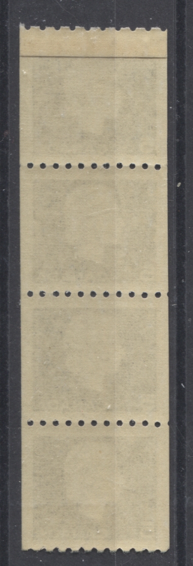
The above scan shows the front and back of a repair paste-up strip. These can be found on all four values of the series, and it may be possible to find strips that contain one of more of the additional varieties identified here.
Jump Strips and Pairs
All four values can be collected showing jumps in the horizontal direction. The jumps can be quite subtle and easy to miss if you are not looking for them. The easiest way to spot them is to look for either pairs or strips in which the width of the margin on one side is not exactly the same along its entire length.
Cutting Guideline Strips
The coils were produced in large sheets which were guillotined into strips. Cutting guidelines appeared along each column to assist in the placement of the guillotine. On very poorly centered strips, it is often possible to find the cutting guidelines in the margins - usually the right margin. These are highly collectible and sought after by specialists.
Spacing Varieties
The normal spacing in the vertical direction between the subjects in the roll, is just over 4 mm - probably close to 4.125 mm. Strips and pairs can be found in which the spacing between two ore more stamps is either wider or narrower than the normal spacing.
Official Stamps

This was the last issue to be overprinted for official government use, as the use of official stamps was discontinued in 1963. Consequently, in-period, postally used examples of these stamps are quite a bit scarcer than their mint counterparts. The 1c, 2c, 4c and 5c were all overprinted with the 3.5 mm Casson font, as shown in the block above. The normal placement of the G was just off to the lower right of the Queen's profile.
Blunt G

The normal Casson font G, is shown on the bottom stamp in the above scan. There is a clear crossbar that protrudes beyond the front of the "G". However, on both the 2c green and 4c scarlet, the G is known with the crossbar truncated, where it meets the upward vertical stroke, as shown on the first stamp in the above scan. This is known to collectors as the "blunt G". On the 2c it occurs on positions 39 and 91, and only on position 91 of the 4c. The 2c from position 39 is customarily collected as a block of 9, with the variety appearing in the centre stamp, whereas the 2c and 4c from position 91 are usually collected in blank lower left corner blocks of 4.
Misplaced G's
Occasionally it is possible to find examples where the G is quite badly misplaced, as shown in the above pair. Unitrade only lists this for the 2c, but I am fairly confident that such varieties could probably be found on the other values as well.
Spacing Varieties
The normal spacing between the G's in the sheet was approximately 21 mm in the horizontal direction and 18 mm in the vertical direction. It is possible to find pairs in which the spacing is wider than 18 mm vertically. Unitrade lists a wide spacing pair on the 2c green only at the present time. However, once again, I am fairly confident that both horizontal and vertical spacing varieties likely exist on all the values, and are just waiting to be discovered.
Other Varieties
The 1c is known with a double G as shown above, while the 2c is known with the "G" omitted, which is usually collected in a pair.
Corner Blocks
No plate blocks exist of these official overprints. They are all collected as blank corner blocks. However, just as was the case with the regular issue stamps, it is possible to collect each position with different selvage widths, which denotes the particular pane from which the block came in the layout of the six panes of 100, that comprised each full sheet.
That brings me to the end of my second detailed post about this neglected Elizabethan definitive issue. Next week's post will cover the remaining aspects, which mostly have to do with the postal history and postal stationery.


Comments
Post a Comment