The Mufti & Pictorial Issue of 1937-1942 Part 1
Overview
Today's post comes after a period of considerable anticipation by some of our readers who have been eagerly awaiting the start of the King George VI period. In this post we will explore some aspects of the 1937-42 Mufti and Pictorial Issue. The issue gets its name from the fact that the low values are the only stamps, other than the 1949-52 Postes Postage Issue, in which King George VI appears in civilian dress, rather than being in uniform. The Pictorial portion of the issue continues the tradition began by the Scroll issue, ten years earlier, of showing scenes from various regions of Canada.
For some unknown reason, Unitrade splits this issue up into two separate issues, which makes little sense to me, as it is very clear that they are the same general issue. One possibility might be that the stamps were all issued on different dates, with the higher values not appearing until more than a year after the low values.
Again, Herman Herbert Schwartz was the designer of these beautiful stamps. The low value designs were engraved by William Ford. The 6c airmail was engraved by two gentlemen: Arthur Vogel, who engraved the vignette, and William Maple, who engraved the frame. While I am not completely certain, it would seem that these two gentlemen were responsible for engraving the other high value stamps as well. Like the previous issue, the low values were printed in sheets of 400 stamps that were guillotined into four post office panes of 100, while the high values were printed in sheets of 200 that were guillotined into 4 post office panes of 50.
The low value stamps were issued between April 1, 1937 and June 18, 1937, while the high values were issued between June 15, 1938 and November 15, 1938. The special delivery stamps appeared between June 15, 1938 and April 1, 1939.
The Stamp Designs, Issue Dates and Quantities


Points of Interest
This issue provides, much much greater scope for the specialist than the previous Dated Die issue does:


The three main shades of blue that I have encountered are steel blue, which contains just a hint of grey, Prussian blue, which contains just a hint of green, and a pure, bright dark blue, which contains neither. In the above scan, the stamp on the left, and the third stamp from the left are both shades of Prussian blue, containing a bit of green to the blue. The second stamp from the left is a deep steel blue that contains no green, but instead a bit of grey. Finally the stamp on the right is a deep bright green that is neither greenish, nor greyish.


Unitrade refers to this colour as violet, but in reality, it is more of a deep lilac. The colour varies from a blackish lilac on the later printings to a deep aniline rose lilac on the first 1938 printings. The stamp on the extreme right is the deep aniline rose lilac from the 1938 printing. The second and fourth stamps from the left are both deep rose lilac in the regular ink. The stamp on the left is the blackish purple, while the third stamp from the left is deep dull violet. It is difficult to see these differences here, but they are more apparent in the flesh.
The scan below shows what the aniline ink looks like from the back on the gum side:


Today's post comes after a period of considerable anticipation by some of our readers who have been eagerly awaiting the start of the King George VI period. In this post we will explore some aspects of the 1937-42 Mufti and Pictorial Issue. The issue gets its name from the fact that the low values are the only stamps, other than the 1949-52 Postes Postage Issue, in which King George VI appears in civilian dress, rather than being in uniform. The Pictorial portion of the issue continues the tradition began by the Scroll issue, ten years earlier, of showing scenes from various regions of Canada.
For some unknown reason, Unitrade splits this issue up into two separate issues, which makes little sense to me, as it is very clear that they are the same general issue. One possibility might be that the stamps were all issued on different dates, with the higher values not appearing until more than a year after the low values.
Again, Herman Herbert Schwartz was the designer of these beautiful stamps. The low value designs were engraved by William Ford. The 6c airmail was engraved by two gentlemen: Arthur Vogel, who engraved the vignette, and William Maple, who engraved the frame. While I am not completely certain, it would seem that these two gentlemen were responsible for engraving the other high value stamps as well. Like the previous issue, the low values were printed in sheets of 400 stamps that were guillotined into four post office panes of 100, while the high values were printed in sheets of 200 that were guillotined into 4 post office panes of 50.
The low value stamps were issued between April 1, 1937 and June 18, 1937, while the high values were issued between June 15, 1938 and November 15, 1938. The special delivery stamps appeared between June 15, 1938 and April 1, 1939.
The Stamp Designs, Issue Dates and Quantities

1c deep green.
King George VI.
Issued: April 1, 1937 (sheet stamps), April 14, 1937 (booklets) & June 15, 1937 (coils).
Replaced: July 1, 1942 (sheet stamps), September 14, 1942 (booklets) & February 9, 1943 (coils).
1,394,000,000 sheet stamps.
16,072,472 booklet stamps.
23,022,000 coil stamps.
King George VI.
Issued: April 1, 1937 (sheet stamps), April 14, 1937 (booklets) & June 15, 1937 (coils).
Replaced: July 1, 1942 (sheet stamps), September 14, 1942 (booklets) & February 9, 1943 (coils).
1,394,000,000 sheet stamps.
16,072,472 booklet stamps.
23,022,000 coil stamps.

2c deep brown.
King George VI.
Issued: April 1, 1937 (sheet stamps), May 3, 1937 (booklets) & June 18, 1937 (coils).
Replaced: July 1, 1942 (sheet stamps), September 14, 1942 (booklets) & November 24, 1942 (coils).
1,163,000,000 sheet stamps.
10,591,256 booklet stamps.
34,565,000 coil stamps.

3c carmine red.
King George VI.
Issued: April 1, 1937 (sheet stamps), April 14, 1937 (booklets) & April 15, 1937 (coils).
Replaced: July 1, 1942 (sheet stamps), August 20, 1942 (booklets) & September 23, 1942 (coils).
2,634,000,000 sheet stamps.
128,128,248 booklet stamps.
57,827,000 coil stamps.

4c orange yellow.
King George VI.
Issued: May 10, 1937.
Replaced: July 1, 1942.
24,074,000 sheet stamps.

5c steel blue.
King George VI.
Issued: May 10, 1937.
Replaced: July 1, 1942.
133,000,000 sheet stamps.

8c deep orange.
King George VI.
Issued: May 10, 1937.
Replaced: July 1, 1942.
14,035,000 sheet stamps.
King George VI.
Issued: May 10, 1937.
Replaced: July 1, 1942.
14,035,000 sheet stamps.

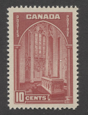
10c carmine.
Memorial Chamber, Ottawa.
Issued: June 15, 1938 (carmine rose) & July 28, 1938 (carmine)
Replaced: July 1, 1942.
10,187,000 (carmine rose) & 54,019,000 (carmine).

13c steel blue.
Halifax Harbour.
Issued: November 15, 1938.
Replaced: July 1, 1942.
13,028,000 sheet stamps.

20c red brown.
Fort Garry Gate.
Issued: June 15, 1938.
Replaced: July 1, 1942.
30,499,000 sheet stamps.

50c deep green.
Vancouver Harbour.
Issued: June 15, 1938.
Replaced: July 1, 1942.
4,924,000 stamps.

$1 blackish purple.
Chateau de Ramezay, Montreal.
Issued: June 15, 1938.
Replaced: July 1, 1942.
2,210,000 stamps.

6c steel blue.
Monoplane over Mackenzie River, Northwest Territories.
Issued: June 15, 1938.
Replaced: July 1, 1942.
29,008,650 sheet stamps.

10c dark green.
Arms of Canada.
Issued: April 1, 1939.
Replaced: July 1, 1942.
2,305,450 sheet stamps.

20c deep carmine red.
Arms of Canada.
Issued: June 15, 1938.
Replaced: March 1, 1939.
200,000 stamps.

10c on 20c deep carmine red.
Arms of Canada.
Issued: March 1, 1939.
Replaced: April, 1939.
200,000 stamps.
From looking at the issue quantities, all of the stamps, except for the last two special delivery stamps re quite common. Althlough a lot of booklet stamps were issued, complete panes are now quite scarce. Finally the last two special delivery stamps are very, very scarce, and the vast majority of examples you will come across will be mint. Used examples of both these stamps, cancelled in the proper period, are very, very scarce and provide a fantastic opportunity for the astute specialist, as the values in Unitrade are ridiculously low: $42.50 for a VF used example of the 20c carmine, and only $9 for a VF used example of the 10c on 20c surcharge. These two stamps are scarcer by far than any of the $1 value stamps from this period from 1928-1938 and yet they are a fraction of the price. I suspect that this is because of the fact that most albums place them on the back pages, behind all the regular issues, which keeps demand for them artificially low.
This issue provides, much much greater scope for the specialist than the previous Dated Die issue does:
- Shade varieties
- Paper and gum varieties
- Plate blocks
- Plate flaws and re-entries
- Imperforate varieties
- Coil stamps
- Booklet panes and complete booklets
- Proof material
- Postal stationery
- First day covers and postal history
- OHMS perfins
- Errors and Freaks
Today's post will cover the first six of these aspects, and then next week, I will address the remaining six.
Shade Varieties
There are not very many prominent shade varieties on this issue, but there are a few minor ones on the 1c, 2c, 3c, 4c, 5c, 6c airmail, 10c, 10c special delivery, 13c, 20c, 20c special delivery and the $1, which exists in a well known, aniline ink printing. The most outstanding shade difference occurs on the 10c Memorial Chamber, which can be found in a deep carmine, and a bright carmine rose. The 50c is perhaps the only stamp which exhibits very little meaningful variation in shade, followed by the 10c and 20c Special Delivery stamps, which are pretty uniform as well. The varieties that I have come across can be summarized as follows:
1c Green

On this value you can find a green that is both bright, and light, a regular, pure green, and then a deeper green that has a tinge of yellow to it. Most of the shades of this value are pure greens that vary only in terms of how bright or how deep they are. In the above scan, the left three stamps are the deep green, but the two at right are lighter and brighter. To see it, relax your eyes and compare the overall appearance of the colour. The second stamp from the right is the same general intensity as the three stamps on the left, but it is brighter. The stamp on the right is a lighter, softer green than any of the other stamps.
2c Brown

On this value, the main aspects of variation are the brightness of the brown, as well as the amount of yellow or red contained in the brown. Unitrade does list a yellow brown, that does contain some yellow, but is really just a very pale version of the brown. The above scan shows three shades of the brown. The stamp on the left contains very little to no red in the brown. The stamp in the middle contains a definite hint of red in the brown, while the stamp on the right is mid-way between the other two shades.
3c Carmine

The carmine varies in terms of the brightness, intensity and the amount of blue included in the colour. I have seen stamps in which the colour is a bright, deep tomato red, and others where the colour is a strong bluish carmine. In the above scan, the middle stamp is the most intense and contains no blue. The right stamp is less intense, but the same overall tone, while the left stamp is a lighter, softer carmine shade.
4c Orange-yellow

Here, the yellow varies in terms of the amount of orange included in the mix. I have seen stamps, that contain almost no orange, and are a pure, bright yellow. Others are almost entirely orange, with a golden tinge. However, most stamps you will see are a nearly perfect blend of yellow and orange. In the above scan, the second stamp from the left contains more orange in the shade than any of the other three. The stamp on the left, and the third stamp from the left are both very similar and are both duller and more yellow, with the stamp on the left being slightly lighter. The right stamp is brighter and yellower than any of the other three stamps.
5c Deep Blue

The three main shades of blue that I have encountered are steel blue, which contains just a hint of grey, Prussian blue, which contains just a hint of green, and a pure, bright dark blue, which contains neither. In the above scan, the stamp on the left, and the third stamp from the left are both shades of Prussian blue, containing a bit of green to the blue. The second stamp from the left is a deep steel blue that contains no green, but instead a bit of grey. Finally the stamp on the right is a deep bright green that is neither greenish, nor greyish.
8c Deep Orange

This shade varies both in terms of how bright the orange is, as well as the intensity. The shade on the left is slightly brighter and contains less red than the one on the right.
10c Carmine

The two main shade groups are pure dark carmine, and bright carmine-rose. The two shade groups are unmistakably different, and could not possibly be confused with one another. However, within each major shade group, there are differences. The bright carmine rose varies in terms of its brightness, but not very much in tone. In contrast, the dark carmine can be found in pure, deep bright carmine that almost completely lacks the bluish undertone, as well is in more bluish dull carmine.
In the above scan, the first three stamps from the left are what Unitrade would call carmine, while the two at right are carmine-rose. However, if you look very closely, you can see that there is quite a bit of variation in both the main two shade groupings. Looking at the carmine group, we can see that the stamp at the left is the brightest and least bluish of the three, and it becomes progressively darker as we move right. The fourth stamp from the left is the bright carmine rose, in which the rose just dominates the shade, whereas the stamp at the extreme right contains more carmine.
In the above scan, the first three stamps from the left are what Unitrade would call carmine, while the two at right are carmine-rose. However, if you look very closely, you can see that there is quite a bit of variation in both the main two shade groupings. Looking at the carmine group, we can see that the stamp at the left is the brightest and least bluish of the three, and it becomes progressively darker as we move right. The fourth stamp from the left is the bright carmine rose, in which the rose just dominates the shade, whereas the stamp at the extreme right contains more carmine.
13c Deep Blue

On this value, the main two shades are steel blue and Prussian blue. I have yet to come across any truly pure dark blue shades. The stamps at left and third in from the left are steel blue, while the other two are Prussian blue. The Prussian blue is brighter than the steel blue.
20c Red Brown

The main variation of the colour on this value lies in the amount of red in the brown, which governs how bright the resulting shade is. I have come across very bright red browns and other red-brown shades that are much duller by comparison. In the above scan, although the shades look similar, you should be able to see that the stamp on the right is rosier and lighter than the other three, which vary slightly in terms of how deep they are, and how much red is contained in the brown.
50c Green
As stated earlier, this is a fairly uniform colour. However, I have come across slight variations in the brightness, with the early 1938 printings being slightly brighter.
$1 Violet

Unitrade refers to this colour as violet, but in reality, it is more of a deep lilac. The colour varies from a blackish lilac on the later printings to a deep aniline rose lilac on the first 1938 printings. The stamp on the extreme right is the deep aniline rose lilac from the 1938 printing. The second and fourth stamps from the left are both deep rose lilac in the regular ink. The stamp on the left is the blackish purple, while the third stamp from the left is deep dull violet. It is difficult to see these differences here, but they are more apparent in the flesh.
The scan below shows what the aniline ink looks like from the back on the gum side:

You can see a very feint bleeding of the ink into the gum, which gives it a pinkish appearance. This is the tell-tale characteristic of aniline ink: its suffusion on the surface of the paper and visibility through the gum. I have only ever seen this on the first printings of the $1 - not any of the other values of the set.
6c Deep Blue Airmail

This stamp exhibits much of the same variation as the 13c, but I have also seen pure dark blue in addition to the more common steel blues and Prussian blues. The two stamps o each end are both the same shade and are the deep Prussian blue, which is greenish compared to the middle two stamps, which are a lighter, duller blue.
10c Dark Green Special Delivery

This stamp exhibits a fair amount of uniformity of colour, but I have seen slight variations in the brightness of the green. The stamp on the left is both deeper and brighter than the other three stamps, while the third stamp from the left is the lightest green of the four. The second stamp from the left and the right stamp are about equal in terms of intensity, but the stamp on the left is a duller green than the stamp on the right.
20c Carmine and 10c on 20c Special Delivery

This stamp is almost exclusively, a deep bright carmine red. However, sometimes a slightly duller shade is encountered, like the stamp on the left in the above scan.
Paper and Gum Varieties
Like the previous issue, this issue exhibits considerable variation in the papers and gums that were employed in production.
Paper Varieties
There is a considerable amount of variation in both the thickness, stiffness, presence of mesh and ribbing of the paper on this issue. In working with the stamps of this issue extensively, I have encountered the following paper types:
- Thick, very soft white wove paper that shows neither any ribbing or any distinct mesh pattern. This paper is found on the 1938 printings, most notably on the $1 aniline ink.
- Thin, crisp white wove paper that is smooth, and shows no distinct mesh pattern, nor any ribbing.
- Thin, crisp white wove paper that is smooth, and shows fine vertical or horizontal mesh, but only when held up to a strong light source.
- White wove paper that shows a clear vertical mesh, but no ribbing.
- White wove paper that shows a very fine horizontal mesh when held up to the light. This paper was used for some printings of the coil stamps.
- White vertical wove paper that exhibits a very light vertical ribbing. This paper was used to print some of the coil stamps as well as the 10c in the bright carmine-rose shade.
- White ribbed horizontal wove paper.
- A thicker, horizontal wove paper that often shows very light horizontal ribbing on the gum side, but is smooth on the printed side. There is no mesh visible, but when held up to the light, the strong horizontal weave can be seen.
The scan below shows the front of a 2c brown that is printed on the horizontal ribbed paper:

Look at the margins: you should be able to see the clear, textured ribbing of the paper.
Gum Varieties


The gum on this issue exhibits more variation than the previous issue, with several very distinct types:
- White gum with a very finely crackly surface and a semi-gloss sheen. This was used in combination with the thick, soft white wove paper. This is shown on the right stamp in the first scan above.
- Cream gum with a very finely crackly surface and a semi-gloss sheen. This was used in combination with the thick, soft white wove paper. It is shown on the left stamp in the first scan above.
- Cream gum with a finely crackly surface and a satin sheen. This was used on the thin, crisp wove paper showing horizontal mesh when held up to a strong light.
- Deep cream gum with a very finely crackly surface and a semi-gloss sheen. This was used in combination with the thick, soft white wove paper. It is shown on the middle stamp in the first scan above. It is also found on the horizontal ribbed paper.
- Cream gum with a very finely crackly surface and a very glossy sheen. It is generally found on a medium white wove paper that shows a fine vertical mesh when held up to the light.
- Cream gum with a satin sheen. Generally found on thin, crisp, white wove paper, that shows very clear vertical mesh, even when not held up to the light.
- Brownish yellow gum with a satin sheen. Often found on the crisp, translucent wove paper with horizontal ribbing. An example can be seen in the seventh scan above.
- Deep yellowish cream gum with a semi-gloss sheen. This is often found on the horizontal wove paper, with light ribbing on the gum. An example of this is shown in the fifth scan above.
- Deep cream gum, similar to the deep yellowish cream above, lighter in colour. An example of this type is shown on the sixth scan above.
- Brownish cream gum with a satin sheen. This is often found on the horizontal ribbed paper, or the vertical ribbed paper. The third scan above shows an example of this gum.
- Yellowish cream gum with a glossy sheen.
- Slightly streaky brownish gum with a semi-gloss sheen. I have seen this on the soft, horizontal wove paper with fine mesh, on the 10c, or soft vertical wove on the other values. This type is shown in the second scan above.
- Deeper brown gum with a semi-gloss sheen. This is often found on the thicker, softer wove papers that show mesh when held up to the light. The fourth scan above shows this type.
Hopefully you can see now how there can potentially be upwards of 10 paper and gum combinations possible on most values of this set, which increases the potential scope of a specialized collection dramatically, especially if you extend this to the vast number of plate blocks that exist for this issue as discussed below.
Plate Blocks

This is the first issue we see where the number of plates used to print the stamps positively explodes in number, making the collection of plate blocks a very challenging endeavour in their own right. This is the first issue in which the standard size for plate blocks is 4 stamps, rather than 6 or 8 stamps, as was customary for earlier issues. The main exception to this is on the centre positions of the 2c and 3c, which can be collected as strips of 4, blocks of 8, or blocks of 20.
The style and size of the plate inscription was different for the low values and the high value stamps. The low values were simply inscribed "Canadian Bank Note Co. Ottawa No.1" in smaller, Times Roman font. The high values had the same basic inscription in slightly larger type, but also had a much smaller bilingual inscription describing the subject matter of the stamps. On the airmail stamp shown above, it simply says "Mackenzie River Northwest Territories".
Many of these blocks can be found with cutting guidelines one or both selvage margins. Both scans above show cutting guidelines on the upper selvage margins.
The number of plates used, and blocks that can be collected can be summarized as follows:
Position Dots
I haven't seen enough plate blocks to say identify all the configurations of dots that can be found in the selvage tabs, or which positions these are to be found in. The 6c airmail block above shows that at least for the upper right position, 1 dot can be found in the selvage directly across from the lower right stamp.
Order Numbers on Lower Left Positions
I haven't examined very many plate blocks of this issue at all, so I can only provide a few numbers here. However, I will update this list as I come across more numbers:
Arrow Guide Blocks
Although not listed in Unitrade, all values of this issue can be collected as arrow guide blocks. Arrows were placed in the sheet margins between the panes to indicate where they were to be guillotined apart. Normally the guillotine would split the arrow, so that it wouldn't be visible on sheets, but occasionally, it was out of alignment, and in these instances, the arrow guide marking is visible in the margins, and is highly collectible.
The scan below shows an example of the 10c memorial chamber in an upper left block showing the guide arrow:

The style and size of the plate inscription was different for the low values and the high value stamps. The low values were simply inscribed "Canadian Bank Note Co. Ottawa No.1" in smaller, Times Roman font. The high values had the same basic inscription in slightly larger type, but also had a much smaller bilingual inscription describing the subject matter of the stamps. On the airmail stamp shown above, it simply says "Mackenzie River Northwest Territories".
Many of these blocks can be found with cutting guidelines one or both selvage margins. Both scans above show cutting guidelines on the upper selvage margins.
The number of plates used, and blocks that can be collected can be summarized as follows:
- 1c green - 11 plates, 4 positions - 44 blocks
- 2c brown - 14 plates, 4 positions plus centre positions on plates 9&10 - 60 blocks.
- 3c carmine red - 23 plates, 4 positions plus centre positions on plates 12 & 13 - 96 blocks.
- 4c yellow orange - 1 plate, 4 positions - 4 blocks.
- 5c steel blue - 3 plates, 4 positions - 12 blocks.
- 8c orange - 1 plate, 4 positions - 4 blocks.
- 10c carmine - 2 plates, 4 positions, 2 major shades - 16 blocks.
- 13c steel blue - 1 plate, 4 positions - 4 blocks.
- 20c red brown - 2 plates, 4 positions - 8 blocks.
- 50c deep green - 1 plate, 4 positions - 4 blocks.
- $1 blackish purple - 1 plate, 4 positions, aniline & regular - 8 blocks.
- 6c steel blue - 1 plate, 4 positions - 4 blocks.
- 10c dark green - 1 plate, 4 positions - 4 blocks.
- 10c on 20c - 1 plate, 4 positions - 4 blocks.
- 20c deep carmine red - 1 plate, 4 positions - 4 blocks.
So a basic set of plate blocks for this issue consists of 276 blocks. If you start to seek out shade variations, which will be much more readily visible on plate blocks than on single stamps, paper varieties and gum varieties, then the potential scope of a specialized collection of plate blocks can become very large, very quickly.
A number of blocks showing plate cracks in the selvage can also be found. A plate crack shows up as a heavy, irregular line in the selvage. The plate cracks that can be found include:
- 1c green - plate 3 UL, plate 7 LL and plate 8 LL or LR.
- 2c brown - plate 5 UL & UR.
- 3c carmine red - plate 2 UR.
- 5c steel blue - plate 2 LL.
Position Dots
I haven't seen enough plate blocks to say identify all the configurations of dots that can be found in the selvage tabs, or which positions these are to be found in. The 6c airmail block above shows that at least for the upper right position, 1 dot can be found in the selvage directly across from the lower right stamp.
Order Numbers on Lower Left Positions
I haven't examined very many plate blocks of this issue at all, so I can only provide a few numbers here. However, I will update this list as I come across more numbers:
- 10c: plate 1 - 1132.
- 20c: plate 1 - 1134.
I will be indebted to anyone who can supply me with information about the order numbers and position dots to be found on the plate blocks of this issue. I will of course, be updating this section regularly, as I examine more and more plate blocks, gathering relevant information that I can add.
Although not listed in Unitrade, all values of this issue can be collected as arrow guide blocks. Arrows were placed in the sheet margins between the panes to indicate where they were to be guillotined apart. Normally the guillotine would split the arrow, so that it wouldn't be visible on sheets, but occasionally, it was out of alignment, and in these instances, the arrow guide marking is visible in the margins, and is highly collectible.
The scan below shows an example of the 10c memorial chamber in an upper left block showing the guide arrow:

Plate Flaws and Re-Entries
There are only two listed constant plate varieties on this issue, and they are both on the 3c carmine:
- The crease on the collar
- The nick in ear
The crease in the collar is shown in the scan below:
Unfortunately I do not have an example of the nick in the ear, nor was I able to find an image online of it. I'd be indebted to any reader who can provide me a scan to include in this blog.
I have, after many years of searching finally found a re-entry. It occurs on two right hand stamps in a booklet pane of 4 plus 2 labels of the 2c shown below:


The Broken "1" in the 10c on 20c Surcharge
Unitrade lists a broken "0" in the right surcharge of the 10c on 20c special delivery stamp, but there is also a broken "1" on the left surcharge. The scan below shows an example of it on the lower left stamp in the block:

Flaw in Last "A" of Canada
Here is an interesting flaw that I found on a mint example of the 4c:

Smudge Above "ES" of Postes
Here is another, probably non-constant flaw that I found on another 4c:

I have, after many years of searching finally found a re-entry. It occurs on two right hand stamps in a booklet pane of 4 plus 2 labels of the 2c shown below:

In this re-entry, if you look at the left and right framelines, you can clearly see areas where the horizontal shading protrudes beyond the frameline. So it is either a re-entry in which the horizontal shading has been somewhat doubled, or it is a retouch of the framelines that does not quite touch the original frame. The scans below show these clearly:

Here, you can see the doubling of the frameline at the bottom.

Here, you can just make out similar doubling in the top right corner.

Another very clear example on the lower right stamp.

This is the least clear example, on the upper left corner of the upper right stamp.
The Broken "1" in the 10c on 20c Surcharge
Unitrade lists a broken "0" in the right surcharge of the 10c on 20c special delivery stamp, but there is also a broken "1" on the left surcharge. The scan below shows an example of it on the lower left stamp in the block:

Flaw in Last "A" of Canada
Here is an interesting flaw that I found on a mint example of the 4c:

The flaw consists of a prominent upward arc inside the second "A" of "Canada". I have no idea of whether or not this is a constant plate variety, but I think it is interesting nonetheless.
Smudge Above "ES" of Postes
Here is another, probably non-constant flaw that I found on another 4c:

Imperforate varieties
All of the values of this series exist in imperforate pairs, and a few even exist as imperforate plate blocks. The total number of pairs and plate blocks currently known of each value are as follows:
- 1c green - 100 pairs, 2 plate blocks.
- 2c brown - 100 pairs, 2 plate blocks.
- 3c carmine red - 150 pairs, 2 plate blocks.
- 4c yellow orange - 100 pairs, 2 plate blocks.
- 5c blue - 100 pairs, 2 plate blocks.
- 8c orange - 100 pairs, 2 plate blocks.
- 10c carmine - 75 pairs or each major shade, 3 plate blocks
- 13c steel blue - 75 pairs, 3 plate blocks.
- 20c red brown - 75 pairs, 3 plate blocks.
- 50c deep green - 75 pairs, 3 plate blocks.
- $1 blackish purple - 75 pairs, 3 plate blocks & 1 plate block that is imperf. horizontally.
- 6c steel blue airmail - likely 75 pairs & 3 plate blocks, but quantity unknown for sure.
- 10c dark green special delivery - 75 pairs & likely 3 plate blocks, though not sure.
- 20c carmine red special delivery - 75 pairs & likely 3 plate blocks, though not sure.
The values for these pairs are quite modest, given their rarity, ranging from $450 to $1,000 per hinged pair. The low plate blocks are much more expensive, being valued at either $2,000 each, or $12,000 for the set, and the plate blocks of the high values range from $2,700 each, to $25,000 for the unique block of the $1 imperf horizontally.
Coil Stamps

Like the previous issue, this issue featured coil stamps for the lowest three values, and these were issued in rolls of 500. Unlike the previous issue, there are no known plate flaws on these coils. However, there are several ways that these can be collected:
- Jump strips exist for all three values.
- Wide and narrow spacing strips can be found for all values. The normal spacing between stamp impression varies between 3.75 mm and 4.25 mm. Narrow spacing will be less than 3.75 mm, and wide spacing will be more than 4.25 mm.
- Cutting guideline strips can also be found, though these are rare.
- Repair paste-up pairs or strips can be found for all three values.
- Start and end strips of 4, plus 10 blank tabs exist for all three values.
In addition to these, these coils exist with at least three paper and gum combinations as follows:
- Soft white wove paper with white gum that has a semi-gloss sheen.
- Horizontal wove paper, with deep yellowish cream gum and a semi-gloss sheen.
- Horizontal wove paper, with brownish cream gum and a satin sheen.
- Vertical wove paper, with cream gum and light vertical ribbing.
Most if not all of the above five varieties of coils should exist with all four of the above paper and gum combinations, and quite possibly more, as well as some shade varieties. In terms of shades, I have seen the following on the coil stamps:
- 1c deep bright green.
- 1c deep green.
- 2c reddish brown.
- 2c deep brown.
- 3c deep rose red.
- 3c dark rose red (contains some black whereas deep rose red does not).
- 3c carmine-red.
- 3c dull carmine-red.
This concludes my discussion of the first six aspects of this issue. Next week, I will cover the remaining aspects.


Yay the Muftis!! As I've said before I really think the George VI low values are among the "classiest" of Canada's definitive series. Not overburdened with fussy decoration, but not minimalist in design either, just clean, clear lines that set the king's portrait off to perfect effect.
ReplyDelete