Printing Inks Used On The 1967-1973 Centennial Issue - Part Five of Eight
Today, we get into the inks used to print the Centennial issue, as they appear under, or are affected by long-wave ultraviolet light, or black light. Today's post will discuss what I mean by this, and then will look at some of the differences that appear on the 1c through 4c values of the series.
Our perception of colour is a function of how the pigments interact with the light that illuminates them. How an ink will appear under yellow incandescent light will be different from how it appears under daylight, which will differ still from how it appears under various forms of coloured light. However, usually a colour will appear more or less the way you would expect it to appear with the addition of the colour that is inherent in the light. Long wave ultraviolet light is of course, a purple light. So the appearance of most colours would appear darker and washed over with a purple undertone. I would refer to these inks as non-transformative, because the introduction of black light does not transform the colour from one to another, but merely modifies it by making it appear, darker, duller or brighter.
However, there are some inks used on the Centennial issue that are a completely different colour under the ultraviolet light from their colour in normal light. Quite often, that colour is black, but in many other instances, it is a different colour other than black. These inks are what I would call transformative, for this reason. So in studying the inks used for this issue, after you have considered the shade differences as they appear under normal lighting conditions, there is the question of whether of not the inks are transformative, and what colour they appear under the ultraviolet light. It is quite possible, and quite common, in fact, to find many instances in which two stamps that appear to be more or less identical under normal light, will appear to be different colours under ultra-violet light.
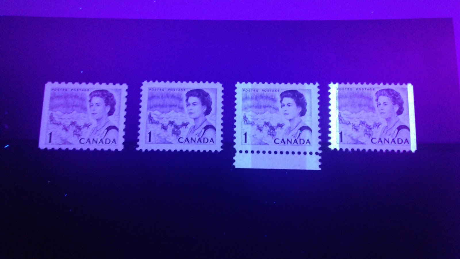
To illustrate what I am talking about, let us now take an example of three 1c stamps shown below:


Our perception of colour is a function of how the pigments interact with the light that illuminates them. How an ink will appear under yellow incandescent light will be different from how it appears under daylight, which will differ still from how it appears under various forms of coloured light. However, usually a colour will appear more or less the way you would expect it to appear with the addition of the colour that is inherent in the light. Long wave ultraviolet light is of course, a purple light. So the appearance of most colours would appear darker and washed over with a purple undertone. I would refer to these inks as non-transformative, because the introduction of black light does not transform the colour from one to another, but merely modifies it by making it appear, darker, duller or brighter.
However, there are some inks used on the Centennial issue that are a completely different colour under the ultraviolet light from their colour in normal light. Quite often, that colour is black, but in many other instances, it is a different colour other than black. These inks are what I would call transformative, for this reason. So in studying the inks used for this issue, after you have considered the shade differences as they appear under normal lighting conditions, there is the question of whether of not the inks are transformative, and what colour they appear under the ultraviolet light. It is quite possible, and quite common, in fact, to find many instances in which two stamps that appear to be more or less identical under normal light, will appear to be different colours under ultra-violet light.
To illustrate what I am talking about, let us now take an example of three 1c stamps shown below:

On the left we have a deep brown booklet stamp with type 8 dex gum and printed on dull fluorescent paper. The other two stamps are BABN booklet stamps printed in two slightly different shades of deep reddish brown, with the middle stamp being more reddish and the right stamp being closer to chocolate. However, none of these shade variations is overly dramatic.
Lets take a look and see how these three stamps appear under UV:

If you look at the stamp on the left, although the purple light of the lamp has cast a light violet shadow over the paper, it has not significantly changed the colour. From the appearance of the shading in the sky and on the ice, it is clear that the colour is still deep brown. The stamp on the right is still deep brown also, albeit darker than it was under normal light. However, the stamp on hibrite paper, in the middle, looks clearly black now, and not brown.
In actual fact, although the scan does not show it clearly, the colour of the right stamp is unchanged under the lamp as well. So I would classify these inks as follows:
Left stamp: non-transformative, deep brown/deep brown.
Middle stamp: transformative, deep reddish brown/black.
Right stamp: non-transformative, deep chocolate brown/deep chocolate brown.
Where the colour to the left of the slash denotes the colour as seen in normal light, and the colour to the right of the slash denotes the colour as seen under ultraviolet light.
Now, lets take a look at the 1c-4c stamps in detail:
1c Northern Lights and Dogsled Team
Non-Transformative Inks.
Within the classification of non-transformative inks, there are essentially three categories:
1. Those inks that appear either deeper, duller, deeper and duller, or deeper and fuller under the light.
2. Those which do not appear significantly different under UV, once the light colour is taken into account, and,
3. Those which appear, lighter, brighter, or lighter and brighter under the light.
We have already seen an example of a non-transformative ink that does not appear significantly different under UV light: the perf. 12 booklet stamp with dex gum. This type of ink generally seems to pre-dominate in those CBN sheet stamps, and booklet stamps that were printed in plain, deep brown ink.
However, let's take a look at some more examples where the ink appears deeper and fuller under the light. Take a look at these three stamps:
Here we have two shades of chocolate brown, on the first two stamps, and deep brown on the right. The middle and right stamps are both BABN booklet stamps, untagged and printed on high fluorescent and medium fluorescent papers, with satin PVA gum. The stamp on the left is general Ottawa OP-2 tagged and is printed on low fluorescent, vertical wove paper with matte PVA gum.
Now, let's take a look at them under UV light:


My phone camera does not do the greatest job at representing the colour as it actually appears, but it should be apparent that in all cases, the colour is still brown, with the centre stamp being the darkest. In each case, the colour is darker and fuller under UV light than under normal light. This type of ink seems to be found on some of the later CBN printings with PVA gum in the deeper brown shades and in several of the BABN booklet stamps that are perf. 12.5 x 12.
Now, let's take a look at ink which looks slightly lighter, and/or brighter under the light. Take these four stamps:

Now, let's take a look at ink which looks slightly lighter, and/or brighter under the light. Take these four stamps:
Here, starting on the left, we have the perf. 10 BABN booklet stamp in the reddish brown, shade, a deep brown CBN sheet stamp on dull fauorescent paper, a very deep violet brown sheet stamp with Winnipeg tagging, and finally another BABN booklet stamp in a dull reddish brown shade. What all of these four stamps have in common, is the somewhat dull nature of the colours.
Now let's take a look at them under UV:

This picture is, once again, not truly representative of how these stamps actually look. However, the left stamp does appear slightly brighter here than it does under normal light. The other three stamps, do not really appear lighter, per se, but they all appear brighter, and less dull, as compared with the colours in normal light.
This type of ink seems to be found on both perforations of the BABN booklet stamps, and many of the CBN sheet stamps, with the deeper, duller browns, both untagged and Winnipeg tagged.
Now let's take a look at them under UV:
This type of ink seems to be found on both perforations of the BABN booklet stamps, and many of the CBN sheet stamps, with the deeper, duller browns, both untagged and Winnipeg tagged.
Transformative Inks
As I said earlier, transformative ink is that which completely changes colour under UV light. Sometimes the change merely involves the loss of a predominant tone, for example, red-brown losing the red undertone and becoming dark brown. Other times, it involves the ink becoming a completely different colour altogether, like green changing to black.
Let's take a look at the following four stamps:

Here we have a BABN booklet stamp in the deep brown shade, with satin PVA gum, a Winnipeg tagged sheet stamp in chocolate brown, a General Ottawa Tagged stamp in reddish brown, and an untagged sheet stamp on hibrite paper in the chocolate brown shade.
Let's take a look at how they appear under UV:

Both stamps on the ends appear to be printed in black when viewed under UV, losing all the brown. The middle two stamps both appear dark brown, with no reddish undertone, when under normal lighting conditions, both stamps have a clear reddish tone. Generally, these inks seem to be limited on this value, to those stamps printed on hibrite paper, and the PVA gum stamps with a some hint or red to the colour, whether untagged, Winnipeg centre bar tagged, or general Ottawa OP-2 tagged.
Let's take a look at the following four stamps:
Let's take a look at how they appear under UV:

2c Pacific Coast Totem Pole
Non-Transformative Inks
In discussing the non-transformative inks on this value, let us begin with the ink that appears more or less the same under the UV light as in normal light: the myrtle green from the dex gum printings. Take a look at the following 2 stamps:
Here we have two of the CBN sheet stamps in two slightly different shades of the myrtle green, with the left stamp being printed in a slightly brighter shade, and Winnipeg centre bar tagged. Both are printed on dull fluorescent paper with type 8 dex gum. As we will see, under the UV light, they do not look much different, once your eyes adjust to the violet light:

The picture makes the right stamp look a bit black, but in reality it looks very close to the same shade of deep myrtle green as the stamp does in normal light. This ink seems to predominate on the dex gum sheet stamps.
Moving on to the printings with PVA gum, the vast majority are printed in a non-transformative ink, which merely looks darker under the light, but is still green, rather than black. Here are four such stamps in normal light:
These are all shades of deep green, except for the second stamp from the left, which is a distinct bright green. The first two stamps on the left, are printed on smooth, white vertically wove paper, while the last two are printed on a horizontally ribbed, white vertical wove paper. All the stamps except for the second last stamp, are untagged, and have eggshell PVA gum. The second last stamp is general Ottawa OP-2 tagged, and has matte PVA gum.
Under the UV light, the first and last stamps get to be a very dark green, but not black:

The picture, makes the two end stamps look black here, but they are actually, very dark green. The middle two stamps are clearly dark green, and are deeper than the shades as they appear in normal light. These inks appear in several of the PVA gum printings, with various grades of fluorescence.
Transformative Inks
Some of the PVA gum printings and the CBN printing on hibrite paper that was made for the OPAL booklet are found with transformative inks, which in all cases appear black under the UV light.
Here we have a Winnipeg centre bar tagged printing on horizontally ribbed, white vertical wove, with eggshell PVA gum. Then we have a general Ottawa OP-2 tagged printing in bright green, on horizontally ribbed, white vertical wove with eggshell PVA gum. Then there is an untagged printing on smooth, white vertical wove with matte PVA gum, and finally, there is the OPAL booklet printing on hibrite vertical wove paper, with vertical mesh and dex gum. The shades are generally either deep green, or deep bright green, with the OPAL booklet printing being a slightly lighter and duller version of the deep green.
Here they are under the UV light:

As you can see, there is no green colour left in the ink. Everything appears black. These inks seem to occur on the PVA gum printings with either very low, or very high fluorescence.
3c Combine Harvester and Oil Rig
Non-Transformative Inks
On this value, very few of the printings were made with ink that did not look darker under UV light than in normal light. However, there are a few of the printings made on dead, non-fluorescent paper that appear deep dull purple in both normal light and under UV light. Here is an example of one such printing: a precanceled example of the deep dull purple, on stiff vertical wove with type 1 dex gum:
Here is how it looks under UV:

The picture is a bit blurry, but you can clearly see that it is dull purple and it's appearance hasn't changed significantly.
Most of the printings of this stamp, in various shades of dull purple, including those with a reddish undertone, all appear darker when viewed under UV. Here are four examples on various papers, which appear darker under UV light as compared to normal light:
On the left, and second from the right, there is the deep, dull purple on two different types of dull fluorescent paper, one with type 1 dex gum and the other with type 2 dex gum. Second from the left, is a lighter, duller shade, with shiny type 3 dex gum and on low fluorescent paper. Lastly, on the right is a deep dull purple precancel on speckled dull fluorescent paper, with type 8 satin dex gum.
Here they are under UV:

If you look at the shading in the wheatfield, rather than the Queen, you can see that none of these stamps appear black, but they generally appear to be much deeper shades of purple. This is the type of ink in which the vast majority of the stamps of this denomination were printed.
Transformative Inks
Two printings of this value were made on white fluorescent paper: the general Ottawa OP-2 tagged precancel with matte PVA gum, and the OPAL booklet printing on hibrite paper:
Both these stamps appear black when viewed under UV light:

4c Seaway Lock
Unlike all the other values examined so far, I have not come across any 4c stamps printed in a transformative ink. All of the inks either appear more or less the same under UV and normal light, or they appear darker under UV.
Let us begin with those stamps whose colour appears more or less the same under UV. Here are five such stamps:
On the left we have scarlet printed on a dull fluorescent, stiff vertical wove paper with horizontal mesh, and type 3 or 4 dex gum. This stamp is Winnipeg tagged with a right side bar. Then we have a scarlet booklet stamp on dull fluorescent horizontal wove paper, with type 8 satin dex gum. In the middle, is a scarlet stamp on less stiff, non-fluorescent vertical wove with type 4 dex gum. Then second from the right is a scarlet stamp printed on a non-fluorescent vertical wove, with type 2 dex gum. Lastly, on the right, we have a perf. 10 BABN booklet stamp in carmine red , on dull fluorescent, horizintal wove paper with type 1 dex gum.
Let's take a look at these under UV:

Although they do look slightly deeper here in the picture, in reality the stamps look very similar under UV to how they look in normal light. These inks appear to be limited to the CBN sheet stamps, booklet stamps and coils with dex gum, as well as the BABN booklet stamps.
The remainder of the stamps printed with dex gum and those with PVA gum, seem to all be printed in brighter shades of scarlet, which merely look darker under UV, but do not become black. Here are five more dex gum stamps and three with PVA gum, all of which appear darker under UV than they do in normal light:
If you compare the scans carefully, you can see that many of the dex gum stamps, being the three on the right, and all the PVA gum stamps are in brighter shades than the earlier dex gum stamps. Most of the stamps on the top row are printed on dull fluorescent paper, or speckled fluorescent paper, and generally with a satin dex gum like type 3 or 4. On the bottom row, we have a bright scarlet stamp on medium fluorescent vertical wove, with matte PVA gum. This stamp is general Ottawa OP-2 tagged. The stamp on the right is the same, except that instead of being general tagged, it is the scarce printing with the Winnipeg centre bar. The middle stamp is similar, but the shade is a bit duller, and the paper is dull fluorescent rather than being fluorescent at all.
Let's take a look at them under UV:

As you can see, every stamp under here looks red and not black. If you compare the images of each stamp carefully under both UV and normal light, you will see that the colours, in every case, appear darker.
That brings me to the conclusion of this week's post. Next week, I will continue with the 5c through 8c values.


Comments
Post a Comment