Printing Inks Used On The 1967-1973 Centennial Issue - Part Three of Eight
Today's post continues my examination of shades on this issue, and features two of my favourite stamps for the range of colour exhibited: the 10c Jack Pine and 15c Bylot Island stamps. It is almost impossible to exhibit the full range of shades that can be found without doing a detailed study of used examples, but I will attempt to show a representative selection of the shades that can be found on these stamps in this post, and will add other examples as they come to my attention.
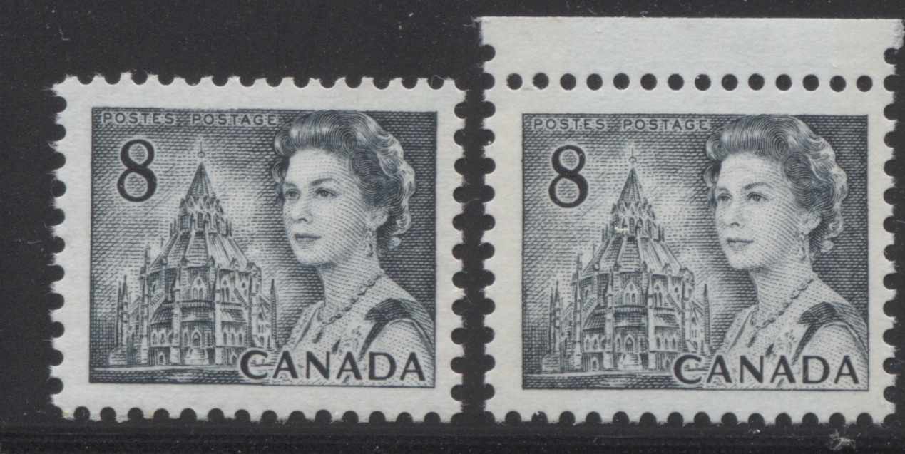
8c Slate - Parliamentary Library
The basic catalogue description for this stamp is slate, but there is variation in terms of the amount of blue, green, and the amount of black, or grey that is present in the mix. Generally, the earlier printings with dex gum and many of the booklet stamps are found in a slate that is more bluish, while the later PVA gum printings tend to be a slate that contains much more grey.
With the exception of the coils, which were printed only by CBN, all the stamps were printed by the BABN. The range of shades is fairly limited, so I will will show them all by way of a single group of scans. Unfortunately I no longer have the slate swatches on my Gibbons colour key, so I will have to describe these shades in relative terms.
Here is the scan showing all of the shades together:

Looking at the top row, both the right hand coil stamp, and the second stamp from the left are the deep greenish slate shade. The stamp on the extreme left, which is printed on whiter horizontal wove paper without any ribbing, is a slightly less intense version of the greenish slate. It is very close to the other two stamps, but is just a bit lighter. The first coil stamp (third stamp from the left) is a distinctly bluish slate compared to the other three stamps. I find that focusing on the queen is the best way to see this difference.
Moving to the second row, all of the stamps here lack the greenish undertone that three of the stamps on the top row have. All four of these stamps are printed with PVA gum, though the type of PVA gum does vary, and the paper of the middle two stamps is vertically ribbed, while the two outer stamps are printed on smooth paper. The left stamp and the first booklet stamp (third from left) are approximately the same shade, and are what I would call a pure slate, which is neither overly bluish, greenish or greyish. The second stamp from the left, is much more greyish and less bluish, while the stamp on the right is more bluish, being almost the exact same shade as the upper left stamp on the first row.
Now let's take a look at these stamps more closely in pairs as they appear on the card, starting with the two sheet stamps with dex gum:

The difference between these first two stamps is much more apparent here, with the stamp on the left being noticeably brighter than the stamp on the right.
Now, let's look at the two coils:

I have found that the coils in general, show much less variation than either the sheet stamps, or the booklet stamps. However, you should be able to see from this scan that the right stamp is definitely greenish compared to the left stamp. Both stamps are General Ottawa Tagged, and both appear to be OP-2. However, the one on the right is printed on a vertical wove paper with matte PVA gum, and the tagging is a pale washed out green. The stamp on the left is printed on a vertical wove paper with slightly shinier eggshell PVA gum, and the tagging is a much deeper and brighter yellow. Under ultraviolet light, the paper of the left stamp is a medium fluorescent, while the paper of the right stamp gives a dull fluorescent greyish reaction.
Now, let us move on to the sheet stamps with PVA gum:
Here you can again, see the differences in shade more clearly, with the stamp on the right lacking the bluish undertone of the stamp on the left. Both of these have white PVA gum with a satin sheen, and the paper of both is a white horizontal wove paper. However, as I have mentioned above, the paper of the left stamp is smooth, while the the paper of the right stamp is vertically ribbed.
Finally, let's finish by looking at the booklet stamps:

These two stamps are extremely close in shade, and to many collectors would be indistinguishable. However, if you look very closely, you can just see that the right stamp is ever so slightly greenish compared to the left stamp. The left stamp is untagged, and printed on a white, horizontal wove paper, with light vertical ribbing, and with a creamy PVA gum that has a satin sheen. It comes from the 25c booklets that were issued mainly between 1972 and 1974. The stamp on the right is General Ottawa tagged with the migratory OP-4 taggant compound, and is printed on smooth, horizontal wove paper with a cream PVA gum that is thicker and has an almost semi-gloss sheen. It comes from the large $1 booklet that was issued on December 30, 1971.
8c Violet Brown - Alaska Highway
This value was only printed by the CBN and is the only stamp in the series that exists only untagged and with only dex gum. All the other values either exist tagged in some form, or exist with PVA gum, but this one does not. Until fairly recently, there were no listed varieties in most catalogues, but in recent years, Unitrade has listed three varieties of paper. However, there are a few distinct shades as well. Unitrade lists the colour as being violet brown, which is true, but the colour varies in terms of how much brown, versus how much purple is included in the blend, with the more purple ones being much closer to deep maroon on the Stanley Gibbons colour key.
Here are four stamps showing the different shades, with two being printed on the usual creamy dull paper, and the other two being printed on the white, non-fluorescent paper that was introduced briefly in 1967:

This is one of those stamps where if you focus too much on the colour, they will all start to look the same after a while, but if you relax you gaze and compare the entire stamp designs, you will see the differences quite clearly. The first two stamps on the top row are printings on the cream coloured, dull fluorescent paper, while the other two stamps are on the much whiter dead paper. The two stamps on dead paper appear much colder in tone than those on the cream paper, which are much warmer in appearance. That is the first difference between the shades.
Looking at the first two stamps on the top row, the one on the left is the rosiest of the two and contains far more purple than any of the other stamps. On the Gibbons colour key, it is closest to what maroon would be if it were darker and contained a slight hint of brown. On the other hand, the right stamp is much browner, and is closest to what purple brown would be if it were deeper and a bit duller. Let's take a closer look at those first two stamps:

Again, try not to focus too much when looking at these, otherwise they will look the same. Look at them with a relaxed gaze and you should see that the left stamp is much more purple than the right stamp.
Now, turning our attention to the two stamps on dead paper, the colour is about mid-way between these first two shades, being closest to what Gibbons's deep rose lilac would be if it were a touch browner. Let's take a close up look at the middle two stamps in the top row:


10c Olive Green - Jack Pine
This stamp shows an absolutely amazing range of shades that run from brown olive all the way to deep yellow green. I find that in general, the stamps with dex gum usually contain either a hint of brown, or grey and are usually shades of olive, rather than shades of dark yellow green. Once the PVA gum printings appear in 1971, the brown and grey disappears, and so does the olive, so that the predominant shade during this period is dark yellow green.
The shades on this stamp can be broken down into three groups:
1. Those found on the stamps with Dex Gum.
2. Those found on the untagged and Winnipeg tagged stamps with the PVA gum and spotty white gum, and
3. Those found on the General Ottawa tagged stamps.
I will deal with each of these individually.
Stamps With Dex Gum
My representation of shades for the stamps with dex gum is by no means complete, as I do not currently have examples where the shade contains a fair amount of brown to the olive, but I will add them as soon as they become available, so that you can see what I am talking about.
The scan below shows four of the shades that I do have:

Like the 8c Alaska Highway, this is another stamp that is best compared with a relaxed gaze, and with the overall design. However, if you do prefer to focus on one part of the design, then I find the large mass of foliage toward the bottom of the tree to be best, or the ground near the tree.
These are all shades of olive as it appears in the Gibbons colour key, with the colour varying in terms of how much yellow there is, versus how much grey. If you look at the above scan, the upper left stamp on the top row contains the most yellow, while the stamp on the second row contains the most grey. The first stamp on the top row is almost an exact match for Gibbons's olive green. The second stamp on the top row is similar at first glance, but it lacks the yellowish cast, and is greyish by comparison. It is closest to Gibbons's grey-olive. Here are these two stamps viewed more closely:

Here you can clearly see the definite yellowish cast of the stamp on the left.
The third stamp on the top row lacks any grey undertone and is closest to Gibbons's deep yellow green, which is unusual for the dex gum stamps. Here is a close up comparison between this stamp and the second stamp from the top row:

Here you can see that the right stamp is much yellower, which is what would be expected for a deep yellow green shade.
Finally, the stamp on the second row lacks the yellowish cast and the greyish cast that the first and second stamps contain, being closest to Gibbons's deep olive. Here is a close-up comparison of this stamp, with the third stamp from the top row:

These two stamps are close in shade, but the right stamp is deeper and less yellowish than the one on the right.
In summary, none of the shades above are particularly bright or vibrant. There is a dullness to most of them that you tend not to see on the PVA gum stamps.
Stamps With PVA Gum
The colours of the stamps with PVA gum have a richness and depth that the stamps with dex gum nearly always lack. They tend not to have any obvious brownish or greyish tone and instead they tend to vary in terms of the amount of yellow in the colour. Below are two stamps with PVA gum and two with the special variant of glossy PVA - they so called "spotty white gum":

Here is a comparison between this stamp and the third stamp with dex gum that I said was closest to the deep yellow green:

Notice how much deeper and richer the colour of the stamp with PVA gum is compared to the dex gum stamp on the right.
It is appropriate to point out at this point that the untagged and Winnipeg tagged stamps exhibit the same range of shades, which is why I did not point out which stamps were tagged and which were not. However, the stamps with general Ottawa tagging of this value, are generally a slightly different shade again.
General Ottawa Tagged Stamps
The stamps with General Ottawa tagging are also closest to Gibbons's deep yellow green, but in all the stamps I have examined, the colour is both brighter and lighter, as shown in this comparison scan of one of the above stamps with a general tagged stamp:

There is a very minute amount of variation within this shade, in terms of intensity and brightness/dullness. The following three stamps are each a bit different, but most collectors would probably say they were the exact same stamp:

The stamp in the centre is slightly deeper in shade than the other two, and the stamp on the right is slightly duller in shade than the stamp on the left. All three stamps are printed on vertical wove paper with eggshell PVA gum, but the two stamps on the ends give a low fluorescent reaction under ultraviolet light, whereas the stamp in the middle gives a brighter, medium fluorescent bluish white reaction under ultraviolet light.
15c Purple - Bylot Island
Of all the stamps in this set, this one is my favourite, hands down for shades, as it exhibits a range that is one of the widest in the set. The shades generally range from deep dull purple, to blackish purple, to deep rose lilac and finally to deep purple.

The shades on the stamps with dex gum run from deep dull purple to plum, with the shades varying largely in terms of how much red is in the shade. The first stamp on the top row is almost an exact match to Gibbons's deep dull purple. The middle stamp in this row is similar, but is just a bit lighter and redder. These first two stamps are printed on a greyish-cream vertical wove paper, with types 1 and 4 dex gum. The stamp on the right is an almost exact match to Gibbons's blackish purple, and is printed on white, vertical wove paper with type 4 dex gum.
Moving on to the second row, the left stamp is very similar to the last, but is just a bit deeper and less reddish, but is still closest to blackish purple. The stamp on the right is almost an exact match to Gibbons's deep rose lilac. It is a very similar colour to blackish purple, but it is a little more reddish. This stamp is printed on hibrite vertical wove paper, with type 2 dex gum.
On the third row, the left stamp is almost the same shade as the hibrite stamp from the row above. I detect just a very small hint of brown in the deep rose-lilac. It is printed on a light cream vertical wove paper with type 3 dex gum. Finally, the reddest shade in this group is found on the right stamp in this row. It is closest to Gibbons's deep purple swatch. It is also printed on hibrite vertical wove paper with type 3 dex gum.
Lets take a closet look at each of these three rows:

Here you can see that the first two shades are both very dull, while the shade of the right stamp is blackish. In comparing the shades, I find the dark shading in the mountains to be the most useful.

Here we can see the difference between blackish purple and deep rose lilac, with the deep rose lilac being much rosier than the blackish purple.

Finally, we can see the very subtle difference on this row between deep rose-lilac and deep purple. In reality the deep purple stamp looks quite a bit rosier than the scan makes it appear.
Stamps With PVA Gum
The stamps with PVA gum are much more reddish in general, than the dex gum stamps. I have yet to encounter anything deeper than deep rose lilac, with most of the shades being much redder than this.

The stamps on the top row are the reddest shades out of all the 15c stamps I have seen and worked with, while the shades in the second row are much closer to the dex gum stamp shades. Starting with the left stamp on the bottom row, we have an almost exact match to the deep rose lilac shade that we saw in the dex gum stamps above. This stamp is the common printing on fluorescent vertical white wove paper with matte PVA gum. To its right, we have a slightly more reddish shade on a Winnipeg Tagged stamp that is printed on a cream horizontal wove paper with matte PVA gum.
The stamps on the top row are all shades that are closest to Gibbons's maroon, with the lightest shade being on the left, and the deepest being on the right. All are printed on white vertical wove paper with matte PVA gum.
General Ottawa Tagged Stamps
The general tagged stamps exhibit a much narrower range of shades, being closest to the deep rose lilac shades, but being a bit browner.

This concludes my examination of these four values. Next week, will be the last of my posts dealing with the shades as they appear in normal light. In that post, I will detail the shades found on the 20c, 25c, 50c and $1 values.

The information you provided through blogs is very important. And people get valuable benefits from reading such information.
ReplyDeleteThank you so much for this
Pincodezone