The Shades Of The 1c Green Admiral Stamp of 1911-1922
Overview
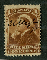
The 1c admiral stamp was issued in both sheet form and in three different coil perforations, as well as in booklet panes. In addition to the regular issue, a War Tax stamp was also issued in 1915, which incorporated the words "War Tax" right into the design. Unitrade lists six different shades of the sheet stamps, three of the perf. 8 vertical coil, and two of the perf. 12 horizontal coil. There are no shades listed on the War Tax Issue.
Unitrade's treatment of the shades is confusing for several reasons. The first is that they are not internally consistent between the sheet stamps, the coils, the booklets and the War Tax stamps. Each issue format appears to have been studied in complete isolation of all the others, instead of being studied together. Secondly, colloquial names have been used to describe the colours rather than a standard colour key like the Stanley Gibbons Colour Key.
What I will attempt to do in this post is to clear some of the confusion by showing you what I believe each major shade looks like. The only shade I do not have to show you right now is the grey green. I will add an example of this in a subsequent update when one becomes available. I will also cross reference the Unitrade names to Stanley Gibbons colour key names.
My basis for judging which shades are which in Unitrade is based mostly on my observation of the dates listed next to each shade group and an understanding that when Unitrade lists and prices a shade, what they are really doing is pricing a group of printings according to their relative scarcity. This means that other factors, like the paper, and the gum become just as important to correctly classifying the stamps in Unitrade as the actual colour. Another implication of this is that there is a range of shades within each of the listed groups. So I believe a collector, however well intentioned is incorrect in asserting that each listed shade is only one exact shade. You often hear a collector saying something to the effect of "yes that is a definitely bluish green, but its NOT the blue green" or something similar.
The Sheet Stamps
Unitrade lists the following six shade groups:

The war tax stamps are described as being "green", but as we shall see from the scan below, nearly all of these stamps fall into the same dark green shade group:


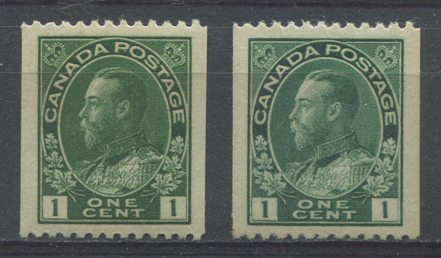
Dark Yellow Green Shades

Unitrade notes that this shade group is from 1920. Actually, I think it covers the period from 1920 until the colour was changed to orange yellow in 1922. The paper and gum should thus be consistent with other stamps of this period, which is to say that the gum is usually a shiny, smooth yellowish cream that sometimes has the appearance of having been "sponged on". Usually, but not always, the stamps will show no visible mesh. Sometimes there will be some stamps that have a fine vertical mesh that can be seen.
In terms of Gibbons colour key swatches:


The coil pair on the left is closest to dull green on the Gibbons colour key, while the one on the right is closest to deep green on the key.


The 1c admiral stamp was issued in both sheet form and in three different coil perforations, as well as in booklet panes. In addition to the regular issue, a War Tax stamp was also issued in 1915, which incorporated the words "War Tax" right into the design. Unitrade lists six different shades of the sheet stamps, three of the perf. 8 vertical coil, and two of the perf. 12 horizontal coil. There are no shades listed on the War Tax Issue.
Unitrade's treatment of the shades is confusing for several reasons. The first is that they are not internally consistent between the sheet stamps, the coils, the booklets and the War Tax stamps. Each issue format appears to have been studied in complete isolation of all the others, instead of being studied together. Secondly, colloquial names have been used to describe the colours rather than a standard colour key like the Stanley Gibbons Colour Key.
What I will attempt to do in this post is to clear some of the confusion by showing you what I believe each major shade looks like. The only shade I do not have to show you right now is the grey green. I will add an example of this in a subsequent update when one becomes available. I will also cross reference the Unitrade names to Stanley Gibbons colour key names.
My basis for judging which shades are which in Unitrade is based mostly on my observation of the dates listed next to each shade group and an understanding that when Unitrade lists and prices a shade, what they are really doing is pricing a group of printings according to their relative scarcity. This means that other factors, like the paper, and the gum become just as important to correctly classifying the stamps in Unitrade as the actual colour. Another implication of this is that there is a range of shades within each of the listed groups. So I believe a collector, however well intentioned is incorrect in asserting that each listed shade is only one exact shade. You often hear a collector saying something to the effect of "yes that is a definitely bluish green, but its NOT the blue green" or something similar.
The Sheet Stamps
Unitrade lists the following six shade groups:
- Dark green
- Blue green, 1911-1913
- Deep blue green, 1913-1914
- Yellow green, 1915-1919
- Dark yellow green, 1920
- Grey green, no date given
Dark Green shades

Unitrade indicates that this shade group is the original 1911 release, but I think that in reality, this shade group is meant to catch all the dark greens that are neither bluish, yellowish or greyish. So in a sense, it is a bit of a catch all group. One factor that I have considered in my allocation of stamps to this group is to consider the shades found on the War Tax stamp, and I would note that they generally match the shades in this group, and Unitrade describes the War Tax stamps as being simply "green".
In terms of Gibbons colour key classifications:
- The stamps on the left and in the centre match the deep green colour swatch most closely.
- The stamp on the right matches the myrtle green swatch most closely. This shade is the one most often seen on the War Tax stamps.
The war tax stamps are described as being "green", but as we shall see from the scan below, nearly all of these stamps fall into the same dark green shade group:

- The left stamp is closest to the deep green swatch.
- The second and fourth stamps are closest to the myrtle green swatch.
- The third stamp is closest to the myrtle green swatch if it were darker, so deep myrtle green.
Blue Green Shades

Unitrade notes that this shade group covers the period 1911-1913, two characteristics to look for are the paper and gum, which should be consistent with stamps printed during this period. Generally you should look for soft wove paper that shows either fine or coarse vertical mesh, and gum that is yellowish and clear, so that the mesh still shows. It should also be relatively shiny. If you are looking to find an actual match to the blue green swatch on Gibbons colour key, you are out of luck, as I have yet to see a truly blue green 1c admiral stamp:
- The left hand stamp is closest to what the dull blue green swatch would be if it were darker - so deep dull bluish green.
- The right hand stamp is closest to the deep dull green swatch.
Several printings of the booklet stamps with the squat printing, so Unitrade numbers 104ais, 104aiis, 104aiiis, 104aivs and 104avs fall into this shade group as well as the deep blue green group below.
Deep Blue Green Shades

Unitrade notes that this shade group covers the period from 1913 to 1914. Again, I would look for the same paper and gum characteristics as for the above blue green group. By now the gum becomes a bit less shiny, being more of a satin sheen, but it is still clear, and the paper still tends to show the vertical mesh. Basically these are the darkest possible greens of the series, with the booklet stamps showing a bit of grey in the green.
In terms of Gibbons colour key swatches:
- The stamp on the left is closest to the dull blue green swatch if it were made very, very dark. In other words very deep dull blue green.
- The stamp in the centre is closest to the bottle green swatch. The gum on this stamp is a clear creamy colour with a satin sheen.
- The stamp on the right is closest to the deep grey-green swatch.
Yellow Green Shades

Unitrade notes that this shade group covers the period from 1915 to 1919 - the entire wartime period. Therefore, the paper and gum characteristics should be consistent with the wartime and early post-war printings. The gum becomes shiny or satin, takes on more of a creamy colour and the paper mesh is not so visible as before. However, some stamps still do show a fine vertical mesh. Generally, these colours are actually closest to just plain green on the Gibbons colour key.
The regular, late printing booklet stamps, Unitrade number 104as and the pane 104a, which Unitrade describes as yellow green falls into this group.
Dark Yellow Green Shades

Unitrade notes that this shade group is from 1920. Actually, I think it covers the period from 1920 until the colour was changed to orange yellow in 1922. The paper and gum should thus be consistent with other stamps of this period, which is to say that the gum is usually a shiny, smooth yellowish cream that sometimes has the appearance of having been "sponged on". Usually, but not always, the stamps will show no visible mesh. Sometimes there will be some stamps that have a fine vertical mesh that can be seen.
In terms of Gibbons colour key swatches:
- The left and centre stamps are closest to the yellowish green swatch if it were made darker, i.e. dark yellowish green.
- The right hand stamp is closest to the dull yellowish green swatch if it were made darker
The Coil Stamps Perforated 8 Horizontally

This coil issue came out in 1913 and was experimental. So genuine examples of this coil stamp should be either in the blue green or deep blue green groups. The strip of three shown above is printed in a deep dull blue green. In other words it is closest to the dull blue green swatch, but is deeper.
The Coil Stamps Perforated 8 Vertically
This coil issue spanned the entire period from 1911 through to 1922, so the main shade groups should all be represented. Unitrade refers simply to green, blue green and yellow green. The following scans show examples from each group:

The coil pair on the left is closest to dull green on the Gibbons colour key, while the one on the right is closest to deep green on the key.

These are the first printings of these coils. Both the left coil pair and single are closest to dull bluish green if it were deeper.

These are among the last printings of these coils and the shade is almost identical to the deep yellowish green in the dark yellow green group above for the sheet stamps.
The Coil Stamps Perforated 12 Horizontally
This coil issue was also experimental, as it only covered the period from 1915 to 1924. Unitrade lists both dark green and blue green shades for this coil, and neither shade corresponds to those shades described as either dark green or blue green in the other listings as we shall see.

The left coil is closest to deep green on the Gibbons key and is the only true deep green in the series. The stamp on the right is what Unitrade calls "blue green" and is actually closest to the bottle green swatch on the Gibbons colour key, but is slightly lighter.
This concludes my discussion of the 1c green shades. On Monday, I will deal with the 1c orange yellow, which is a much more difficult stamp as the shade differences are so subtle. I hope my scanner will co-operate with me and show the differences clearly.
Have a good weekend everyone!
If you want to view the 1c green Admirals that I have for sale in my store right now, please do click on the following link:
http://stores.ebay.ca/Pristine-Canadian-Stamps/1c-green-/_i.html?_fsub=5230649013&_sid=1009259433&_trksid=p4634.c0.m322
If you want to view the 1c green Admirals that I have for sale in my store right now, please do click on the following link:
http://stores.ebay.ca/Pristine-Canadian-Stamps/1c-green-/_i.html?_fsub=5230649013&_sid=1009259433&_trksid=p4634.c0.m322

Comments
Post a Comment