Collecting the Definitives of Queen Elizabeth II 1953 to Date, Paper Fluorescence and Tagging
Overview and Main Point of Interest: Paper Fluorescence and Tagging
The definitives of the present reign provide an almost endless amount of possibilities for the collector who is wiling to take the time to study them. Many collectors find them intimidating because many of the types of varieties that occur on them are either invisible to the naked eye, or they require a great deal of patience and experience to identify. This stands in sharp contrast to the classic stamps of the Large and Small Queens or the Admirals. In the classic period, the types of varieties that collectors have sought out are all things that can readily be identified with a perforation gauge, and a watermark detector. Most collectors are used to seeking out profound and obvious colour differences, perforation changes and watermarks.
While the modern definitive issues do occasionally feature perforation changes, there are very few obvious shade differences and no watermarks. Because modern printing technology is so exact, shade differences, while they exist are much more subtle and are generally ignored by the Unitrade catalogue. I believe this to be a mistake, as a small difference in shade is actually quite significant for modern issues, given that modern technology allows for printings in the millions that result in colours that are exactly identical. Most of the interesting varieties require the use of a long-wave ultraviolet lamp to identify. The UV lamp detects and highlights differences in the chemical composition of inks and paper.
Much of this complexity has been either ignored by most collectors as being too complicated, or is perceived by many to be just meaningless random variation. However careful study of the stamps, combined with an understanding of what drove the experimentation in stamp production since the early 1960's will reveal that the variations in papers and tagging are anything but random. In the late 1950's most industrialized countries began to look for ways to automate the mail sorting and cancelling process. Each country utilized different equipment and had different means of making their stamps machine readable. The principal was the same though: they needed to make the stamp machine readable so that the sorting machines could orient the letter in the correct position, so that the cancelling device could cancel the stamps.
What follows is my theory about what drove the production of many modern paper and tagging varieties. It is just my opinion, but I think it makes sense. Initially, in the 1960's when Canada first introduced Winnipeg tagging, paper recycling was not yet a common practice. Paper was produced from native fibres that had not been subject to the bleaching processes that today's modern recycled papers are. The result was that paper generally did not react to UV light, and so the "signal or glow" coming from the tagging did not need to be strong. Winnipeg tagging was adequate for the job, although there is evidence that some experimentation was done in terms of how much taggant to apply to the stamps. As the late 1960's approached, paper mills began to use recycled fibres. The bleaching processes used to produce this paper resulted in paper that gave a fluorescent reaction under UV light. In many cases, the reaction was mild, being limited to a few flecks in the paper, representing the few fluorescent fibres in the paper. As more and more of the fibre was recycled, the density of these fibres increased, and you can see this pattern very clearly when you look at papers from the early 1960's to about the late 1980's. In some cases, the bleaching process was so strong that it resulted in Hibrite paper, giving a very strong bluish white glow.
This didn't work too well with Winnipeg tagging because the glow from the paper was as strong, or stronger than the tagging. Envelope papers at this time were also becoming fluorescent as more and more were being produced from recycled papers. So the facer cancelling machines couldn't see the stamps anymore. So in response the post office department came out with Ottawa Tagging, which glowed bright green, making it distinguishable from even the most bright fluorescent reaction. Initially, the Op-4 chemical compound used was unstable and it migrated through the stamps, losing its effectiveness. So the chemical composition was changed to the current OP-2 taggant that continues to be used to this day. Some of the issues in the past 20 years have been printed abroad in Australia where they use a bright yellow fluorescent coating that covers the full stamp. This is why some of the issues exist on fluorescent coated paper and most continue to use the OP-2 tagging.
As for paper fluorescence, there was another development that occurred starting in the 1970's that paralleled the development of tagging and that was the use of photogravure and lithography to print most issues as opposed to engraving, which was more costly and incapable of producing the range of colours that modern printing could. Lithography had been used successfully on a very limited basis for the 1965 Churchill Issue, the 1967 Woman's vote issue as well as a handful of the 1968-1971 commemorative issues. As these techniques were developed, the challenge that arose was finding a paper to which both the printing inks would adhere, and to which the cancellation ink would also adhere. I believe that this is what led to the emergence of chalk surfaced papers that were used for many of the modern issues. The increase in the use of recycled materials in paper-making meant that for a time in the early 1970's nearly all papers were highly fluorescent to hibrite, and that this was still making it difficult for the machines to see the tagging on the stamps. The application of chalk coating to the surface of the paper dulled the natural reaction of the paper from the front making the tagging easier to see and resulting in paper that gives a different UV reaction on the front and back. Starting in 1973 or so we begin to see the chalk-surfaced Abitibi-Price papers that were dull on the front and give varied reactions on the back depending on how much recycled content was in the paper. Careful studies of these papers will reveal that while there are a large number of variations, they are neither infinite nor random, and therefore worthy of being further studied and understood.
By the mid 1980's with the bankruptcy of Abitibi-Price, Canada post began to source papers from the United Kingdom and other suppliers. These are commonly known as Clark, Slater, Rolland, Harrison, Coated Papers, Fasson, Jac and Peterborough. Peterborough and Rolland are most like Abitibi Price in that one can find considerable variations in fluorescence. In contrast, Clark, Slater, Harrison and Coated Papers are almost always dead to dull in appearance under UV light. Fasson and Jac papers are always fluorescent.
So with this, I believe that the papers form an excellent basis for study of these issues. This can also be done with used stamps as long as one is careful to avoid using copies that have become contaminated by picking up the additives in the paper of the envelopes to which they were stuck. Generally, stamps that have a mottled reaction under UV are contaminated. Fluorescence is generally of uniform intensity across the entire stamp.
In addition to paper varieties, the modern period saw much experimentation in the production of stamp booklets. Prior to 1953 the only booklets available were 25c regular and chewing-gum booklets, so called due to their resembling a piece of Wrigley's gum. Starting in 1961 the post office began to experiment with ways to provide consumers with larger amounts of stamps for their convenience. They introduced cello-paqs which contained large panes of 25 in cellophane wrappers. These proved to be a failure because they got mashed up in people's purses and bags, and they didn't fit in wallets or pockets. Chewing gum booklets were discontinued in 1953. Booklets from 1953-1967 were, except for the Cello paqs largely like their predecessors in terms of layout. However, there are some interesting varieties to be found on the covers. Starting in 1968, the British American Bank Note Company produced the first Integral stamp booklets. These booklets had the panes glued into the cover rather than being stapled or stitched. The modern presses were also able to produce, for the first time, se-tenant combinations of different values. Thus we see booklets that combine 1c, 3c, 6c, 7c, and 8c stamps on the same pane.
Finally, the postage rates were complicated until 1972 when they were streamlined with the introduction of "All Up" airmail. So the lack of shade and paper varieties on issues prior to the 1967 Centennial Issue can be more than compensated for by the rich variety of covers that can be found. In addition the Cold War resulted in a large number of world events that affected the mail system. Collectors can seek out some very interesting pieces documenting these events, such as the 1956 Soviet invasion of Budapest, when mail service to Hungary was suspended for example. This period also eclipses all of the problems in the Middle East that have arisen since 1947, and one could trace the story of this region through the postal history of these issues.
The Issues Themselves to 2000


The 1c, 2c, 4c, and 5c exist with G overprints, as do the 10c and 20c. These later values can also be found with "Flying G" varieties and several misplaced G's can be found where they appear on the wrong part of the stamp relative to the normal position. Postal stationery can also be found with pre-stamped envelopes, postcards and wrappers.

There are fewer fluorescent papers on this issue than in the previous one. Shades on values other than the 3c and 5c are scant. However, the 3c purple exhibits a very large range of shades, which have not, as far as I know been studied specifically. There were up to 5 plates used to print most values, so there are a respectable number of plate blocks possible with this issue.
Where this issue really shines though is in the tagging varieties that can be collected. All values exist with 2 bar tagging down the sides and can be found in a variety of intensities, which suggests that experiments were conducted to determine the optimal amount of taggant to apply. Generally the earlier ones are darker than the later printings. Also the 4c can be found with 1 bar tagging down one side and with bars of different widths, as well as two different types of centre bars (4mm and 8mm).
Cello-paqs continue into this issue with the 2c, 4c and 5c, as well as a 5c tagged pane. Different types of cellophane wrappers can be collected, with printings made close to 1967 having the Centennial Emblem on them. Booklets can be found with Centennial and regular covers. Finally, this is the last issue to exist with G overprints. The 1c, 2c, 4c and 5c can be found with this overprint, and are scarce in used condition, as official stamps were discontinued in 1963, just after this set was introduced. Postal stationery can also be found with pre-stamped envelopes, postcards and wrappers.


This is another issue where more and more varieties are beginning to emerge as more people study it. There is a fair range of fluorescent paper varieties, though not as many as the prior issue. There seems to be some variation in the shades on many of the stamps, although subtle. The $2 was current when Abitibi-Price went bankrupt, and printings of this stamp can be found on both Clark and Harrison papers.
One interesting constant tagging flaw that has been found on these issues is the hook tag flaw. It is a large smudge in the shape of a hook and is found on the low values to the 15c.
50c booklets continue with the 10 different designs. But also, this issue introduces booklets of 25 of the 14c and 17c Queen. These booklets were produced with 5 different cover designs as well. Finally, all the booklets can be found with the tagging omitted, which are all scarce to rare.


The definitives of the present reign provide an almost endless amount of possibilities for the collector who is wiling to take the time to study them. Many collectors find them intimidating because many of the types of varieties that occur on them are either invisible to the naked eye, or they require a great deal of patience and experience to identify. This stands in sharp contrast to the classic stamps of the Large and Small Queens or the Admirals. In the classic period, the types of varieties that collectors have sought out are all things that can readily be identified with a perforation gauge, and a watermark detector. Most collectors are used to seeking out profound and obvious colour differences, perforation changes and watermarks.
While the modern definitive issues do occasionally feature perforation changes, there are very few obvious shade differences and no watermarks. Because modern printing technology is so exact, shade differences, while they exist are much more subtle and are generally ignored by the Unitrade catalogue. I believe this to be a mistake, as a small difference in shade is actually quite significant for modern issues, given that modern technology allows for printings in the millions that result in colours that are exactly identical. Most of the interesting varieties require the use of a long-wave ultraviolet lamp to identify. The UV lamp detects and highlights differences in the chemical composition of inks and paper.
Much of this complexity has been either ignored by most collectors as being too complicated, or is perceived by many to be just meaningless random variation. However careful study of the stamps, combined with an understanding of what drove the experimentation in stamp production since the early 1960's will reveal that the variations in papers and tagging are anything but random. In the late 1950's most industrialized countries began to look for ways to automate the mail sorting and cancelling process. Each country utilized different equipment and had different means of making their stamps machine readable. The principal was the same though: they needed to make the stamp machine readable so that the sorting machines could orient the letter in the correct position, so that the cancelling device could cancel the stamps.
What follows is my theory about what drove the production of many modern paper and tagging varieties. It is just my opinion, but I think it makes sense. Initially, in the 1960's when Canada first introduced Winnipeg tagging, paper recycling was not yet a common practice. Paper was produced from native fibres that had not been subject to the bleaching processes that today's modern recycled papers are. The result was that paper generally did not react to UV light, and so the "signal or glow" coming from the tagging did not need to be strong. Winnipeg tagging was adequate for the job, although there is evidence that some experimentation was done in terms of how much taggant to apply to the stamps. As the late 1960's approached, paper mills began to use recycled fibres. The bleaching processes used to produce this paper resulted in paper that gave a fluorescent reaction under UV light. In many cases, the reaction was mild, being limited to a few flecks in the paper, representing the few fluorescent fibres in the paper. As more and more of the fibre was recycled, the density of these fibres increased, and you can see this pattern very clearly when you look at papers from the early 1960's to about the late 1980's. In some cases, the bleaching process was so strong that it resulted in Hibrite paper, giving a very strong bluish white glow.
This didn't work too well with Winnipeg tagging because the glow from the paper was as strong, or stronger than the tagging. Envelope papers at this time were also becoming fluorescent as more and more were being produced from recycled papers. So the facer cancelling machines couldn't see the stamps anymore. So in response the post office department came out with Ottawa Tagging, which glowed bright green, making it distinguishable from even the most bright fluorescent reaction. Initially, the Op-4 chemical compound used was unstable and it migrated through the stamps, losing its effectiveness. So the chemical composition was changed to the current OP-2 taggant that continues to be used to this day. Some of the issues in the past 20 years have been printed abroad in Australia where they use a bright yellow fluorescent coating that covers the full stamp. This is why some of the issues exist on fluorescent coated paper and most continue to use the OP-2 tagging.
As for paper fluorescence, there was another development that occurred starting in the 1970's that paralleled the development of tagging and that was the use of photogravure and lithography to print most issues as opposed to engraving, which was more costly and incapable of producing the range of colours that modern printing could. Lithography had been used successfully on a very limited basis for the 1965 Churchill Issue, the 1967 Woman's vote issue as well as a handful of the 1968-1971 commemorative issues. As these techniques were developed, the challenge that arose was finding a paper to which both the printing inks would adhere, and to which the cancellation ink would also adhere. I believe that this is what led to the emergence of chalk surfaced papers that were used for many of the modern issues. The increase in the use of recycled materials in paper-making meant that for a time in the early 1970's nearly all papers were highly fluorescent to hibrite, and that this was still making it difficult for the machines to see the tagging on the stamps. The application of chalk coating to the surface of the paper dulled the natural reaction of the paper from the front making the tagging easier to see and resulting in paper that gives a different UV reaction on the front and back. Starting in 1973 or so we begin to see the chalk-surfaced Abitibi-Price papers that were dull on the front and give varied reactions on the back depending on how much recycled content was in the paper. Careful studies of these papers will reveal that while there are a large number of variations, they are neither infinite nor random, and therefore worthy of being further studied and understood.
By the mid 1980's with the bankruptcy of Abitibi-Price, Canada post began to source papers from the United Kingdom and other suppliers. These are commonly known as Clark, Slater, Rolland, Harrison, Coated Papers, Fasson, Jac and Peterborough. Peterborough and Rolland are most like Abitibi Price in that one can find considerable variations in fluorescence. In contrast, Clark, Slater, Harrison and Coated Papers are almost always dead to dull in appearance under UV light. Fasson and Jac papers are always fluorescent.
So with this, I believe that the papers form an excellent basis for study of these issues. This can also be done with used stamps as long as one is careful to avoid using copies that have become contaminated by picking up the additives in the paper of the envelopes to which they were stuck. Generally, stamps that have a mottled reaction under UV are contaminated. Fluorescence is generally of uniform intensity across the entire stamp.
In addition to paper varieties, the modern period saw much experimentation in the production of stamp booklets. Prior to 1953 the only booklets available were 25c regular and chewing-gum booklets, so called due to their resembling a piece of Wrigley's gum. Starting in 1961 the post office began to experiment with ways to provide consumers with larger amounts of stamps for their convenience. They introduced cello-paqs which contained large panes of 25 in cellophane wrappers. These proved to be a failure because they got mashed up in people's purses and bags, and they didn't fit in wallets or pockets. Chewing gum booklets were discontinued in 1953. Booklets from 1953-1967 were, except for the Cello paqs largely like their predecessors in terms of layout. However, there are some interesting varieties to be found on the covers. Starting in 1968, the British American Bank Note Company produced the first Integral stamp booklets. These booklets had the panes glued into the cover rather than being stapled or stitched. The modern presses were also able to produce, for the first time, se-tenant combinations of different values. Thus we see booklets that combine 1c, 3c, 6c, 7c, and 8c stamps on the same pane.
Finally, the postage rates were complicated until 1972 when they were streamlined with the introduction of "All Up" airmail. So the lack of shade and paper varieties on issues prior to the 1967 Centennial Issue can be more than compensated for by the rich variety of covers that can be found. In addition the Cold War resulted in a large number of world events that affected the mail system. Collectors can seek out some very interesting pieces documenting these events, such as the 1956 Soviet invasion of Budapest, when mail service to Hungary was suspended for example. This period also eclipses all of the problems in the Middle East that have arisen since 1947, and one could trace the story of this region through the postal history of these issues.
The Issues Themselves to 2000

The first issue of the present reign is nicknamed the "Karsh"issue, after the famous photographer Yousuf Karsh, who took the above portrait of the young Queen. This series consisted of 1c, 2c, 3c, 4c and 5c stamps of the above design, as well as a 7c, Canada Goose, a 20c Pulp and Paper Industry design, a 50c Textile Industry design and a $1 totem pole design. The 1c-5c values were replaced in 1954 by the stamps of the next series, but the 20c remained in use until 1956, the 7c and $1 until 1963 and finally the 50c until 1967.
There are a few subtle shade differences in the low values, most notably the 3c, 4c and 5c. and there are clear paper varieties discernible on the 7c and 50c values. The high fluorescent paper on the 50c is a rare and sought after stamp. Finally, up to 5 plates were used to print most values, so a specialist can go after a fairly substantial number of plate blocks that they can arrange into matched sets of 4 - one from each corner of the sheet.
All the values of this set exist with the official G overprint for official use. The 50c exists with a "Flying G" variety and a rare "Fishhook G". Postal stationery can also be found with pre-stamped envelopes, postcards and wrappers.

The next issue is nicknamed the "Wilding" issue, after the photographer Dorothy Wilding, who took the above portrait of the Queen. This series consisted of a 1c, 2c, 3c, 4c, 5c,and 6c of the above design, as well as a 10c Inuk and Kayak design, a 15c Gannet design, a 20c Paper Industry design, and a 25c Chemical Industry design. The low values to 6c and the 15c were replaced in late 1962 and early 1963 by the stamps of the next issue, but the higher values remained in use until they were replaced in 1967 by the Centennial Issue Group of Seven designs.
This issue was the first to feature Winnipeg tagging and a number of varieties can be found. Up to 20 different plates were used to print the stamps, so a very large number of plate blocks can be collected. In addition, this is the first issue on which we begin to see fluorescent varieties, although it should be noted that what the Unitrade Catalogue calls highbrite is much less bright than what it calls highbrite on later issues. There are also a few rare imperf varieties and gutter pairs that exist for this issue, so there are still some challenging items that will require patience to acquire. This is the first issue to feature Cello-paqs of the 2c and 5c stamps and also the first in which all the booklets had only bilingual covers. The early printings of these stamps were on horizontal wove paper and later, the orientation of the printing plates was changed so that all later printings after about 1960 are on vertical wove paper.
The 1c, 2c, 4c, and 5c exist with G overprints, as do the 10c and 20c. These later values can also be found with "Flying G" varieties and several misplaced G's can be found where they appear on the wrong part of the stamp relative to the normal position. Postal stationery can also be found with pre-stamped envelopes, postcards and wrappers.

This next issue is nicknamed the "Cameo" issue, due to the very simple nature of the designs. The low values consisted of a 1c, 2c, 3c, 4c and 5c, each depicting a different symbol in the upper left corner for different natural resources: minerals, wood, fish, electricity and wheat. There were also 7c and 8c airmail stamps, a 15c Canada Geese design and a $1 Exports design. All of these stamps were replaced in 1967 by the Centennial Issue below.
There are fewer fluorescent papers on this issue than in the previous one. Shades on values other than the 3c and 5c are scant. However, the 3c purple exhibits a very large range of shades, which have not, as far as I know been studied specifically. There were up to 5 plates used to print most values, so there are a respectable number of plate blocks possible with this issue.
Where this issue really shines though is in the tagging varieties that can be collected. All values exist with 2 bar tagging down the sides and can be found in a variety of intensities, which suggests that experiments were conducted to determine the optimal amount of taggant to apply. Generally the earlier ones are darker than the later printings. Also the 4c can be found with 1 bar tagging down one side and with bars of different widths, as well as two different types of centre bars (4mm and 8mm).
Cello-paqs continue into this issue with the 2c, 4c and 5c, as well as a 5c tagged pane. Different types of cellophane wrappers can be collected, with printings made close to 1967 having the Centennial Emblem on them. Booklets can be found with Centennial and regular covers. Finally, this is the last issue to exist with G overprints. The 1c, 2c, 4c and 5c can be found with this overprint, and are scarce in used condition, as official stamps were discontinued in 1963, just after this set was introduced. Postal stationery can also be found with pre-stamped envelopes, postcards and wrappers.

This issue is one of the most popular among collectors due to its complexity. It is called the Centennial Issue due to the fact that it was first issued in Canada's Centennial year, on February 8, 1967. The set consisted of 1c, 2c, 3c, 4c, 5c, 6c, 7c and 8c values depicting the Queen on the right and a different scene from Canada on the left. There were also a series of designs reproducing famous paintings by the Group of Seven. These were the 8c, 10c, 15c, 20c, 25c, 50c and $1 values. The 10c above is the famous "Jack Pine" by Tom Thompson. The higher values were replaced in late 1972 by the stamps of the next series and the low values in 1973.
The number of plates found on this issue is similar to the Cameo issue, but the number of possible paper varieties makes the number of collectible blocks the largest of any issue before it. In addition, shade varieties can be found on all the values, although they are subtle. Gum varieties can be collected with many values being found with both dextrine and PVA gum. Tagging on this issue consists of the Winnipeg 2-bar tagging on all values and then Winnipeg Centre Bar on the 1c, 2c, 4c, 5c and 6c black. General Ottawa tagging can be found on all values except the 5c blue, 6c orange, 7c green, 8c violet brown, 25c slate green, 50c brown orange and $1 carmine.
This is the last issue to feature cello-paqs on the 4c and 5c values and the last issue to feature stapled booklets on the 1c & 4c and the 5c. Integral booklets are introduced in 1968 and there are many, many varieties of booklets that can be collected. On the 25c and 50c booklets starting in 1972, they are issued with 10 different cover designs, increasing the number of possible collectible varieties tenfold. Miscutting varieties and hibrite papers have resulted in two modern rarities being found among the booklets of this issue.
This was the first issue to introduce coil stamps in rolls of 100, down from the traditional roll of 500. As with all the earlier issues, spacing varieties and jumps can be found. But the coils of this issue can also be found in imperforate form. All of these varieties are very rare.
The postal stationery of this issue provides a very complex are of study because in addition to the usual range of envelopes and post cards, there were a number of surcharges, precancels and private order envelopes that are very rare today, especially used.

This series is nicknamed the "Caricature and Landscape" issue due to the fact that the low values consisted of sketches of former Prime Ministers and the Queen, while the high values depicted various Canadian landscapes. The low values consisted of a 1c John A Macdonald, 2c Laurier, 3c Borden, 4c Mackenzie King, 5c Bennett, 6c Pearson, 7c St. Laurent, and 8c & 10c Queen. The higher values comprised a 10c Forrest, 15c Mountain sheep, 20c Prairies,25c Polar bears, 50c Seashore, $1 Vancouver as shown above and $2 Quebec City. The low values were replaced in 1977 by the next issue and the higher values were replaced between 1977 and 1979. This was the issue that sparked my interest in stamps.
When I was a kid, the catalogues recognized very few varieties in this issue, the only ones being the perforation changes on the mid and $1 values, the type 1 and type 2 differences on the 10c, 15c, 25c and 50c, and the Winnipeg 2-bar tags on the 10c-25c values. However, in recent years, more and more tagging and paper varieties have been discovered, to the point that this issue now rivals the Centennial Issue for its complexity. In addition because its popularity was overshadowed by the Centennials for so long, very little attention was paid to collecting the blank field stock blocks with the result that many off the better paper varieties, which do not exist in plate block form are very scarce and expensive in block form.
The low values are mostly found on a smooth paper giving a low fluorescent reaction, but a number of different types can be found from dead to hibrite. In addition, a distinct horizontal ribbed paper can be found on most values. On the mid values from 10c to 50c, the chalky paper can be found giving a number of different fluorescent reactions on both the front and back of the stamp, but in addition, the texture of the surfacing can vary from smooth, to horizontal ribbed to vertical ribbed. Vertical ribbed is the common type, with some of the smooth papers and horizontal ribbed papers being very scarce on the plate 1 printings. There were up to 3 plates used for these stamps, plate 3 always being the later perf. In some instances, plate 2 was not used, or is thought to not exist. So it would be of great interest if a collector could discover a plate 2 of the 20c and the 25c.
These issues can be found with misplaced tagging in the form of single bars where there should be two as well as missing tagging.
Booklets continue to feature the 10 different cover designs and printing problems resulted in many collectible varieties of both the 25c and 50c booklets. Most of these booklets can be found with the tagging missing, which are all very scarce. This is the last issue to have 25c booklets. Postal stationery is less interesting, with a small range of postcards and stamped envelopes, though you could always look for uprated items to foreign destinations other than the US and UK.
This issue is known as the "Floral" issue, due to the fact that most all the values up to the 35c depict various trees and wildflowers. There were also designs issued for the first class rates in the form of a bas relief of the Queen and another for the parliament buildings. There were two rate increases during the life of this issue, so there are three denominations of each of these designs. The 50c, 60c, 75c and 80c values depict various street scenes in Canada, while the $1 and $2 values depict Fundy and Kluane national parks. The floral, parliament and street scene designs were replaced in 1982 by the next series. The bas relief Queen design would continue to be used until 1987 and the national park theme would be continued into the next issue with additional higher denominations being introduced.
This is another issue where more and more varieties are beginning to emerge as more people study it. There is a fair range of fluorescent paper varieties, though not as many as the prior issue. There seems to be some variation in the shades on many of the stamps, although subtle. The $2 was current when Abitibi-Price went bankrupt, and printings of this stamp can be found on both Clark and Harrison papers.
One interesting constant tagging flaw that has been found on these issues is the hook tag flaw. It is a large smudge in the shape of a hook and is found on the low values to the 15c.
50c booklets continue with the 10 different designs. But also, this issue introduces booklets of 25 of the 14c and 17c Queen. These booklets were produced with 5 different cover designs as well. Finally, all the booklets can be found with the tagging omitted, which are all scarce to rare.

This issue is known as the "Artifacts and National Parks" issue. The values below the $1 each depicted a different household object from Canada's pioneer days, while the $1, $1.50, $2, and $5 values depicted Glacier, Waterton Lakes, Banff , Point Pelee and La Maurice national parks. The first class rates utilized the bas relief Queen design, a maple leaf design and a different rendition of the parliament buildings. There were four general rate increases during the life of this series, so there are several of each of these designs. This was the first series to feature a $5 denomination. These stamps were all replaced in 1988 and 1989 by the Wildlife and Architecture series shown below.
The low values were printed by both Ashton Potter and the Canadian Bank Note company and different perforations were used. With the bankruptcy of Abitibi-Price, we start to see the introduction of Harrison and Clark papers. The result is that there are many collectible varieties of these stamps rivaling the Caricature issue in terms of complexity. The mid-range values are less complex, but there are still a number of paper varieties to be found on these.
The first class maple leaf and parliament stamps are a complicated area, with both Ashton Potter and CBN printings, as well as Abitibi-Price, Clark and Harrison papers to be found on these. The 50c booklets continue to be produced on this issue in 10 different cover designs, through five different first class rates. On the 30c and 32c, the design is a maple leaf and on the 34c, 36c, 37c the basic design is the parliament buildings. The booklets of 25 remained popular and continued to be produced as well. These booklets of 25 were produced for the 30c, 32c, 34c, 36c and 37c. Starting with the 36c, we see the introduction of booklets of 10.

This series that appeared in 1988 is known as the "Wildlife and Architecture" issue. It includes a number of very rare and desirable varieties that are eagerly sought out by collectors. The values to the $1 depict various wildlife, while the $1, $2 and $5 depict Runnymede Library, McAdam Railway Station and Bonsecours Market. The first class rates continued to utilize the parliament design and introduced a new full face portrait of the Queen, as well as a new Flag design. There were three general rate increases during the life of this set. This series featured Canada's first Quick stick stamps and was the last series to have 50c vending machine booklets. It was gradually replaced between 1991 and 1996 by the next series.
This series has very few fluorescent varieties, but lots of perforation changes and different papers - Slater, Rolland, Harrison, Peterborough and Coated Papers. Some of these like the 74c Wapiti on Rolland paper are rarities worth several hundreds of dollars. Most of the better varieties are found only on the field stock printings, so there are no plate blocks - only blank blocks like the one shown above.
On the high values there were some re-prints that show small differences in the designs and again these are scarce and sought after.
There are a large number of imperforate and partially imperforate errors to be found on this issue and all of them are rare and worth a lot of money.
Booklets form a complicated area because this was the first issue to feature booklets of the first class definitives for USA and international rates. These were generally panes of 5. The first class stamps continued to be issued in the booklets of 25 and 10. Because there were four rates in effect during the life of this issue it means that there are four times as many possible booklets as with the prior issues. Also there are differences to be found in the text on the booklet covers that can be collected. This is the last issue to have 50c booklets. There are five basic booklets to be found, one being a scarce perforation variety. The Quick Stick flag stamps mentioned above were issued in booklets of 12.

This series, which first appeared in 1991 is called the "Fruit and Flag" issue. The values up to the 25c depict various edible berries, while the mid values below $1 depict various fruit trees. The first class rates were covered by the Queen and flag designs and Quick sticks were continued in this series but were phased out in 1993 and would not appear again until 1995 with the Greetings stamps. The high values continued the architecture theme with $1, $2 and $5 depicting the Yorkton Courthouse, Provincial Normal School and the Public Library in Victoria BC. There were three general rate increases during the life of this series. The stamps of this series were gradually replaced between 1997 and 1999 by the next series.
On the low values, both Ashton Potter and CBN printed them and used both Harrison paper and Coated papers, so an number of different printings can be found for each value. In addition, many constant plate flaws can be found on all the values.
In addition to the panes of 10 and 25 for the first class local stamps we see the brief appearance of a booklet of 50, which only appears in this issue. The USA and international stamps continue to be produced in booklets of 5 but now there is an added twist. The philatelic booklets have a flap that closes with a small flap and are unsealed at the open end. Field stock booklets are glued shut, which makes for 2 different collectible types of each and every booklet from this point on. Like the prior issue, there were four rates in affect during its life, so lots of booklets to collect.
There aren't really any shades to speak of, but there are a few fluorescent papers to be found and lots of perforation changes, some of which are very scarce.
Finally there are lots of very rare imperforate varieties on this issue, particularly on the $1 and $2, which are also known with inverted inscriptions.
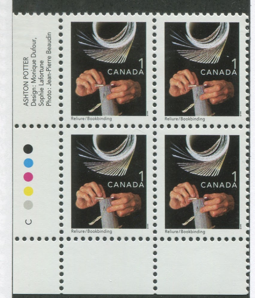
This is the last series that I have material for at the moment. But it is also the last series to feature a completely new set of designs to the new $10 Whale design. All the stamps issued since this series are variations of the first class stamps for local, US and international rates, as well as a new series of low values for beneficial insects. This set is known as the "Trades and Wildlife" issue, as the low values feature various skilled trades. A new stylized maple leaf design features into the mid-range values for US and international first class mail, while the dollar values return to the wildlife theme, this time utilizing really exquisite engravings. There is $1 loon, $1 White Tailed Deer, $1 Atlantic Walrus, $2 Polar Bear, $2 Peregrine Falcon, $2 Sable Island Horse, $5 Moose, $8 Grizzly Bear and $10 Blue Whale. There have been multiple rate increases during the life of this issue. The low values up to 25c started to be replaced in 2007, but the high values are still in use to this day.
I must confess that I know very little about these stamps as my in-depth knowledge doesn't go this recent. But I can see that there are several printings of the low values, and several fluorescent paper varieties possible on the dollar values.
Booklets continue to be the same format as before with panes of 10 for the first class local stamps and the introduction of panes of 30 instead of 25. International and US rate stamps continue to be produced in booklets of 5.
There are a few imperforate varieties to be found on these, although many less than the prior issue. The $5 moose is known with the centre (i.e. the moose) completely missing.
There you have my roundup of the Elizabethan definitives to 2000. If there is anything I have missed, please do let me know and I will incorporate it into future updates. I will be doing in-depth posts on each of these issues as I work on them. This post is intended to be a broad brushstrokes overview of the issues.

Comments
Post a Comment