Posts

Showing posts from March, 2016

Shades Of The 3c Carmine Admiral Stamp 1923-1928

Image
Overview This stamp is perhaps the simplest of the Admiral issues in terms of shades, with Unitrade listing only two shades of the sheet stamps: carmine and rose-carmine, and just carmine for the coil stamps. However, in reality, there are quite a large number of extremely subtle shades, none of which, in my opinion are carmine, as we shall see. The closest this stamp comes to carmine in my opinion is a carmine-red shade. These subtle shades may be difficult to differentiate in the scans, but I think if you look at the scans long enough, you will begin to see the differences. I do not, at the moment, have an example of Unitrade's rose-carmine shade, but will add an example when one becomes available. I will start with the sheet stamps, then will show the 1926 surcharges, the imperforates, and then will conclude with the coils. I will show you the different shades and then cross reference them to the Stanley Gibbons Colour Key. The Sheet Stamp Carmine Shades The abo

The Shades Of The 3c Brown Admiral Stamp And The 2+1c War Tax Stamp 1916-1918

Image
Overview Unitrade's treatment of shades on this stamp is practically non-existent, with only three shades being listed for the sheet stamps: brown, yellow-brown and dark brown. For the coil stamps and the War Tax stamps there are only two listed shades: brown and yellow brown. In reality this stamp has at least as many shades as most other stamps in the set, and although there is some overlap, the shades found on the War Tax stamp, which was issued over a year earlier, are completely different from those found on the regular issue postage stamps. In addition, as we shall see, the Unitrade listed brown shade on the wet printings, is different from the shade found on the dry printings, even though Unitrade calls both "brown" Yellow-brown is another shade name bandied about quite a lot in Canadian philately and while these browns do contain a hint of yellow, many do not match the yellow-brown swatch in the Gibbons Colour Key. This issue is no exception, with no stamp

The Shades Of The 2c Green Admiral Stamp 1922-1928

Image
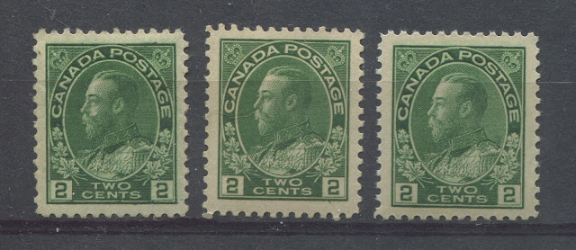
Overview This stamp, which replaced the 2c green in 1922 is tricky because of the fact that many of the listed shade groups are very similar to one another, and classifying individual stamps can be very tricky. Like the 2c carmine before it, most of the listed shade groups do not carry any real premium in price, so many collectors do not bother trying to identify them. However, identifying these shades can aid in identifying fake coils as well as spotting better varieties at a glance, like the rare wet printing of the part-perforate 8 vertical coil. Unitrade lists three major shade groups for the sheet stamps: yellow green, green and deep green. All three of these, except for the deep green are listed for both the wet printings and the dry printings. As we shall see though, there are very slight differences between the shades for each printing, so I will show them both here. As with my previous posts, I will show you the Unitrade group as it is named for each shade and then I will

Shades Of The 2c Carmine Admiral Stamp of 1911-1922

Image
Overview Of all the stamps in the 1911-1928 Admiral Issue, this stamp is the most complicated in terms of the number of shades that can be found. Unitrade makes some attempt to list the broader shade groups. However, as with all carmine or dark red stamps issued before and during World War I from just about any country you care to name, there are a tremendous number of shades. The main reason why there are so many has to do with the fact that the Commonwealth countries relied on Germany for their supply of red dies. When the war broke out in 1914, these supplies were interrupted and the printers were forced to improvise and find alternate sources of dyes. It was this improvisation that led to the largest range of shade varieties in philatelic history. Unitrade uses the general colour name, "carmine" very loosely to describe just about all the dark red stamps that Canada has issued over the years. However, in actual fact, there are very few stamps that are actually truly c

Shades Of The 1c Yellow Admiral Stamp 1922-1928

Image
Overview Of all the stamps in the series, this one is probably the most difficult to identify in individual stamps due largely in part to how similar the shades seem to be. Of course, once you become fully familiar with them it should be much easier for you to identify individual stamps, or to sort through large piles of used stamps. There are three basic shade families: Yellow-orange, which are common Orange-yellow, which are also common, and Lemon yellow, which are scarce. All of these shade groups are found on both the sheet stamps and in the coils, though the specific shades found will depend on whether you are dealing with a dry printing or wet printing. The booklet panes of 4 seem to be found mostly in the lemon-yellow shade group, whereas the panes of 6 tend to hail from the yellow-orange or orange-yellow shade families.  So this becomes the starting point for identification: to determine to which basic shade group your stamp belongs. Once you have classified th

The Shades Of The 1c Green Admiral Stamp of 1911-1922

Image
Overview The 1c admiral stamp was issued in both sheet form and in three different coil perforations, as well as in booklet panes. In addition to the regular issue, a War Tax stamp was also issued in 1915, which incorporated the words "War Tax" right into the design. Unitrade lists six different shades of the sheet stamps, three of the perf. 8 vertical coil, and two of the perf. 12 horizontal coil. There are no shades listed on the War Tax Issue. Unitrade's treatment of the shades is confusing for several reasons. The first is that they are not internally consistent between the sheet stamps, the coils, the booklets and the War Tax stamps. Each issue format appears to have been studied in complete isolation of all the others, instead of being studied together.  Secondly, colloquial names have been used to describe the colours rather than a standard colour key like the Stanley Gibbons Colour Key. What I will attempt to do in this post is to clear some of the confusion