The Large Queen Issue of 1868-1876
Background
Following Confederation it became necessary to prepare a new issue of stamps which would replace the issues of The Province of Canada, New Brunswick and Nova Scotia. British Columbia would continue to use its own stamps until it joined Confederation in 1871, and of course Newfoundland would join in 1949.The contract to print the stamps went to the British American Bank Note Company of Montreal and Ottawa. The basic design for all the values in the series was the young Queen Victoria facing right, which was based on the famous engraving by Charles Henry Jeens. The actual engraving of the portrait was the work of Alfred Jones, while the frames and lettering were engraved by Henry Earle Sr. The frames varied slightly on each denomination, but consisted of beautifully ornate scrolls in the corners and foliate ornaments within which were the words "Canada Postage" and then the demination expressed in both words and numerals.
There were nine basic demoninations and colours in this series as follows:


The ornate, uniform designs and beautiful colours have made this series one of the most popular with collectors of Canada. After seeing the pictures above, it is not hard to understand why.
Postage Rates, Usages and Quantities Issued
The postage rates at the time were complicated, and each value issued in the series served to pay one or more rates as follows:
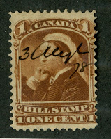
The 1/2 cent was used to pay the rate on periodicals, such as newspapers. It is extremely rare thusas most of the time it wound up being used to pay the regular letter rates, being used in pairs, blocks and strips. It is the fourth most common value in the series, with approximately 6.7 million issued between 1868 and 1882.
The 1 cent red brown and 1c deep orange were used to pay the drop letter rate per 1/2 ounce. A drop letter was a letter dropped off at a post office for delivery at the same office. It was therefore cheaper than a regular letter since there was no need to have a mail carrier deliver the letter. Initially, until January 1869, the colour was red brown, and then in January 1869 it was changed to orange, the reason most likely being the similarity between the red brown colour of the 1c and red colour of the 3c stamps. One has to remember that these were handled by oil lamplight at the time of issue, or candlelight, so they would be difficult to distinguish from one another. These are the third scarcest stamps in the set, both having been issued in quantities of 4.61 and 4.99 million respectively.
The 2c green paid either the registration fee for local letters, the rate for transient newspapers, or double the drop letter rate. Occasionally, it can be found used in larger multiples to make up the higher postage rates, and in these instances would be rare. This value is the second most common of the stamps in the series with 10.3 million stamps being issued.
The 3c red was the common stamp of the series, with just over 22 million printed. It was used to pay the rate for domestic letters, which was 3c per 1/2 ounce.
The 5c olive green was a latecomer in the series, being issued in October 1875. It is the scarcest regular issue of the set because of how short-lived it was: 5 months it was in use before being replaced on February 1, 1876 by the smaller design. It was issued to pay the new 5c rate on letters to the UK. Unitrade does not give the printing figures for this stamp, but it is likely to have been under 1 million stamps.
The 6c brown paid the rate to the USA and the Red River Colony (what is now Manitoba), or it could be used with a pair of 2c stamps to pay the 10c rate to British Columbia and Vancouver Island. It is the third most common of the stamps in the set, with 9.4 million being issued before being replaced by the 6c Small Queen in January 1872.
The 12.5c blue paid the rate to Newfoundland and the UK via Newfoundland. It is the second scarcest value in the series, with only 1.94 million printed. It is curious then, that it has the same catalgue value as many of the more common stamps in the series like the 1c, 2c and 6c. It should be catalogued much higher than these stamps, but for some reason it isn't.
Finally, the 15c initially paid the rate to the UK via New York. It is the longest running stamp in the series, being used until just after 1900. Initialy, it was issued in a red-lilac and grey violet colour, and in this state, it it the third scarcest value in the set with 2,37 million issued. By the early 1870's the basic colour was changed to grey and slate, and there were many more millions issued. Of course, as the postage rates evolved, the intended use of this stamp changed until it was basically used for insured registered letters and parcels by the late 1880's.
Condition and Availability
If you are a perfectionist and insist on flawless quality and perfect centering, then unless you have very deep pockets and a ton of patience, this is probably not the set for you. The quality you see in the above scans represents select quality found by going through many dozens of stamps. The 15c stamp shown in particular is literally a one in a thousand example, with huge margins and post office fresh colour.
The papers used to print the stamps of this issue is fragile and had a tendency to crease easily, tear easily and is also susceptible to thinning from hinge removal - even if you are being careful. For this reason, I wouldn't recommend ever removing a dry hinge - I would soak the stamp, which of course means that for a stamp with gum, I wouldn't even attempt to remove a hinge remnant. In addition, the perforations are fragile and stamps with one or a few short or missing perf tips are common. The cancels also tended to be heavy barred grid duplexes, which were designed to completely deface the designs. Later, cork cancellations became popular, as well as two-ring numerals and these too tend to be quite heavy. Finally, centering on this issue is very poor. Margins between stamps on the plates were small and the perforations often touch or cut into the design on at least one side.
The upshot of all this is that when you grade the stamps properly, taking all the relevant factors into account, the normal quality for this issue is either VG (between 55 and 65 on my 100 point scale) or G (between 45 and 54). I would say that F (65-74) is uncommon and VF or above (75 and up) is scarce to rare. Below are some illustrations of the quality more commonly found on these:


For a detailed explanation of my grading system, please click on the following links, which will take you to my store pages where I discuss grading:
Now what you will notice, if you peruse many listings online of these stamps and auction catalogues is that most sellers over-grade their stamps. The demand by most collectors for VF has created a sort of "grade inflation" if you will, where minor, but nonetheless faults, such as short perforations, heavy cancels and small creases or tears are being completely ignored, with just about any well centered stamp being described as VF. All of this would be alleviated of course if collectors would simply accept the fact that F or VF quality is scarce on this issue, and is simply not available to every philatelist who wants to collect these stamps. I would close by saying that if you intend to specialize in this issue, you will probably find that you have just as much fun studying VG examples as VF examples.
Very few of the Large Queens are found with original gum. The only values that seem to appear with any regularity are the 1/2c and 15c values.
Points of Interest
There are several points of interest in this series, which make it possible to form extensive specialized colections. Furthermore, this set seems to strike a good balance between being just complex enough to be interesting, but not so complicated as to be overwhelming, like the Small Queens tend to be.
The main points of interest, which I will discuss in further detail are:
1. Paper types
2. Cancellations
3. Colour shades
4. Perforation vartieties
5. Plate flaws and re-entries
6. Postal history
Paper Types
There were 10 basic types of paper used to print all the values of the series and then several others used for the later printings of the 15c value. H.E and H.W Duckworth, the premier students of this issue, have identified these papers, so that they are now known to philatelists as Duckworth paper 1, 2, 3 etc. I will deal with these paper types in detail in a future post. Most of them are equally scarce, but there are a few that stand out.
By far the rarest, is Duckworth Paper 5, otherwise known as the laid papers. Only the 1c, 2c and 3c are found on this paper, and it is generally accepted among philatelists that the stamps on this paper were from the original printings made in 1868. The 2c on this paper is the rarest regular issue of Canada, with only three known examples, all of which are used. Until earlier last year, there were only two known examples, the third one being discovered by a collector in the US in an APS circuit book, where he paid less than $10 for a stamp that turned out to be worth over $250,000. The other two values are very rare, but obtainable in used condition, with fewer than 10 mint examples known of the 1c and 3c stamps.
The three next most scarce papers are Duckworth paper 9, which is a thin tissue paper that is very seldom seen, Duckworth paper 7, which is a thin ivory white paper and Duckworth paper 8, which is known to philatelists as the thick, soft blotting paper. The description of this paper as thick is a bit misleading as it is not actually that much thicker than any of the other papers. However it is highly opaque, which gives it the appearance of being thick.
Then there are two scarce papers found only on the 15c value and they are they paper with the Alexander A Pirie watermark in script letters, from the 1876 printing, as well as the thick, soft opaque carton paper from the 1880 printing of the stamp in a distinct clear deep violet.
Then the next scarcest paper, found on all values is the Bothwell paper, Duckworth paper 6. It has a distinct vertical mesh and the watermark: "E&G Bothwell Clutha Mills" appears in double lined capitals in each sheet, in two lines. Usually, only 12-14 stamps in each sheet of 100 will receive the watermark, with the rest of the stamps being unwatermarked. Until only a few years ago, the Scott and Unitrade catalogues only listed this paper if the stamp was watermarked, whereas now there is a separate listing for the unwatermarked paper as well, and the catalogues assign a smaller premium to this paper. On the 1/2c value there are only a handful of examples recorded with the watermark. The reason for this is unclear, but no new discoveries have been made for many years.
Finally, the papers exist showing horizontal and vertical stitch watermarks, which are very rare. A stitch watermark appears as a series of horizontal or vertical lines, and results from the stitching together of paper reams during the manifacturing of the paper.
Cancellations
A wide variety of cancellations can be found on these stamps:
1. Two-ring numerals - a numeral contained within two concentric circles. There were 60 different numerals assigned to various Canadian cities. Most are relatively obtainable, although a few are very rare indeed.
2. Straight line cancellations such as "Registered", "Money Letter" or "Way Letter". The last two are scarce, but registered is uncommon, but not scarce.
3. Various cork cancellations: designs carved by the postmasters in cork include various geometric and segment patterns, most of which are common, but there are also some fancy types like leaves and other designs that are very desirable and form a collecting area in and of themselves.
4. Bulls-eye, which was a large solid dot within several concentric circles.
5. Barred grid duplex cancellations for various cities.
6. The halifax barred grid, which was an H contained within an oval grid of thick bars.
7. Various barred grids - mostly struck by steel hammer cancelling devices.
8. Split-ring and Circular Date Stamps - uncommon on this issue, and highly desirable when found, as they contain a date, which is useful for distinguishing the printings on this issue.
Colour Shades
All of the stamps in this issue can be found with different shades of the basic colour in which they were issued, some of which were very distinct. The illustrations below show how widely the colours can vary:


I will deal with the shade differences and how to distinguish between them in a future post. Most of the shades are not particularly rare, but the blue and violet shades of the 15c, containing no grey or slate, whatsoever, are rare and desirable.
Perforations
The basic perforation for these stamps is 11.9 on the Instanta gauge, which the catalogues round to 12. The 1/2c and 15c are both found perforated 11.5 x 12, from the Montreal printings made in the mid 1870's.
The 5c value is found in three perforations: 11.75 x 12, which accounted for 60% of the stamps printed; 11.5 x 12, which accounted for 34% of the stamps printed, and finally 12.1, which is rare and found only on 6% of the stamps printed. The difference between the 11.75x12 and 12.1 is very minute and can be easily misidentified unless you use an Instanta gauge, which is accurate to .05 of a perf. , or a Kiusulas gauge, which is calibrated specifically for Canadian stamps and is based on Imperial measurements.
In all cases, the 11.5 x 12 stamps are scarcer than the perf. 11.9's. The catalogue does not really assign a premium to the 1/2c value, although in my experience it should, but it does assign a considerable premium to the 15c value.
Plate Flaws and Re-Entries
All the values except for the 5c and the 12.5c exist with major-re entries, and in the case of the 6c, a very dramatic double print of the bottom portion of the stamp. A re-entry occurs when a portion of the design is doubled after printing using a plate that has been re-worked. The early plates were made from soft steel, which wore as they were used. Periodically, they would be taken, and the transfer roll containing the dies of the design would be re-applied to the plate. Of course, very rarely would the new impression perfectly align with the old, creating the doubling. The Unitrade catalogue lists only the most spectacular of these, although there are probably many minor ones to be found as well.
There are also other flaws to be found as a result of damage to the plates and are found primarily on the 1/2c, 2c, 3c, 12.5c and 15c values:
1. On the half cent, a small spur protruding left from the outermost ornament just to the upper left of the "H: of half can be seen on some stamps. A variation of this in which the spur is in the form of a small "H" also exists as well. There can also be found stamps showing a line above the "P" of postage, and finally the Chignon variety, which is an absence of shading in the bun of the Queen's hair.
2. On the 2c a slash accross the tip of the Queen's nose is called the "Needle Nose" variety.
3. On the 3c value diagonal lines can be found in the "C" and "T" of Cents. A blob of solid colour on the Queen's chin is known as the "Goatee" variety and has been well known for a long time - as long as I can remember. A newer listed variety consists of a slash of colour accross the chin and has been dubbed the "Shaving Nick" variety.
4. On the 12.5c value, three large guide dots in the lower left corner is called the "Balloon Flaw", which was unlisted until just a few years ago.
5. On the 15c value, three dots in a triangular pattern can be found in the margin to the right of the right "15". This is called the "Pawnbroker" variety.
All of these flaws, except those on the 1/2c are very expensive, being worth hundreds of dollars and up.
Postal History
With the exception of 1c circulars, drop letters, 3c covers and 6c covers to the US, all postal history from this issue is scarce to rare, with many covers being valued at thousands, or tens of thousands of dollars. This issue pre-dates the UPU, so postage rates to destinations other than the UK could be quite expensive and were at the discretion of the steamer companies like the Cunard line that carried the mail.
A very challenging idea indeed would be to get one cover from each of the following rates made from different combinations of stamps as follows:
1. Periodical - single use of the 1/2c
2. Drop letter- single 1c (each colour on a separate cover) or a pair of 1/2c stamps
3. Circular - as above on unsealed circular
4. Domestic 1/2 oz - 3c single use, 2c +1c, 2c plus 2 x 1/2c, 1/2c block of 6, strip of three 1c.
5. Domestic 1oz - 6c single use and the above stamps doubled, plus strip of three 2c.
6. USA 1/2 oz - as above for the domestic oz, but to US destinations
7. Red river - as above for domestic oz
8. British columbia 1/2oz - strip of 5 2c, 6c plus pair of 2c, 6c plus four 1c.
9. Domestic registered: 3c + 2c, 3c + block of 4 1/2c, 3c+ 2 x 1c
10. UK via Newfoundland: 12.5c single usage; 6c x 2 plus 1/2c; 3 x 4 plus 1/2c, 2c x 6 plus 1/2c etc.
12. UK via New York:single 15c, 6c x 2 + 3c, 3c x 5 etc.
13. Reduced rate to UK: single 5c.
The above example collection would comprise 40 covers and would take years to assemble, and that is not even taking foreign, non-uk destinations into account.
So there you have it, a run-down on the Large Queen issue of Canada. The issue proved to be expensive to produce, due to the size of the stamps. So starting in 1870, just 1.5 years after they were first introduced, the post office replaced them with a similar design in a smaller format. Only the 1/2c 5c and 15c designs were retained, being replaced in 1882, 1876 and after 1900 respectively.
My store currently has over 100 Large Queens available for sale at all price ranges. To take a look at what I have, click on the following link:
http://stores.ebay.ca/Pristine-Canadian-Stamps/Large-Queen-Issue-1868-1897-/_i.html?_fsub=1542787013&_sid=1009259433&_trksid=p4634.c0.m322

Very helpful summary of the Large Queens. Did you ever post an article on shade varieties for this issue. I am working on my layout for this issue in my album and while I know there are a plethora of shades, a simple summary of what exists would be very much appreciated :)
ReplyDeleteHi Gene
ReplyDeleteI'm happy to make this the subject of my next post.
Cheers,
Chris
Look forward to it Chris!
ReplyDelete