The Shades Of The 10c Plum And 10c Bistre Brown Admiral Stamps 1912-1928
Overview
This post will deal with the last of the intermediate value Admiral stamps before I deal with the three high values, the 20c, the 50c and the $1. The Unitrade catalogue until fairly recently did not list any shades at all of the 10c bistre brown, and has only ever listed two shades of the first 10c: plum and reddish purple. As we shall see though, there is a fair range of shades of the first 10c, and also there are more than two shades of the bistre brown as well. In keeping with the structure of all previous posts, I will illustrate examples of each Unitrade listed shade and will then cross-reference the shade names with the Stanley Gibbons Colour Key.
The 10c Plum or Reddish Purple
This stamp was released in January 1912 and replaced the 10c King Edward VII stamp. It's use was primarily for insurance fees on registered mail, bulk mailings of printed matter and parcels. Consequently, it was in fair demand, and a lot of printings were made between 1912 and 1922, when it was replaced by the 10c blue.
The what most people think of when they hear "plum" are the more common brownish purple and purple brown shades, that were from printings made after 1920. Indeed most mint examples are from that time period, with examples from 1912-1914 being comparatively scarce. Unitrade identifies the reddish purple shade as coming from the first printings in 1912, which is correct, but a number of early printings from 1912-1913 can be found in a dull greyish purple shade as we shall see.
Plum Shades


The above stamps are all examples of Unitrade's reddish purple. These are quite distinct and different from the plum shades above. In terms of the Gibbons Coour Key, they are closer to maroon than reddish purple. From left to right on each row we have:
The paper and gum characteristics of all these stamps are consistent with printings made before 1914, which supports Unitrade's assertion that these are from the first printings.
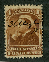
The 10c Bistre Brown
This stamp replaced the 10c blue in 1925 and by the time it was issued, its use had expanded to include other post office services like acknowledgement or receipt and the like. So again, it saw very heavy use. Surprisingly, there are quite a few subtle shades of this stamp, although they are all very similar to one another, due largely to the fact that they were only printed by the dry method, which appears to result in less marked shade varieties than one finds on the wet printings.

The stamps on the top row are all examples of the bistre-brown, while the stamps on the bottom are the listed yellow-brown shade. As you can see, the yellow brown is quite distinct. From left to right, on both rows we have:
This post will deal with the last of the intermediate value Admiral stamps before I deal with the three high values, the 20c, the 50c and the $1. The Unitrade catalogue until fairly recently did not list any shades at all of the 10c bistre brown, and has only ever listed two shades of the first 10c: plum and reddish purple. As we shall see though, there is a fair range of shades of the first 10c, and also there are more than two shades of the bistre brown as well. In keeping with the structure of all previous posts, I will illustrate examples of each Unitrade listed shade and will then cross-reference the shade names with the Stanley Gibbons Colour Key.
The 10c Plum or Reddish Purple
This stamp was released in January 1912 and replaced the 10c King Edward VII stamp. It's use was primarily for insurance fees on registered mail, bulk mailings of printed matter and parcels. Consequently, it was in fair demand, and a lot of printings were made between 1912 and 1922, when it was replaced by the 10c blue.
The what most people think of when they hear "plum" are the more common brownish purple and purple brown shades, that were from printings made after 1920. Indeed most mint examples are from that time period, with examples from 1912-1914 being comparatively scarce. Unitrade identifies the reddish purple shade as coming from the first printings in 1912, which is correct, but a number of early printings from 1912-1913 can be found in a dull greyish purple shade as we shall see.
Plum Shades

The above stamps are all examples of the Unitrade listed plum shade. This scan shows a fair amount of uniformity of colour, although in the flesh, the shades are all quite different. The blackish plum is shown at the lower right, while the upper left stamp is the common dark purple brown. From left to right on each row we have:
- Dark purple brown - similar to purple brown, but containing some black.
- Deep dull greyish purple - similar to dull purple, but deeper and greyer.
- Dull greyish purple - similar to dull purple, but greyish.
- Purple brown.
- Dark purple brown - similar to purple brown, but with a hint of black.
- Deep brown purple - similar to brown purple, but deeper.
- Dark purple brown - similar to brown purple, but with black added.
- Blackish plum - similar to plum, but with black added.
The greyish purple shades have paper and gum that is consistent with printings made before 1914, while the blackish plum has paper and gum consistent with 1915-1917 printings. Finally the other shades have paper and gum consistent with printings made after 1918.
Reddish Purple Shades

The above stamps are all examples of Unitrade's reddish purple. These are quite distinct and different from the plum shades above. In terms of the Gibbons Coour Key, they are closer to maroon than reddish purple. From left to right on each row we have:
- Light maroon - similar to maroon, but with some white added.
- Brown purple.
- Dull greyish purple - similar to greyish purple, but dull.
- Maroon.
The paper and gum characteristics of all these stamps are consistent with printings made before 1914, which supports Unitrade's assertion that these are from the first printings.
The 10c Bistre Brown
This stamp replaced the 10c blue in 1925 and by the time it was issued, its use had expanded to include other post office services like acknowledgement or receipt and the like. So again, it saw very heavy use. Surprisingly, there are quite a few subtle shades of this stamp, although they are all very similar to one another, due largely to the fact that they were only printed by the dry method, which appears to result in less marked shade varieties than one finds on the wet printings.

The stamps on the top row are all examples of the bistre-brown, while the stamps on the bottom are the listed yellow-brown shade. As you can see, the yellow brown is quite distinct. From left to right, on both rows we have:
- Light bistre brown - similar to bistre brown, but with a touch of white.
- Bistre brown.
- Pale bistre brown - similar to above but less intense.
- Deep ochre - similar to ochre, but more intense.
- Ochre.
- Light yellow brown - similar to yellow brown, but with white added.
That concludes my post on the shades of the 10c Admiral. If you would like to see the 10c Admirals that are for sale in my store, click on the following two links:
Have a fantastic weekend!

Comments
Post a Comment