Posts

Showing posts from March, 2017

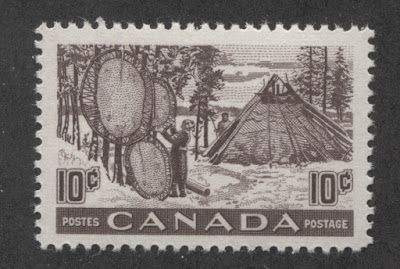
The Natural Resources Definitives of 1950-1956
Image
Overview Today's post will be much shorter than in the past several weeks and will look at the high value definitive stamps that began to replace the designs of the 1946 Peace Issue, starting with the 50c in 1950. They are interesting stamps because they technically occupy both the end of King George VI's reign, as well as the very beginning of Queen Elizabeth II's reign. So they really ought to be included in your collection if you are a specialist of either reign. Although they do not display quite the same range of paper, shade and gum varieties as the earlier Peace Issue, there are still some worthwhile varieties that can be collected. I will illustrate most of them here, though there is one very dull, cold shade of ultramarine on the $1 fisheries that I do not currently have an example of. This set is probably not complicated enough on its own to make a lifetime collection, though there is still a decent amount of proof material, which will prove ellusive to a spe...
Updated Yet Again - The Duckworth Paper Types on Large Queens

I bought a 1c orange Large Queens on the scarce paper 9, that is not the thin paper. I note that Unitrade this year has re-named the thin tissue white paper as paper 9A, and has listed the paper 9, which it calls smooth, white. So I have added a scan of the paper 9, and have amended the heading of the former paper 9, to now read "9A". You can access the post by clicking on the following link: http://canadianphilately.blogspot.ca/2015/09/the-duckworth-paper-types.html To look at the Large Queen stamps that I have for sale, click on the following link: http://stores.ebay.ca/Pristine-Canadian-Stamps/Large-Queen-Issue-1868-1897-/_i.html?_fsub=1542787013&_sid=1009259433&_trksid=p4634.c0.m322

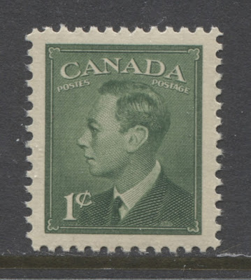
The Postes-Postage Issue of 1949-1953

Image
Overview After World War II had ended, there was a strong desire to modernize stamp design. In the late 1940's the prevailing design trend was minimalist with sleek lines. This trend was very prevalent in the architecture of the period, and in product design. So it made sense that this design aesthetic would extend into the stamp realm as well. Indeed if one looks at the stamps of many countries issued during this time, one will see that many of them share this simplicity in common. Thus, this issue may not be for you if you like very ornate designs, with fancy scrollwork. However, without the distracting influence of all these embellishments, it stands as a showcase of engraver's skill in executing flawlessly five separate portraits of King George VI, all from photographs. The resemblance to the actual king is quite striking, and much better than what was later accomplished on the Queen Elizabeth II Karsh Issue. This issue is much more straightforward than any issue that ...