The Natural Resources Definitives of 1950-1956
Overview
Today's post will be much shorter than in the past several weeks and will look at the high value definitive stamps that began to replace the designs of the 1946 Peace Issue, starting with the 50c in 1950. They are interesting stamps because they technically occupy both the end of King George VI's reign, as well as the very beginning of Queen Elizabeth II's reign. So they really ought to be included in your collection if you are a specialist of either reign. Although they do not display quite the same range of paper, shade and gum varieties as the earlier Peace Issue, there are still some worthwhile varieties that can be collected. I will illustrate most of them here, though there is one very dull, cold shade of ultramarine on the $1 fisheries that I do not currently have an example of.
This set is probably not complicated enough on its own to make a lifetime collection, though there is still a decent amount of proof material, which will prove ellusive to a specialist. Also, since these are higher value stamps, you could challenge yourself to build postal history and cancellation collections of the two highest values: the 50c and $1. So there is still plenty of scope for someone wishing to specialize. Of course, they also make a logical addition to a specialized collection of the Postes Postage and Karsh Issues as well.
The designers of these issues were varied and we are introduced to a new name in stamp design, that featured prominently in the 1950's and 1960's: Allan Pollock, who went on to design the 25c chemical industry stamp of 1956 and the Export $1 of 1963. Herman Herbert Schwartz, whom many of you are already familiar with designed the 50c oil wells stamp, and was involved in the design of the 10c fur resources stamp, along with the National Film Board. Fairbairn Art Studios cooperated with the Federal Department of Fisheries in designing the new $1 definitive stamp, featuring the fishing industry. These issues mark the first time that non-career designers were heavily involved in the design of Canadian Postage stamps.
The 50c Oil Wells design was engraved by the well established engraver, Silas Robert Allen, who had been responsible for the beautiful 12c-20c designs of the 1928-1929 Scroll Issue, and many others in the intervening years. The 20c Newsprint Industry stamp was engraved by Joseph Keller. I'm not sure who engraved the 10c and $1 designs, but these look very similar in style to the 20c. The Canadian Bank Note Company printed all the stamps in sheets of 200 that were divided into four smaller post office panes of 50 stamps each.
These issues are the first to exist only with either OHMS or G overprints, for the government officials, and not perforated OHMS. However, private perfins continued to be made and these are still highly elusive and collectible.
The Stamp Designs, Issue Dates and Quantities


As with the other OHMS overprints, forgers have been faking them and using laser printing to overprint inexpensive sheets of stamps with the overprint, or applying the fake overprint to used examples of this stamp. This stamp is problematic because the overprinted stamp is worth significantly more than the regular stamp, especially used. There are several things to be on the lookout for in this regard:
1. The ink of the originals should be shiny and jet black. Dull ink is very likely to have come from a fake.
2. The left vertical bar of the "M" is much thinner than the right bar. On the forgeries the left and right bars often appear thick.
3. The action of overprinting the original stamps often left a light imprint of the overprint in the gum, so that you can just make out the overprint from the gummed side of genuine stamps. This will not be the case on the forgeries, which will be flat on the gummed side, with no sign of the overprint. However, this by itself is not a fail-safe test, as I have seen genuine stamps where no imprint of the overprint is visible in the gum. So to be certain, you really have to be familiar with the appearance of the genuine overprint:


Today's post will be much shorter than in the past several weeks and will look at the high value definitive stamps that began to replace the designs of the 1946 Peace Issue, starting with the 50c in 1950. They are interesting stamps because they technically occupy both the end of King George VI's reign, as well as the very beginning of Queen Elizabeth II's reign. So they really ought to be included in your collection if you are a specialist of either reign. Although they do not display quite the same range of paper, shade and gum varieties as the earlier Peace Issue, there are still some worthwhile varieties that can be collected. I will illustrate most of them here, though there is one very dull, cold shade of ultramarine on the $1 fisheries that I do not currently have an example of.
This set is probably not complicated enough on its own to make a lifetime collection, though there is still a decent amount of proof material, which will prove ellusive to a specialist. Also, since these are higher value stamps, you could challenge yourself to build postal history and cancellation collections of the two highest values: the 50c and $1. So there is still plenty of scope for someone wishing to specialize. Of course, they also make a logical addition to a specialized collection of the Postes Postage and Karsh Issues as well.
The designers of these issues were varied and we are introduced to a new name in stamp design, that featured prominently in the 1950's and 1960's: Allan Pollock, who went on to design the 25c chemical industry stamp of 1956 and the Export $1 of 1963. Herman Herbert Schwartz, whom many of you are already familiar with designed the 50c oil wells stamp, and was involved in the design of the 10c fur resources stamp, along with the National Film Board. Fairbairn Art Studios cooperated with the Federal Department of Fisheries in designing the new $1 definitive stamp, featuring the fishing industry. These issues mark the first time that non-career designers were heavily involved in the design of Canadian Postage stamps.
The 50c Oil Wells design was engraved by the well established engraver, Silas Robert Allen, who had been responsible for the beautiful 12c-20c designs of the 1928-1929 Scroll Issue, and many others in the intervening years. The 20c Newsprint Industry stamp was engraved by Joseph Keller. I'm not sure who engraved the 10c and $1 designs, but these look very similar in style to the 20c. The Canadian Bank Note Company printed all the stamps in sheets of 200 that were divided into four smaller post office panes of 50 stamps each.
These issues are the first to exist only with either OHMS or G overprints, for the government officials, and not perforated OHMS. However, private perfins continued to be made and these are still highly elusive and collectible.
The Stamp Designs, Issue Dates and Quantities

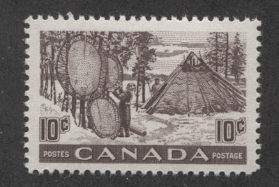
10c violet brown - drying animal skins.
Issued: October 2, 1950.
Replaced: February 21, 1955.
115,000,000 stamps.
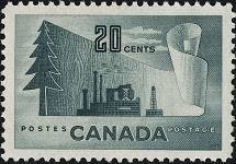
20c slate - forestry products.
Issued: April 1, 1952.
Replaced: June 7, 1956.
104,975,000 stamps.

50c deep dull green - Alberta oil field.
Issued: March 1, 1950.
Replaced: November 2, 1953.
10,150,000 stamps.

$1 ultramarine - fishing resources.
Issued: February 1, 1951.
Replaced: February 2, 1953.
4,460,000 stamps.
Points of Interest
While there are fewer complexities to these stamps compared with the earlier issues, there are still several ways that you can collect them in a more specialized fashion.
1. Shade varieties.
2. Paper and gum varieties.
3. Plate blocks.
4. OHMS and G Overprints.
5. Proof material.
6. Partially imperforate varieties.
7. First day covers.
8. Postal history and cancellations.
Shade Varieties
Each of the four stamps in this series can be found in anywhere from two to five different shades of colour. Some of these varieties are quite striking, while most are subtle. Unitrade does not consider any of them to be sufficiently striking to list any shade varieties for these, even though such varieties clearly do exist, as the scans below will hopefully show.
10c Furs
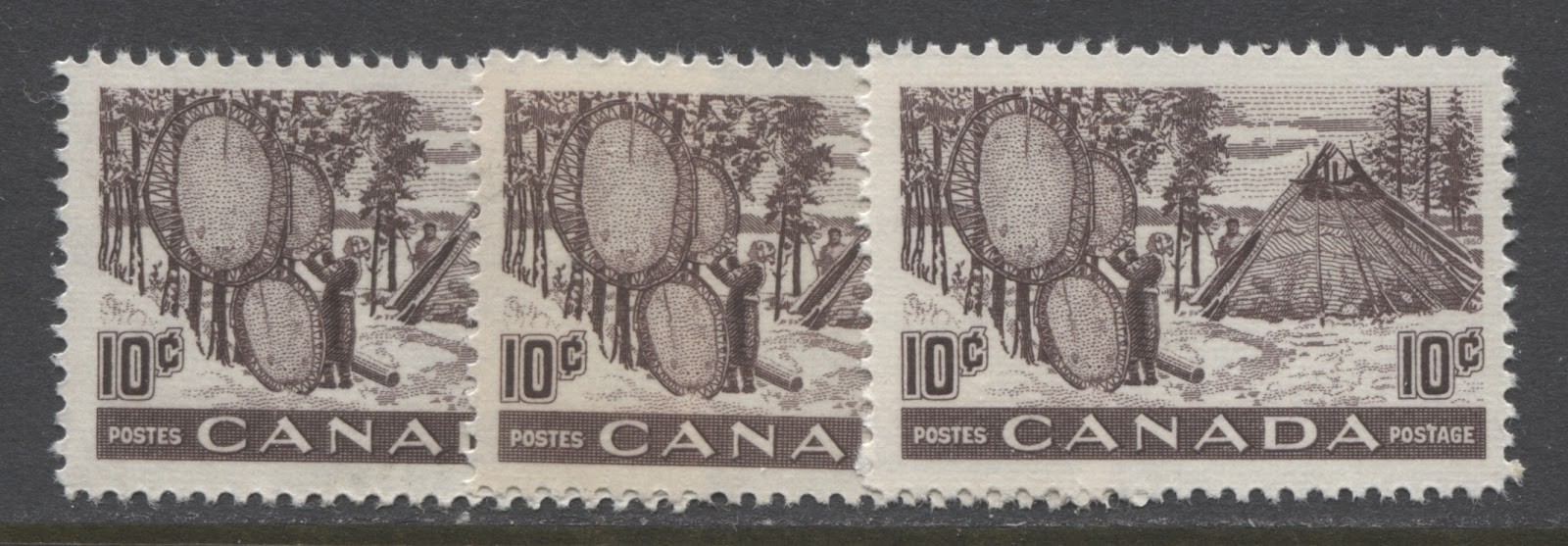
The basic colour is a violet or purple brown. The shade varies according to the balance between the amount of purple or violet in the colour and the amount of brown, and then hopw intense the shade is. Fort instance the stamp on the extreme left contains slightly less purple than the one on the extreme right, even though both shades are about the same intensity. The stamp in the middle is a noticeably lighter version of the shade on the left.
20c Forest Products

The basic shade of this stamp is a slate that can contain more pure grey than blue or green on the one hand, like the block on the right, or it can contain more of a greenish tone, like the two blocks on the left. The best way to see the difference between the shades is to focus on the colour of the tree. You will see that the tree in the block on the right is much lighter and greyer than the other trees.
50c Oil Wells
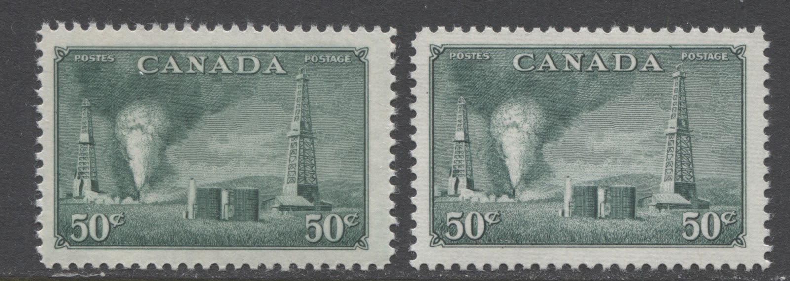
The basic shade of this colour is a deep dull green. The earlier printings were slightly lighter and brighter than the later printings where the colour contained a definite hint of black. The original shade is shown on the stamp at left, whereas the later, blackish shade is shown on the right stamp. You shouldn't need to focus on one part of the stamps to see this. Rather, the entire stamps should look different from one another.
$1 Fishing Resources

This stamp probably shows the most shade variation of the four. The basic colour is ultramarine, but it varies in terms of its depth, and its brightness. So on the left, we have the basic ultramarine that is neither light, nor dark, nor dull or bright. Then on the right we have the deep ultramarine, which has a hint of black compared to the stamp on the left. The middle stamp shows the lighter, duller ultramarine. It can be found even lighter than this, but I do not have an example I can show you at the moment. The ultramarine can also be found in a much brighter shade than is shown here, but again I do not have an example I can show you. However, I will add scans of these shades as I obtain examples for stock.
Paper and Gum Varieties

There are two basic types of paper for these stamps, both of which is shown above. The first printings were on the paper shown on the left stamp. It is a smooth wove paper of medium thickness that shows no clear mesh and no evidence of ribbing on either side. The perforations of stamps on this paper tend to be more cleanly cut and less prone to fraying. The second paper used for the later printings is a thicker stiffer wove paper that shows very clear ribbing on the printed side, and lighter ribbing on the back. This paper type is shown on the stamp on the right. This is a much more fibrous paper than the earlier paper and the perforations have a tendency to fray somewhat.

In terms of gum, there are two types. The earlier paper without the ribbing tended to have a smooth cream gum that had either a satin sheen, as shown on the left hand stamp above, or it had a semi-gloss sheen as shown on the right stamp. The later paper had a more yellowish and much more shiny gum, as shown on the middle stamp.

Here we can see two more examples of the gum on the two printings of the 50c oil wells stamp. The left hand stamp shows the smooth cream gum with the satin sheen, while the one on the right shows a slightly brighter cream gum with a semi-gloss, or a glossy sheen. Also, if you look very closely at the scan, you can just make out some light horizontal ribbing on the gum of the stamp on the right.
In between these two extremes there is a third paper type, which has the strong horizontal ribbing on both sides, but is thinner than the paper shown on the right hand 50c. An example of this can be seen on the following block of the 20c forestry products:

If you look carefully at the selvage tabs, you can clearly see the horizontal ribbing. This ribbing is also very clear on the back as you can see from the following scan:

The gum associated with this paper tends to be a smooth, yellowish cream gum with a semi-gloss sheen.
There is also a fourth paper type that I have seen, which is very thin and translucent, with no visible mesh or ribbing. Here is an example of it, front and back:

Here if you look carefully, you can see the black of the stockcard through the paper, which indicates that it is thinner than usual. However, what really makes this paper stand out is that you can see the design clearly through the back:
I don't know if all the shades I have identified can be found with all four paper and gum types. I suspect that there are some shades that can only be found with one paper, but if we assume for simplicity that there are two papers and two shades of each stamp, then there are at least 16 different stamps, for just the basic designs. Once you start factoring in the overprints, this number grows to at least double.
Plate Blocks

Most of the stamps were printed from only one plate, so that there are only four basic plate blocks for each stamp. The 10c and 20c were each printed from 2 plates, so there are 8 basic plate blocks for each of these stamps. In addition, there are the O.H.M.S and G overprints, which results in the following basic blocks for a set:
- 10c furs - plates 1 &2 - 8 blocks.
- 20c Forestry products - plates 1 & 2 - 8 blocks.
- 50c oil wells - plate 1 - 4 blocks.
- $1 fishing resources - plate 1 - 4 blocks.
- 50c oil wells - OHMS overprint - plate 1 - 4 blocks.
- 10c furs - G overprint - plates 1 & 2 - 8 blocks.
- 20c forestry products - G overprint - plates 1 & 2 - 8 blocks.
- $1 fishing resources - G overprint - plate 1 - 4 blocks.
So the basic set of plate blocks consists of 48 plate blocks. If we assume that there are 2 shades and 2 paper types possible for each value and plate, then that number can be quadrupled to 192 blocks. Then we can look at two other aspects to the plate blocks that have received very little attention to date: the order numbers and the position dots, which will be discussed below.
Print Order Numbers and Position Dots

Like the other issues printed by the Canadian Bank Note Company, the lower left plate blocks contain the plate number, and a printing order umber in the left selvage tab reading upwards. I have not seen enough plate blocks to be able to list all known order numbers, but here is what I have seen so far:
- 10c furs plate 1 - #753 with numerals widely spaced.
- 20c forestry products plate 2 - #1114 with numerals widely spaced.
- 50c oil wells plate 1 - #538 with closely spaced numerals.
On other issues I have seen variations in the spacing of the numerals in the order number, with some having very closely spaced numerals, while others have the numerals wide apart. It is not clear whether both spacings exist on some issues, or whether each stamp only exists with one spacing. It would be a fun and satisfying study to undertake, I think.
On most issues printed by the Canadian Bank Note Company, the lower left and lower right blocks can be found with one or more coloured dots in the selvage. It is not known why these dots were placed in the selvage, but different configurations have been found. A study would be needed to determine whether or not more than one dot configuration exists for both lower left and lower right positions.
On this issue the lower left blocks seem to have one coloured dot in the lower selvage, on the extreme right hand side, whereas the lower right blocks have this dot at then extreme left.
On some blocks I have found coloured dots in the side selvage as well. The following scan shows a 20c forestry products lower left block that shows a clear dot above the order number in the left selvage tab, as well as the usual dot at lower right:

The existence of this block introduces the possibility that there are at least two different kinds of lower left block, those with the two dots, and those with only one. However, I have actually found a third type of lower block: one with no dots in the selvage at all:

Now, this block is a lower right position, so what this indicates is that there are at least two different types of lower right block as well: those with one dot at the lower left, and those with no dots at all. So if the 192 blocks discussed above exist with two types of lower positions for each of the lower left and lower right, then the number of possible plate blocks now becomes 288 blocks - not a bad size collection. At 4 blocks a page, you are looking now at at least a 72 page album to arrange and write them all up.
Then I found an example of the 50c oil wells from the lower right position that shows a coloured dot in the right selvage tab at the top:

So, it would now appear that there may be three different types of lower right position. Of course, each of these types are occuring on a different denomination, and it is possible that each denomination exists with only one type. However, if each denomination exits with all types of dot configuration, then the number of collectible blocks climbs to 334 blocks.
Then in looking through the blank blocks in my stock, I came across this upper right block showing a single coloured dot in the selvage at upper right:

Thus there would appear to be at least two different types of each position except the upper left, and the lower right, which would seem to exist with three dot configurations. However, I am going to go ahead and speculate that there are probably 2 different types of those blocks as well. Thus I expect that there are two different types of block potentially for each and every plate and position, which would being the number of collectible plate blocks up to 430 blocks!
Finally, I found another 50c block from the upper right position, showing a single coloured dot in the right selvage tab near the bottom:
Thus to summarize, I have found the following dot configuations:
Upper left: no dots.
Upper right: no dots, one dot in lower part of right selvage & one dot in the right part of top selvage.
Lower right: no dots, one dot at left in lower selvage & one dot in upper part of right selvage.
Lower left: one dot at right in lower selvage tab, or one dot at lower right, and one at upper left.
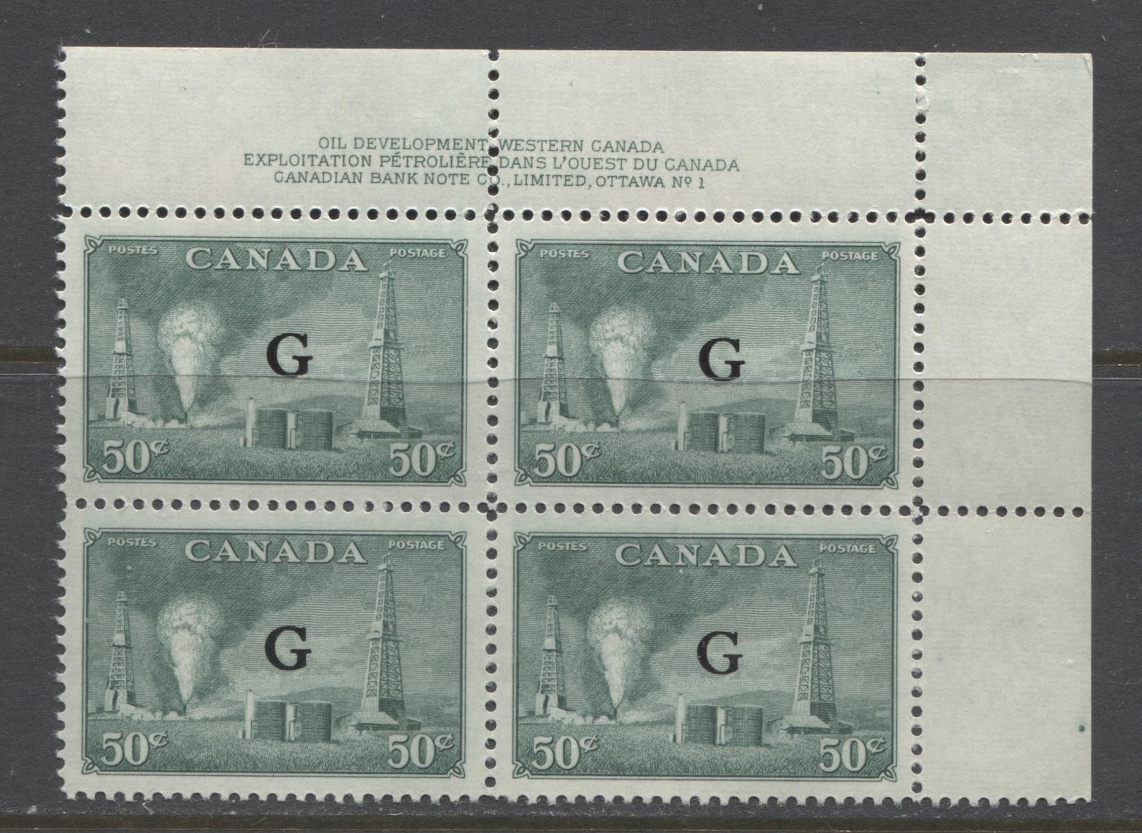
OHMS and G Overprints
OHMS Overprints

The only value of this series to exist with the O.H.M.S overprint is the 50c oil wells as shown above. The reason is that this value was issued in March 1950, while the G overprint had replaced the O.H.M.S overprint by the time the other values were issued, starting with the 10c furs in October 1950. It would appear also that the "no period after S" error that had occurred on the earlier War and Peace designs had now been corrected, as this stamp is not known with that variety.
1. The ink of the originals should be shiny and jet black. Dull ink is very likely to have come from a fake.
2. The left vertical bar of the "M" is much thinner than the right bar. On the forgeries the left and right bars often appear thick.
3. The action of overprinting the original stamps often left a light imprint of the overprint in the gum, so that you can just make out the overprint from the gummed side of genuine stamps. This will not be the case on the forgeries, which will be flat on the gummed side, with no sign of the overprint. However, this by itself is not a fail-safe test, as I have seen genuine stamps where no imprint of the overprint is visible in the gum. So to be certain, you really have to be familiar with the appearance of the genuine overprint:
- The entire overprint, from the left side of the "O" to the end of the right period, should be 12 mm long.
- The "O" should be thinner at the top and bottom than it is on the sides.
- The two vertical bars of the "H" should be the same thickness.
- The left vertical bar of the "M" should be noticeably thinner than the right vertical bar.
- The "S" should be noticeably thinner at the top and bottom.
- The letters should be just under 2 mm high.
G Overprints

All four of the stamps of this series are found with the Casson font "G" overprint. Its distinguishing characteristic is that the top and bottom of the G are narrower than the sides, and there is a full horizontal cross stroke, as well as a barbed serif at the top of the G where it is open. The other characteristics are that the height and width are both 4 mm. The overprint is generally located in the centre of each stamp. Unitrade does not list any misplaced G varieties, though I believe that they must exist. Similarly, there are no listed "blunt G" varieties, but I expect that if you look hard enough you should be able to find some. The 10c furs is known with the G missing, which comes from position 31 of the pane, and is usually collected in either a se-tenant pair, or a plate block of 14.
Although this overprint has been extensively forged, on the earlier Peace Issue, forgeries are not really an issue on these, except possibly on used examples of the 50c and $1. They are usually made in a dull black ink and the letters are either the wrong proportions, of they lack the features described here. In recent years, fakers have been forging these overprints on the less expensive values using mint sheets or plate blocks. They have done this with laser printing. The easiest way to detect these again is that the sizes will be off and the ink will appear different.
Proof Material
The BNA Proofs website curiously does not list any proof material at all for any value of this series except the 20c, of which it lists 9 items. I do not believe that this is because such material does not exist, but rather because of its extreme rarity. The 9 items listed for the 20c are all very rare with only 1-3 examples of each being recorded and are all valued in the $700-$1,200 price range:
- 2 different photographic die essays, one in grey and one in brown grey.
- 1 metal tintype plate.
- 1 small progressive proof with no background in black.
- 1 large unhardened die proof on India paper in grey.
- 1 small die proof on India paper in grey.
- 1 large trial colour proof on India paper in grey-green.
- 2 small trial colour proofs on India paper, one in grey-green and the other in light brown.
You can view scans of these items by accessing the following link and clicking on the white rectangles that appear on the right side of the page:
Partially Imperforate Varieties
There are no imperforate pairs known of these stamps, nor are there any completely imperforate plate blocks. The 50c is known with no top row of horizontal perforations, so that pairs can be found where one stamp is missing the top perforations, while the other is normal, as well as a plate block with the top margin imperforate. This block is unique.
First Day Covers
A very wide variety of cachet makers were active during the life of this issue. The most common cachets are those by Artcraft and Rosecraft. However there are dozens of others. Most of these will bear the cancellations of the town where the cachet maker was active. However, there are some that prepared the covers in Montreal or Ottawa, so that they can also be found with the official first day of issue cancellation as well. Of course many first day covers that have no cachet at all can be found, though these are not as collectible as those covers with cachets. As the above illustration shows, there were first day covers that bore plate blocks as well as those that bore singles. So with dozens of different cachets, plate blocks versus singles and cancellations you could easily collect a few hundred different first day covers. You can also find, though they are very elusive now and expensive, hand painted covers with very detailed and colourful cachets.
Postal History and Cancellations
As these are high value stamps, there are plenty of scarce and attractive postal history items that you can collect. The scans above show an attractive used pair of the $1 fisheries with an in-period dated CDS cancellation. The size of these stamps makes them ideal for the collecting of CDS town cancellations. With many thousands of post offices in each province, the possibilities are almost endless. Nice copies of the $1 can get expensive, but the other values are all relatively inexpensive.
Covers and bulk mailing receipts such as the one shown above for 500 flyers delivered at the householder rate of 1c each, are another field that holds a lot of possibility for the patient specialist with an eye for quality. Due to the fact that these issues are relatively recent, finding individual covers at auction is liable to be challenging, though E-bay should be a good source of material. Otherwise bulk cover lots bought at auction are the most likely source of the better foreign airmail and registered covers.
This concludes my discussion of these issues, and nearly brings me to the end of the King George VI period. Next week's post will look at the commemorative issues of this period, and then I will get back into the Elizabethan period with a series of posts about the commemorative issues from 1951 to 1962.

Comments
Post a Comment