The Stapled Booklets and Cello-Paqs of the 1967-1973 Centennial Issue
Today's post will be the first of four posts that will explore the alternative issue formats in which the stamps of this issue were available, other than the basic sheet stamps. For decades the stamps of Canada have been available in booklets and in coil form, and this issue was no exception. In addition, starting with the 1954 Wilding Issue, some of the stamps were available in large panes of 25 or 20, that were sold sealed in large cellophane packages. The 4c and 5c stamps of this issue were also issued in this form until the end of 1967, when this format of issuing stamps was abandoned in favour of larger integral booklets.
Today's post will examine the two stapled booklets that were issued in 1967, and which were replaced, by integral booklets that were printed by the BABN, starting in 1968, and continuing for the remainder of the life of this issue.
The Stapled Booklets
For this issue, two stapled booklets were issued on February 8, 1967, both of which sold for 25c. One contained 1c and 4c stamps (BK54) while the other contained 5c stamps only (BK55). 24,093,000 of BK54 were issued, while the number of BK 55 that were issued was 14,002,000.
The Basic Formats and Contents
The 1c+4c booklets each contained 2 panes of 5 stamps, plus a printed label, and each of the panes was separated by a glassine interleaf page, which was intended to prevent the stamps from sticking together. Further interleaf pages were placed after the last pane, in order to prevent the stamps from sticking to the cover as well. McCann does note that the combination booklet, BK 54, can be found without any interleaving.
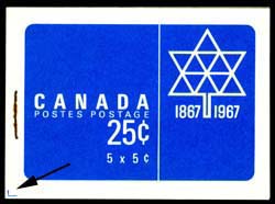
The Front Covers
The front covers of the booklets were first introduced for the very last printings of the 25c booklet from the previous Cameo Issue, that contained 5c stamps only. It consists of the Centennial celebrations emblem in white on a coloured background. Dark red was used for BK 54, while bright blue was used for BK 55. The covers appear as follows:


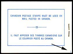
The Back Covers
The back covers were very simple, consisting of a bilingual text message enclosed in a rectangular box. The message simply states that stamps are required on mail posted in Canada. The covers were identical in all respects, except for the colour, which was the same as that used for the front cover:


The inside back cover of both booklets contained a bilingual message in black and white to the effect that apartment numbers were important for a complete address:


The Booklet Panes
All three of the panes that were included in the booklets were identical in their general layout. Five stamps and 1 label were printed in a 2 x 3 arrangement, with the label at the top left. The message on the label was always the same for the 1c and 5c, and read: "Avoid Loss Use Postal Money Orders", in both English and French. The message on the 4c booklets, in both English and French was "Address All Mail, Clearly, Correctly, and Completely".
The general layout of the panes looked like this:

Cutting Guidelines
The covers were printed in sheets that were cut apart using a guillotine. In order to ensure that the covers were guillotined in the correct place, small "L" shaped guide marks were printed on the covers in the same colour as the cover. Usually, these were trimmed off and are not visible on the covers. However occasionally, they show up in the corners of the front covers, back covers, or both. They are highly sought after by specialists, and sell for a significant premium (generally 500%) over the price of a normal booklet.
The guide markings appear like so:


The pack had instructions printed in either red, for the 4c value, or blue, for the 5c value, on a white background at the top of the pack. Then in the centre, was the centennial emblem and the value of the pack, printed horizontally across in a repeating pattern. Then along the bottom in a repeating pattern was printed "Postes Canada Postage". As far as I know, there were no major variations in the designs that were printed across the front of the packages. However, this is another aspect of this issue that has been highly neglected, as most of these packs were opened, and the cellophane thrown away, without any diligent study being carried out to check to see if there were collectible variations in the size, style and spacings between lettering on the front of these packs.
The panes contained in each pack are shown in the following scans:


Today's post will examine the two stapled booklets that were issued in 1967, and which were replaced, by integral booklets that were printed by the BABN, starting in 1968, and continuing for the remainder of the life of this issue.
The Stapled Booklets
For this issue, two stapled booklets were issued on February 8, 1967, both of which sold for 25c. One contained 1c and 4c stamps (BK54) while the other contained 5c stamps only (BK55). 24,093,000 of BK54 were issued, while the number of BK 55 that were issued was 14,002,000.
The Basic Formats and Contents
The 1c+4c booklets each contained 2 panes of 5 stamps, plus a printed label, and each of the panes was separated by a glassine interleaf page, which was intended to prevent the stamps from sticking together. Further interleaf pages were placed after the last pane, in order to prevent the stamps from sticking to the cover as well. McCann does note that the combination booklet, BK 54, can be found without any interleaving.
The Front Covers
The front covers of the booklets were first introduced for the very last printings of the 25c booklet from the previous Cameo Issue, that contained 5c stamps only. It consists of the Centennial celebrations emblem in white on a coloured background. Dark red was used for BK 54, while bright blue was used for BK 55. The covers appear as follows:

BK54 - 61.75 mm x 41 mm-41.5 mm

BK55 - 61.75 mm x 41 mm-41.5 mm
The inside of the front cover for both booklets was identical, and consisted of bilingual basic postage rate information, in sans-serif letters. The scan below shows one such cover:

Total text width: 52.5 mm, height: 40 mm
The Back Covers
The back covers were very simple, consisting of a bilingual text message enclosed in a rectangular box. The message simply states that stamps are required on mail posted in Canada. The covers were identical in all respects, except for the colour, which was the same as that used for the front cover:

BK54 - 55.5 mm x 35.75 mm

BK54 - 55.5 mm x 35.75 mm
The inside back cover of both booklets contained a bilingual message in black and white to the effect that apartment numbers were important for a complete address:

Inside back cover - 55.5 mm x 35.75 mm
The Wilding Cover
McCann, in his specialized booklet catalogue, notes the existence of a version of BK 54 that was produced using the older Type III cover that was used for the earlier Cameo issue. I had never heard of this prior to seeing McCann's catalogue, and I have never seen one. However, he prices it at 25 times the price of a normal booklet, which reflects its scarcity.
The covers of this booklet type are shown in the following scans:

Front cover.

Back cover

Inside front cover.

Inside back cover.
All three of the panes that were included in the booklets were identical in their general layout. Five stamps and 1 label were printed in a 2 x 3 arrangement, with the label at the top left. The message on the label was always the same for the 1c and 5c, and read: "Avoid Loss Use Postal Money Orders", in both English and French. The message on the 4c booklets, in both English and French was "Address All Mail, Clearly, Correctly, and Completely".
The general layout of the panes looked like this:

The edges of the panes were generally deckled, rather than being clean, straight edges, and the quality of the guillotining was usually not great, with the result, that poorly centered booklet stamps with either very wide outer margins, or very narrow, and almost nonexistent margins are the norm.
The paper is generally found to be a horizontal wove, that often shows some very faint vertical ribbing on the surface. This is in contrast to the sheet stamps, which are usually printed on vertical wove paper (at least for the low values), that shows faint horizontal ribbing. The gum is generally the smooth dextrose gum with a satin sheen. There is a fairly decent range of paper fluorescences that range from dead to medium fluorescent, as discussed below.
In terms of perforations, both the 11.85 and 11.95 gauges that the CBN employed were in use during this time, so that it should be possible to find all three of these panes with four perforations:
- 11.85
- 11.95
- 11.95 x 11.85
- 11.85 x 11.95
It should be noted that it will be difficult to measure the vertical perforations accurately, due to the fact that there is no opposing perforation tooth on the outer edges to use in lining up the guide-line of your Instanta gauge. Great care and patience is needed to do this accurately.
Cutting Guidelines
The covers were printed in sheets that were cut apart using a guillotine. In order to ensure that the covers were guillotined in the correct place, small "L" shaped guide marks were printed on the covers in the same colour as the cover. Usually, these were trimmed off and are not visible on the covers. However occasionally, they show up in the corners of the front covers, back covers, or both. They are highly sought after by specialists, and sell for a significant premium (generally 500%) over the price of a normal booklet.
The guide markings appear like so:
"L" shaped Guide mark on a front cover of BK 55.
A portion of the "L" shaped guide mark on the back cover of BK 55.
Staple Widths
Another important feature of booklets, that becomes a point of differentiation for specialists is the width of the staple used to bind the panes and covers of the booklet. All of the specialist literature says that 12 mm was the only width of staple used, which appears to be correct. However, carefully measuring the holes in an exploded booklet reveals that the actual measurement is closer to 12.5 mm.
It is entirely possible that other widths, such as 14 mm, 16 mm or 17 mm do exist somewhere, as these were commonplace in the booklets that were produced for earlier issues. However, I have not, as yet come across any.
Cover Fluorescence

This an aspect of the booklets that, as far as I know, has not received any attention at all, even in the most specialized handbooks. This is a shame, as the covers seem to exhibit many of the same variations as the stamps, although they do not show the same, bright levels of fluorescence as the later printings of stamps from this issue. They do exhibit a fair amount of variation though within the dead to low fluorescent end of the spectrum, with some covers showing clear fluorescent fibres. In the above scan, it is difficult to see, but if you look at the booklet cover on the right, towards the top, you can just make out the fluorescent fibres at the top, whereas the booklet cover on the left is a straight-up dull fluorescent ivory cover, that shows no fluorescent fibres at all.
I haven't unfortunately examined enough of these yet to be able to give a comprehensive listing of all known fluorescence varieties on both the front and back covers, but I can certainly list those that I have seen thus far and add more to the list as I encounter them:
Front Covers
- BK 54 - Dull fluorescent ivory, with no fluorescent fibres.
- BK 54 - Dull fluorescent bluish white with very sparse low fluorescent.
- BK 54 - Dull fluorescent greyish white, with no fluorescent fibres.
- BK 55 - Dull fluorescent ivory, with very sparse low, medium and high fluorescent fibres.
- BK 55 - Dull fluorescent violet-white, with no fluorescent fibres.
- BK 55 - Dull fluorescent greyish white, with no fluorescent fibres.
- BK 55 - Dull fluorescent greyish white with sparse low & medium fluorescent fibres, and very few high fluorescent fibres.
Back Covers
- BK 54 - Dull fluorescent greyish white, with no fluorescent fibres.
- BK 55 - Dull fluorescent greyish white, with no fluorescent fibres.
- BK 55 - Dull fluorescent violet-white, with no fluorescent fibres.
- BK 55 - Dull fluorescent greyish white, with sparse low fluorescent fibres.
Pane Fluorescence
As mentioned above, all of the panes used in the booklets are found with a range of fluorescence from dead to medium fluorescent. What is more, because BK54 contains two panes, it is possible to find different combinations of paper fluorescence for the two panes

A 1c deep brown pane of 5 + label that is dull fluorescent and greyish in colour under UV.
The panes that I am aware of include:
- 1c - dull fluorescent, with the colour under UV being ivory, grey, bluish white or greyish white.
- 1c - dead, with the colour being either violet or dark brown under UV.
- 1c - low fluorescent greyish white or bluish white.
- 1c - medium fluorescent bluish white.
- 4c - dull fluorescent, with the colour under UV being ivory, grey, bluish white or greyish white.
- 4c - dead, with the colour being either violet or dark brown under UV.
- 4c - low fluorescent greyish white or bluish white.
- 4c - medium fluorescent bluish white.
- 5c - dull fluorescent greyish, with no fluorescent fibres.
- 5c - dull fluorescent greyish white, with sparse low fluorescent, and very sparse medium fluorescent fibres. This is what McCann refers to as low fluorescent.
- 5c - dull fluorescent greyish, with very sparse low fluorescent fibres.
- 5c - medium fluorescent, bluish white.
- 5c - dull fluorescent, with the colour under UV being ivory, grey, bluish white or greyish white.
- 5c - dead, with the colour under UV, being either violet, or dark brown.
On the combination booklet, BK 54, these levels of fluorescence can be found in various combinations, including:
- Both panes dull fluorescent, in various colours under UV.
- Both panes dead, in either violet or dark brown under UV.
- 1c pane is dull, while 4c pane is dead.
- 1c pane is dead, while 4c pane is dull.
- 1c pane is low fluorescent, while 4c pane is dull.
- 1c pane is medium fluorescent, while 4c pane is dull.
- 1c pane is low fluorescent with fluorescent fibres, while the 4c pane is dull fluorescent with fluorescent fibres.
There obviously should be more combinations of panes that exist on this booklet, given that there are at least four of each kind, which means that there should be 16 different possible combinations.
Cover Colour Variations
This is another aspect of these booklets that has been largely ignored, quite unjustifiably, I think. There are definite differences in the red and blue colours used to print the covers. I do not, at the moment, have an example of a marked difference on the red cover, though it can be found in a very deep red, and an almost deep orangy red. I will be sure to add an example when I come across one, so that you can see what I mean.
The scan below shows two variations of the blue colour on BK 55, with the left being a much deeper blue, compared to the cover on the right:

Cover Lettering and Spacing Varieties
I am not aware of any lettering or spacing varieties (between the lines of text, or between words) of the covers of these booklets, though again, this is not an area that has received all that much attention from specialists, as compared to other aspects of this issue. So, it is possible that some subtle varieties may exist. I have noted for each of the front and back covers, what the outside dimensions of the printing are, in order to provide a reference point for further study, to see if in fact, any varieties do exist of this nature.
The Cello Paqs
The 4c stamps of this series were sold in sealed panes of 25 stamps, and the 5c stamps were available in sealed panes of 20 stamps. In the case of the 5c, both tagged and untagged versions were available. The packs had a face value of $1 each and were sold for their exact face value. They were issued on February 8, 1967, when the set was first issued, and remained on sale throughout the year.
The scan below shows the general format of these packs:

The pack had instructions printed in either red, for the 4c value, or blue, for the 5c value, on a white background at the top of the pack. Then in the centre, was the centennial emblem and the value of the pack, printed horizontally across in a repeating pattern. Then along the bottom in a repeating pattern was printed "Postes Canada Postage". As far as I know, there were no major variations in the designs that were printed across the front of the packages. However, this is another aspect of this issue that has been highly neglected, as most of these packs were opened, and the cellophane thrown away, without any diligent study being carried out to check to see if there were collectible variations in the size, style and spacings between lettering on the front of these packs.
The panes contained in each pack are shown in the following scans:

The 4c carmine rose pane of 25

The 5c blue untagged pane of 20.

A Winnipeg tagged pane of 20 of the 5c blue.
These panes were guillotined apart and the edges were very cleanly cut, which sets them apart from the stamps that are usually found in the stapled booklets. These were also generally printed on vertical wove paper, just like the sheet stamps. So it is generally not too difficult to distinguish a straight edged stamp from one of these panes, from a stamp that came from one of the two stapled booklets. However, distinguishing the stamps from the middle of the pane from those printed only in full sheets, is much, much more difficult, and may not even be possible. Shades may help to an extent, as most of the 5c sheet stamps tend to be more of a violet blue, rather than the deep bright blue of these panes. The 4c stamps tend to be more carmine, though I have also seen carmine-rose as well. The gum of these panes tends to be fairly smooth and shiny like types 3 and 4 dextrine gum.
In terms of perforation, the same range of perforations found on the sheet stamps and booklet stamps should exist on these as well, however, the same comments about measuring vertical and horizontal perforations accurately apply here too - at least with respect to the stamps from the outer perimeter of the sheet.
Until very recently these were only listed as being printed on dull paper, and the catalogues do not generally bother to differentiate the small differences between the different types of dull paper, in terms of the appearance under UV light. Generally, I have seen grey to greyish white and these two colours with very, very few low fluorescent fibres. However, in recent years Unitrade has begun to list these as being on dead paper as well, which generally appears violet under UV. I have found this type of paper for all three basic types of pane (4c, 5c untagged and 5c tagged). The dead paper is much, scarcer than the dull fluorescent, and is easily overlooked if you aren't familiar with it. However, at the present time, Unitrade does not list it for the 5c untagged stamp, only listing it for the Winnipeg tagged pane.
Unitrade does list these in used condition for the same price as mint. Collectors should be aware of the fact that in practice, genuinely used examples of these are much, much harder to come by than mint, as there are very few mail items that would have required something so large. The only practical use for sheets this size would have been parcels, and consequently it would be rare for sheets this size to survive without some minor creases, or wrinkles and perforation separations. So if you come across in-period, used sheets with legible dated cancellations, you would be well advised to buy them, as they may be among some of the scarcest regular-issue items from this issue.
This concludes my review of these two early issue formats, both of which were more or less superseded by the integral booklets that first appeared in 1968. It would appear, from how long it took me to write this post today, that I am going to need more than one post to cover the integral booklets, because there were so many of them. I have decided that I will cover these in three posts:
- The Perf. 10 BABN Booklets (BK56-BK62).
- The Perf. 12.5 x 12 booklets not containing the 8c library and the OPAL booklet (BK63-68).
- The 25c booklets containing the 8c parliamentary library (BK69-BK71).


Comments
Post a Comment