Determining a Numeric Grade Weighing All Factors
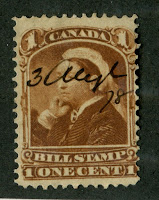
Imperforate Mint Stamps
1. Size of Margins: 0-70 Points
- 70 Points- The margins are oversize on all four sides - usually showing portions of the adjoining stamp.
- 65 Points - The margins are full on one side and oversize on three sides. Full margins are defined to be approximately 1/2 of the average distance between impressions on the plate from which the stamp was printed. This varies widely by issue.
- 60 Points - The margins are full on two sides and oversized on two sides.
- 56 Points - The margins are full on three sides and oversized on one side.
- 54 Points - The margins are full on all sides.
- 51 Points - The margins are full on three (or two for triangular stamps) sides and close on one side.
- 49 Points - The margins are full on two sides and close on two sides.
- 45 Points - The margins are full on one side and close on three sides.
- 44 Points - The margins are clear on all four sides, although none of them are full.
- 34 Points - The stamp has margins on only 3 sides and none of these are full.
- 24 Points - The stamp has margins on only two sides and none of these are full.
- 15 Points - The stamp has no margins to speak of at all, but is not cut into the design on any one side by more than 1/2 mm.
- 5 Points - There are no margins, and the design is cut into on one or more sides by between 1/2mm and 1mm
- 0 Points - The design is cut into by more than 1mm on any one side.
2. Paper Freshness: 0-10 Points
- 10 Points - The paper is bright and fresh, showing no signs of discolouration.
- 8 Points - The paper is fresh, but not bright.
- 6 Points - The paper is not visibly toned, although not particularly fresh.
- 4 Point - The paper shows some very light overall toning.
- 2 Points - The paper has noticeable toning, although it is not deep.
- 0 Points - The paper is heavily toned or has visible staining.
3. Clarity and Strength of Printing Impression: 0-5 Points
- 5 Points - The impression is razor-sharp, with all finer details of the design being clearly visible. The stamp appears almost like a proof.
- 3 Points - The impression is reasonably strong and detailed, but some of the shading lines may merge into one another, but no ink stripping will be visible.
- 2 Points - The impression is neither crisp nor weak, with some but not all of the finer details being visible. On lithographed or typographed (surface printed) stamps, there will be some patchiness (ink-stripping) visible.
- 0 Points - The impression is weak, heavily blurred or there may be extensive ink stripping
4. Freshness and Depth of Colour: 0-10 points
- 10 Points - Unusually deep and rich colour. Appears as fresh as the day the stamp was printed.
- 8 Points - Post office fresh colour that shows no oxidation or fading.
- 6 Points - Full and true colour that is not faded, but is not post office fresh, but does not appear aged.
- 4 Points - Colour is not faded, although it is not fresh, and appears slightly aged.
- 2 Point - Colour shows some very mild fading or other discolouration, or is otherwise uneven.
- 1 Point - Colour is noticeably faded or very slightly altered
- 0 Points - Colour is highly faded, and noticeably changed.
Colours that are naturally pale, will at best receive a point value of 8 regardless of how fresh they are. This is to reflect the fact that collectors generally prefer deeper colours visually. That said, a stamp that is superb in all respects that has pale colour will still receive a possible maximum grade of 98, which is still superb. Determining whether a colour has changed from its original state requires some knowledge of the printing inks used for a particular issue and can be difficult for the novice to judge. For example, the green inks used by De La Rue on the crown CA commonwealth keyplate stamps was originally deep or dull green, or occasionally deep blue green. These inks were singly fugitive, which means that they are water soluble. When these inks are exposed to water, they fade first to bright blue green and then to a bright yellow green. These are changed colours, and a stamp like this would receive a score of 1 if it was bright blue green and 0 if it was yellow green.
5. Absence of Visual Paper Flaws: 0-5 points
- 5 Points - No visible paper inclusions, no visible creases, no margin nicks, no visible thin spots, no visible tears or visible scuffs.
- 4 Points - May be a slightly noticeable paper inclusion but no other flaws.
- 3 Points - may be a small margin nick but no other flaws.
- 2 Points - may have a small inclusion and a small margin nick, or only a very small scuff.
- 1 Point - may have a small corner crease, but no other flaws.
- 0 Points - Has one or more visible closed tears, thin spots or large surface scuff, or deep gum soak. A gum soak is a transluency caused by the gum becoming wet and soaking through to the front of the stamp.
Imperforate Used Stamps
For used stamps, the scale employed to evaluate them is similar, but the appearance of the cancellation must be considered, and the maximum number of points allocated to paper freshness and depth and freshness of colour is reduced to 5 points each in order to reflect the fact that (a) neither factor at its best can ever be as good on a used stamp as a mint stamp and (b) to enable a sufficient number of points to be allocated to the cancellation.
Thus the factors become:
1. Size of Margins - 0-70 Points as Above
2. Paper Freshness: 0-5 Points
- 5 Points - The paper is bright and fresh, showing no signs of discolouration.
- 4 Points - The paper is fresh, but not bright.
- 3 Points - The paper is not visibly toned, although not particularly fresh.
- 2 Point - The paper shows some very light overall toning.
- 1 Points - The paper has noticeable toning, although it is not deep.
- 0 Points - The paper is heavily toned or has visible staining.
3. Clarity and Strength of Printing Impression: 0-5 Points as Above
4. Freshness and Depth of Colour: 0-5 Points
- 5 Points - Unusually deep and rich colour. Appears as fresh as the day the stamp was printed.
- 4 Points - Post office fresh colour that shows no oxidation or fading.
- 3 Points - Full and true colour that is not faded, but is not post office fresh, and does not appear aged.
- 2 Points - Colour is not faded, although it is not fresh, and appears slightly aged.
- 1 Point - Colour shows some very mild fading or other discolouration, or is otherwise uneven.
- 0 Points - Colour is noticeably faded, although not changed.
5. Absence of Visual Paper Flaws: 0-5 Points as Above
6. Appearance of the Cancellation: 0-10 Points
- 10 Points - The cancellation is clearly legible, crisp and struck in such a way that the design is not obscured in any significant way. There is no bleeding of the cancellation ink into the paper of the stamp, no smudging and no discoloration of the stamp by the cancellation ink.
- 8 Points - The cancellation is clearly legible, but not completely crisp. Again, the design is not obscured in any significant way.
- 4 Points - The cancellation is legible, although it is not light. It does not detract from the appearance of the design, but it does not enhance it either the way that the cancellations in the above two grades do.
- 2 Points - The cancellation is a manuscript cancellation, light cork or light smudge cancellation that does not significantly obscure the design or discolour the stamp. Or the cancellation is a date stamp or town cancellation that is of medium intensity but is not readable.
- 0 Points - The cancellation covers less than 25% of the design, is not clearly readable and can be considered heavy.
Note that heavy cancellations that cover more than 25% of the design detract from the eye appeal of the stamp and consequently reduce the grade, as explained at the bottom of the page. Thus the best grade that a stamp will receive if its cancellation receives a score of 0 will be 90, which is extremely fine.
Perforated Mint Stamps
In the case of perforated stamps, the factors that apply to imperforate stamps will all apply, except that now there are two additional attributes to consider that are not relevant to imperforate stamps: (1) how well centered the design is within the margins and (2) how intact, even and well defined the perforations are. 5 points are reallocated from each of the paper freshness and colour attributes, and assigned to the perforation attribute. So the scale used to evaluate the paper freshness and colour is the same as that above for the imperforate used stamps.
The factors are thus evaluated:
1. Ampleness of Margins and Centering Within Them - 0-70 Points
- 70 Points - The margins are fully clear of the design on all sides. In addition, the margins will all be of equal width as far as the eye can tell. Even after staring at the stamp for a considerable length of time, it will be next to impossible to pick one margin that as being wider than the others. Multiples will have perfectly even margins both on the outside of the multiple and inside
- 68 Points - The margins are also fully clear of the design on all sides. At first glance, it will appear as though the margins are of equal width. It will only be after very careful examination that it will become apparent that one margin is very slightly larger than the other three, which will all be of equal width. Multiples will be evaluated in the same way with respect to both outer margins and inner margins.
- 64 Points - The margins are fully clear of the design on all sides. Opposing margins will be perfectly balanced, being the same width, although the two pairs of margins will not all be the same width (i.e. top and bottom may be slightly wider than left and right). On multiples, the opposing outer margins will be perfectly balanced and the inner margins will be even in the sense that the perforations are aligned down the centre of the gutters between each stamp in the multiple.
- 54 Points - The margins are fully clear of the design on all sides, with the centering appearing to be more or less perfect at first glance. A second glance reveals that the margins are not at all of uniform width, being only nicely balanced. One margin may be considerably wider than the other three, but in these cases, the margins will all be well clear of the design, and the remaining margins will be equal in width. The outer margins of multiples will be much the same as with single stamps, with the inner margins being even, or the outer margins may be perfectly balanced, but the inner perforations will be ever so slightly off centre in one direction.
- 50 Points - The margins are fully clear of the design, but may be very close to the design. The width of the margins will be well balanced, upon close examination, it will be apparent that they are not of equal width, but they will be well balanced. On multiples the outer margins will either be similar to single stamps with balanced inner margins, or the outer margins will be balanced, but the inner perforation rows or columns will be slightly off centre in two directions.
- 45 Points - The margins are clear of the design on three sides, although they may be very close, and the perforations just touch, but do not cut into the design on one side. Alternatively, the margins are clear of the design on all sides, but it is fairly obvious that they are not of equal width, but they are almost equal, with no margins being much closer to the design. On multiples, the inner and outer margins will be as with single stamps.
- 40 Points - The perforations just touch the outer framelines of the design on all sides, so that while there are no distinct margins to speak of, the stamp has a balanced appearance. Multiples will be as single stamps.
- 35 Points - The margins are clear of the design on all sides, but are very clearly unbalanced, with one or two margins being clearly wider than the others. Alternatively, the perforations just cut into the design on one side, although the margins on the other sides will either just touch the design, or clear it on all the other sides. The margins will appear to be fairly well balanced otherwise.
- 30 Points - The margins clear the design on all sides, but are very unbalanced with one or two margins just touching the perforations. On multiples, either the outer margins will be unbalanced, or the inner margins will be, or both sets of margins will be noticeably unbalanced, but not severely so.
- 25 Points - The perforations clearly cut into the design on one side, although not deeply (i.e. less than 1 mm). On multiples this will be true of either one outer margin, or one inner margin.
- 20 Points - The perforations clearly cut into the design on two sides. Again they will not cut into the design by more than 1 mm on any given side. On multiples, this will be true of either one outer margin or one inner margin.
- 5 Points - The perforations cut into the design deeply on one side (i.e. by more than 1 mm). On multiples, this will be true of either one outer margin or one inner margin.
- 0 Points - The perforations cut deeply into the design on two or more sides. On multiples, this will be true of either one outer margin or one inner margin.
2. Paper Freshness: 0-5 Points as Above
3. Clarity and Strength of Printing Impression: 0-5 Points as Above
4. Freshness and Depth of Colour: 0-5 Points as Above
5. Absence of Visual Paper Flaws: 0-5 Points as Above
6. Definition, Intactness and Uniformity of the Perforations: 0-10 Points
- 10 Points - The perforations are all well defined, intact and are of even length on all sides of the stamp.
- 8 Points - The perforations are all well defined and intact, but are of uneven length. However, none of the perforation teeth are less than half the length of a full tooth.
- 5 Points - The perforations are not well defined, but are intact on all sides of the stamp. This score applies to issues with rough perforations, such as early St. Vincent.
- 3 Points - The perforations are rough, and almost, but not entirely intact on all sides. Alternatively, the perforations are well defined and intact, but there are one or two short perfs. A short perforation tooth is one which is less than half the length of a full tooth.
- 1 Point - The perforations are rough and there are clearly one or two missing teeth. However, the perforations are not pulled, creating two consecutive holes. Alternatively, the perforations are well defined, but there may be one pulled perforation, which means that it is missing entirely, or there will be three or four short perfs.
- 0 Points - The perforations are rough and there are several missing teeth, especially at the corners of the stamp. Alternatively there is more than one pulled perf, or more than four short perfs.
Perforated Used Stamps
For perforated used stamps, the factors that apply above for mint stamps are used, as well as the factor for the appearance of the cancellation as discussed for imperforate issues above. The number of points allocated to the centering and margins is reduced from 70 points to 60 points. The factors thus become:
1. Ampleness of Margins and Centering Within Them - 0-60 Points
- 60 Points - The margins are fully clear of the design on all sides. In addition, the margins will all be of equal width as far as the eye can tell. Even after staring at the stamp for a considerable length of time, it will be next to impossible to pick one margin that as being wider than the others.
- 58 Points - The margins are also fully clear of the design on all sides. At first glance, it will appear as though the margins are of equal width. It will only be after very careful examination that it will become apparent that one margin is very slightly larger than the other three, which will all be of equal width.
- 54 Points - The margins are fully clear of the design on all sides. Opposing margins will be perfectly balanced, being the same width, although the two pairs of margins will not all be the same width (i.e. top and bottom may be slightly wider than left and right).
- 44 Points - The margins are fully clear of the design on all sides, with the centering appearing to be more or less perfect at first glance. A second glance reveals that the margins are not at all of uniform width, being only nicely balanced. One margin may be considerably wider than the other three, but in these cases, the margins will all be well clear of the design, and the remaining margins will be equal in width.
- 40 Points - The margins are fully clear of the design, but may be very close to the design. The width of the margins will be well balanced, upon close examination, it will be apparent that they are not of equal width, but they will be well balanced.
- 35 Points - The margins are clear of the design on three sides, although they may be very close, and the perforations just touch, but do not cut into the design on one side. Alternatively, the margins are clear of the design on all sides, but it is fairly obvious that they are not of equal width, but they are almost equal, with no margins being much closer to the design.
- 30 Points - The perforations just touch the outer framelines of the design on all sides, so that while there are no distinct margins to speak of, the stamp has a balanced appearance.
- 25 Points - The margins are clear of the design on all sides, but are very clearly unbalanced, with one or two margins being clearly wider than the others. Alternatively, the perforations just cut into the design on one side, although the margins on the other sides will either just touch the design, or clear it on all the other sides. The margins will appear to be fairly well balanced otherwise.
- 20 Points - The margins clear the design on all sides, but are very unbalanced with one or two margins just touching the perforations.
- 15 Points - The perforations clearly cut into the design on one side, although not deeply (i.e. less than 1 mm)
- 10 Points - The perforations clearly cut into the design on two sides. Again they will not cut into the design by more than 1 mm on any given side
- 5 Points - The perforations cut into the design deeply on one side (i.e. by more than 1 mm)
- 0 Points - The perforations cut deeply into the design on two or more sides.
2. Paper Freshness: 0-5 Points as Above
3. Clarity and Strength of Printing Impression: 0-5 Points as Above
4. Freshness and Depth of Colour: 0-5 Points as Above
5. Absence of Visual Paper Flaws: 0-5 Points as Above
6. Definition, Intactness and Uniformity of the Perforations: 0-10 Points as Above
7. The Appearance of the Cancelation: 0-10 Points as Above
Covers
When evaluating a cover, the condition of the stamp is a secondary factor. The most important factors are how intact the cover itself is, the condition of the paper, the attractiveness of the handwriting on the front, and the clarity of the postal markings.
1. Intactness of the Cover: 0-25 Points
- 25 Points - The cover is completely intact. If it is an envelope, the backflap will be complete, with no missing pieces. It will also be its full original length, as indicated by the fact that the backflap will be centered and not skewed to one side. If it is a folded letter, the letter will be its full original size
- 10 Points - The backflap may have one or two pieces missing, but will be at least 75% intact. Folded letters can be reduced by 1-2 mm from their original size. The back is fully intact.
- 5 Points - More than 25% of the backflap is missing. The back is fully intact.
- 0 Points - The backflap is entirely missing, but the remainder of the back is intact.
2. Freshness of the Paper as Seen From the Front: 0-25 Points
- 25 Points - The paper is completely fresh and free of any aging, as if it could have been sent yesterday. If it is a coloured paper, it will be completely free of any of the fading that comes with age, being bright an fresh. Folded letters will not show any discolouration or fading along the fold lines.
- 20 Points - The paper is fresh, but lacks the brightess of a 25 point cover above. There will be no staining, and no fading of coloured paper, although some very mild aging may be apparent. Folded letters will not show any discolouration or fading along the fold lines.
- 15 Points - The paper is clearly aged, but is not stained. Coloured papers may have some very light fading inasmuch as the colour is uneven, but is not obviously faded. Folded letters may show some mild discolouration or fading along the fold lines.
- 10 Points - The paper has some obvious toning, or mild foxing or staining in two or three small spots that are smaller than a pencil eraser. Coloured papers will have obvious fading or discolouration around the edges, or in two or three spots that are no larger than a pencil eraser. Folded letters will show some deep discolouration or fading along the fold lines.
- 5 Points - The paper is heavily toned, with no obvious stains, or if the paper is coloured, it is obviously faded or discoloured on both the edges, and the body of the cover. Alternatively, there is obvious staining, although the paper is not heavily toned, and the staining is present in more than three spots, or in one or two large spots that are more than 5mm wide. Folded letters will show some deep discolouration or fading along the fold lines.
- 0 Points - The paper is heavily toned and contains several obvious stains, or is not toned, but contains 3 or more large stains that are more than 5mm wide. Coloured papers are heavily faded in several spots, or otherwise discoloured, or are only lightly faded, but heavily stained as above. Folded letters will show deep discolouration or fading along most or all of the fold lines.
3. Freshness of the Paper as Seen From the Back: 0-10 Points
- Same descriptions as above, except without reference to the fold lines and except that each description is awarded 10, 8, 6, 4, 2 and 0 points respectively.
3. Condition of the Paper and Edges: 0-15 Points
- 15 Points - The edges are crisp and completely free of wrinkles, tears and fraying. The body of the cover is crisp and free of wrinkles, creases, holes and file folds. Letters will be completely free of tears and splitting along fold lines.
- 10 Points - The edges are not crisp, and may show slight fraying. There may also be some small corner creases and wrinkles on the edges. However, there will be no file folds, no holes and no tears. Letters will not have tears or splitting along folds.
- 5 Points - The edges show extensive fraying, and wrinkling. There may be an obvious file fold, or one or two small edge tears no more than 2 mm long. Letters may have one or two small tears that are less than 5 mm long, or there may be some mild splitting along one or more of the fold lines. There may be a small pinhole or staple hole.
- 0 Points - The edges show extensive fraying and creasing, or multiple edge tears, but not both. Alternatively, there may be a file fold and pinhole, staple hole or minor edge tear. Generally any two paper faults in combination drop the score on this attribute to 0.
4. Appearance of the Handwriting: 0-5 Points
- 5 Points - The handwriting is clear, legible and written in an especially attractive hand.
- 4 Points - The handwriting is clear and legible, but lacks the decorative style that would give it a score of 5.
- 3 Points - The handwriting is clear, but not completely legible.
- 2 Points - The handwriting is neither entirely clear or legible
- 0 Point - The handwriting is not at all legible, or has been obliterated.
5. Clarity of Postal Markings: 0-15 Points
- 15 Points - The postal markings are fully legible and crisp. There is no ink bleeding.
- 12 Points - The postal markings are fully legible and crisp, but there is some mild bleeding of the cancellation ink into the remainder of the cover.
- 10 Points- The postal markings are clear and legible, but are not crisp. There is no bleeding of the cancellation ink.
- 8 Points - As above, but there is some mild ink bleeding.
- 5 Points - The postal markings are legible, but are not entirely clear. Alternatively, the markings may be legible and clear, but weak and incomplete. There may be considerable bleeding of the cancellation ink.
- 0 Points - The postal markings are unclear, incomplete or illegible, adding nothing to the cover, from an aesthetic point of view.
6. Condition of the Stamp(s): 0-5 Points
- 5 Points - The stamp(s) grade(s) 95 or higher on average
- 4 Points - The stamp(s) grades (s) 85-94 on average
- 3 Points - The stamp(s) grade(s) 75-84 on average
- 2 Points - The stamp(s) grade(s) 65-74 on average
- 1 Point - The stamp(s) grade(s) 55-64 on average
- 0 Points - The stamp(s) grade(s) less than 55 on average
It should be noted that the following serious faults reduce the grade of an item as follows:
1. Missing piece. - 90 points
2. Colour heavily faded or altered. - 70 points
3. Tears that are more than 2 mm long. - 60 points
4. Heavy smudge cancellations that effectively obliterate more than half of the design. - 50 points
5. Cover is a front only, back is missing - 50 points
6. Cover is reduced from its original width by more than 5mm - 40 points
Less serious faults reduce the grade of items as follows:
1. Creases that break the paper - 30 points
2. Creases that do not break the paper, being light bends - 5 points each
3. Shallow thins - 30 points
4. Closed tears that are less than 2mm in length - 30 points
5. Creased perforation teeth - 10 points per tooth.
6. Heavy cancellation that covers between 25% and 50% of the design - 30 points
7. Perforations clipped off - 30 points
8. Cover is reduced in size by less than 5mm - 30 points
9. Cover has three paper faults simultaneously - 10 points.
10.Cover has four or more paper faults simultaneously - 20 points.
You will notice that I have not mentioned the issue of the gum on mint stamps at all. Gum does not affect the grade of a stamp as it is a purely non-visual characteristic. It does affect the price of course, and I discuss this in my page dealing with catalogue values. pricing and grade.
Also, grades above 84 can generally only be identified with a calibrated loupe. A calibrated loupe is a magnifying glass that has built into the lens a printed ruler. Thus you can actually measure the width of the margins. On perforated stamps you measure from the frameline to the bottom of a perforation hole. You don't want to measure to the end of a perforation tooth, as these dimensions will vary. But the distance to the bottom of the perforation hole will remain the same. Grades up to 84 can be determined by eyesight.
Also, faults are generally deducted from the overall score determined. A minor fault that cannot be seen from the front and is not even noticeable from the back, such as a thin or crease that can only be seen in fluid would reduce the grade by 5 points. A minor fault that is not visible on the face, but can be clearly seen from the back reduces the grade 10 points. A fault that can be seen from the front, but is not obvious is 15 points. Then anything that is obvious from the front will be a minimum 20 point reduction . Thus a stamp that would otherwise be VF-84 that has a visible tear would be VG-64 at best.
Illustrative Examples
Grade is VF-75
Margins/centering - 45/70
Paper freshness 5/5
Colour 5/5
Absence of visible paper flaws: 5/5
Impression: 5/5
Perforations: 10/10
On this stamp you can clearly see at first glance that it is not perfectly centered, but at the same time, the stamp has a well balanced look to it. It is close to being 50/70, but the displacement left to right is just a bit too much to award it 50 points. So it is given 45. The perforations are all intact and none are short. The colour and paper are fresh (this is the naturally toned paper) and there are no other flaws.
Grade is VF-80
Margins/centering - 50/70
Paper freshness 5/5
Colour 5/5
Absence of visible paper flaws: 5/5
Impression: 5/5
Perforations: 10/10
This stamp almost looks perfectly centered at first glance, but not quite. It is just so slightly off from left to right, so it is given a score of 50/70 for the margins. The perforations are a bit fluffy, but are all intact and not short. Again, the colour and paper are fresh with no flaws.
Grade is F-70
Margins/centering - 40/70
Paper freshness 5/5
Colour 5/5
Absence of visible paper flaws: 5/5
Impression: 5/5
Perforations: 10/10
Here the stamp is very clearly off centre at first glance. However, the margins are not close to the design on any side. So the margins are awarded 40/70. The perforations are all intact and the paper and colour are all fresh.
Grade is F-68
Margins/centering - 40/70
Paper freshness 5/5
Colour 5/5
Absence of visible paper flaws: 5/5
Impression: 5/5
Perforations: 8/10
This stamp again is very clearly not centered. While the right margin is close to the design, it is well clear on the other sides. To be 35/70, the margins would have to be close to the design on 2 sides. The fifth perforation tooth up on the left is slightly short, so 2 points are deducted, giving a perforation score of 8 (perforation score will drop by 2 points for every short perf. until it reaches 0 after 5 short perfs.)
Grade is G-50
Margins/centering - 35/60
Paper freshness 5/5
Colour 5/5
Absence of visible paper flaws: 5/5
Impression: 5/5
Perforations: 10/10
Cancellation: 10/10
Deduction for visible tear: -25 points
Here the stamp is clearly not perfectly centered at first glance, but it does have a balanced overall appearance because the left and right margins are equal, so it is given a score of 35/60 for margins. 10 points are taken away from margins for used stamps and assigned to the cancel. Here, the cancel is light and does not detract from the appearance in any way, so it is given a score of 10/10. The perforations are all intact, and all the other condition factors are perfect, except the stamp has a visible obvious tear at the bottom just under the V of "seven". Becuase of how obvious it is, it is assigned a score of -25. If it had been less noticeable, then it would have been -15 or -10 if it were really tiny and hard to see. So without the tear this would be a VF-75 (low end VF) used stamp. With a very tiny tear that was barely visible, a F-65 (low end fine) stamp and with a noticeable but less obvious tear than this one, a VG-60 (mid range VG). As it is, it is a mid range good stamp.
|


Comments
Post a Comment