The 1899 Provisional Surcharges
On January 1, 1899 the local letter rate to Canada and the USA dropped from 3 cents per ounce, to 2 cents. This decrease ignited a flurry of letter writing and exponentially increased the demand for 2 cent stamps. 72,021,200 2 cent purple stamps had been printed for the Numeral Issue and 19,927,500 stamps had been printed for the 1898 Imperial Penny Postage Issue, for a combined total to 91,948,700 stamps. This proved to be insufficient to meet the demand and supplies were soon exhausted.
The 2c carmine from the Numeral issue was not ready for issue until August 22, 1899, so in the interim period from July 31, 1899 until then, there was a shortage of 2c stamps. Something had to be done.
The Post Office Department decided that rather than waste the existing stock of 3c Numeral stamps, they would be overprinted with a simple surcharge to reduce their value from 3 cents to two cents:


Deep bright carmine Pale rose carmine


Carmine Deep bright rose carmine
The shade differences are subtle, but I suspect that if you collect them in large multiples, they will be much more obvious. The shades that I have seen so far on the stamps are as follows:
Maple Leaf:
1. Carmine (very common)
2. Pale carmine
3. Rose carmine
4. Bright rose-carmine
5. Rose
6. Carmine-rose
7. Deep bright carmine (very common)
Numeral:
1. Deep carmine-red
2. Deep rose-scarlet
3. Deep bright carmine-red
4. Rose-carmine
5. Dull carmine-red
6. Bright carmine red (most common)
Unitrade makes no distinction between these, calling all the stamps simply "carmine". I'm sure that the above list is by no means exhaustive and that there are other shades besides what I have listed there. Some of them are clearly more common than others, as I have indicated in parentheses. A study aimed at establishing the relative scarcity of the shades could be a very rewarding study project.
Setting Varieties

The normal spacing between the surcharges on adjacent stamps is 7mm as shown between the first and second columns of the above block. However, a narrow spacing variety exists in which the spacing is 4mm. It just so happens that this variety is present in the above block between columns 3 and 4. Normally the variety is collected as a strip of three, so that the difference can be readily seen. However, it can also be collected in pairs, given that the dimensions of both types are now well known.
In addition, some stamps are known with inverted surcharge, and with the surcharge on the back of the stamp:


There is some disagreement among specialists as to the authenticity of these errors. I'm not exactly sure why, since the characteristics of the overprint on these stamps exactly matches the other issued stamps. I'm guessing that it is because there is no official record of their discovery. However, regardless of whether or not they are genuine, they are nonetheless interesting in my opinion.
Studying the Effect of Wear on the Surcharge
To my knowledge, I have never seen anything written on the surcharge itself, although I have noticed very clear varieties in both the thickness and clarity of the letters. I have also noticed that nearly all of the Numeral stamps have very thin, clear letters, while most of the Maple Leaf stamps have thicker letters that are sometimes very thick, and nearly all show signs of wear:


The only explanation that makes any sense, given that the Maple Leaf stamps were issued after the Numeral stamps is that the typeface wore quickly, causing the varieties. It would be interesting to trace the wear of the letters across the different printings. To my knowledge, this has not been undertaken as yet.
Multiples and Plate Blocks
I have seen very few used multiples, so I must conclude that they are quite scarce and definitely worth pursuing. Mint multiples are not to difficult to come by, but plate blocks are scarce, and form a very interesting topic. Why? Well this issue was made from remainders of the regular 3c stamps, which were printed from many plates. So it is unlikely that stamps exist from every single plate that was used to print the 3c stamps. However, there is no guide book that I know of that definitively lists all the plate blocks of this issue that exist. Below is a plate block of 8 from plate 6 of the Maple Leaf stamp that sold for $180 in a recent Spink auction:

To see the stamps I have for sale from this issue access the following link:
tores.ebay.ca/Pristine-Canadian-Stamps/1899-Surcharges-/_i.html?_fsub=12754743013&_sid=1009259433&_trksid=p4634.c0.m322
The 2c carmine from the Numeral issue was not ready for issue until August 22, 1899, so in the interim period from July 31, 1899 until then, there was a shortage of 2c stamps. Something had to be done.
The Post Office Department decided that rather than waste the existing stock of 3c Numeral stamps, they would be overprinted with a simple surcharge to reduce their value from 3 cents to two cents:

It was also decided that if the stocks of this stamp proved to be insufficient to meet demand, they could overprint some stocks that were on hand of the 3c Maple Leaf Issue.
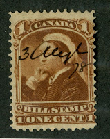
Thus the 3c Numeral with the overprint was issued first on July 31, 1899. The lettering of the surcharge as you can see is thin, the letters being well formed, with smooth edges, and a solid appearance.
However, the 3c Numeral stamps were quickly exhausted, after 2,745,000 stamps were overprinted. So on August 10, 1899, stocks of the 3c Maple Leaf were also surcharged:

Within just under 2 weeks, the 2c carmine Numeral was issued and so the need for these stamps had ended. Consequently, just 1,375,000 of these stamps were overprinted. It is thus very strange that this stamp is valued at just over half of the Numeral stamp (in fine and very fine mint anyway), since there were just over half as many stamps issued. In used condition it is worth more, as it should be.
An interesting observation concerns the overprint itself. If you look at the scan of the 2c Maple Leaf stamp above, you will see that the letters are thicker and the edges are not smooth. This is because the typeface for the surcharge wore very quickly as the issue was produced, with the result that the letters got thicker and began to show pitting and other signs of wear.
Points of Interest
Although very brief, this issue is ideal for a specialist whose means are somewhat limited, but who still wishes to form a specialist collection of Queen Victorian material. There are several points of interest that a specialist can pursue:
1. Colour shades of the stamps
2. Setting varieties of the surcharge
3. Studying the effect of wear on the surcharge
4. Multiples and plate blocks
5. Postal history
6. Cancellations including precancels
7. Die proofs
I will now discuss each one in detail:
Colour Varieties
The basic 3c stamps for both issues exhibit a wide variety of shades of carmine, rose and scarlet. Below is a list of the shades I have seen with some photos of the varieties on the stamps


Bright rose carmine Pale carmine


Deep bright carmine Pale rose carmine


Carmine Deep bright rose carmine
The shade differences are subtle, but I suspect that if you collect them in large multiples, they will be much more obvious. The shades that I have seen so far on the stamps are as follows:
Maple Leaf:
1. Carmine (very common)
2. Pale carmine
3. Rose carmine
4. Bright rose-carmine
5. Rose
6. Carmine-rose
7. Deep bright carmine (very common)
Numeral:
1. Deep carmine-red
2. Deep rose-scarlet
3. Deep bright carmine-red
4. Rose-carmine
5. Dull carmine-red
6. Bright carmine red (most common)
Unitrade makes no distinction between these, calling all the stamps simply "carmine". I'm sure that the above list is by no means exhaustive and that there are other shades besides what I have listed there. Some of them are clearly more common than others, as I have indicated in parentheses. A study aimed at establishing the relative scarcity of the shades could be a very rewarding study project.
Setting Varieties
The normal spacing between the surcharges on adjacent stamps is 7mm as shown between the first and second columns of the above block. However, a narrow spacing variety exists in which the spacing is 4mm. It just so happens that this variety is present in the above block between columns 3 and 4. Normally the variety is collected as a strip of three, so that the difference can be readily seen. However, it can also be collected in pairs, given that the dimensions of both types are now well known.
In addition, some stamps are known with inverted surcharge, and with the surcharge on the back of the stamp:

There is some disagreement among specialists as to the authenticity of these errors. I'm not exactly sure why, since the characteristics of the overprint on these stamps exactly matches the other issued stamps. I'm guessing that it is because there is no official record of their discovery. However, regardless of whether or not they are genuine, they are nonetheless interesting in my opinion.
Studying the Effect of Wear on the Surcharge
To my knowledge, I have never seen anything written on the surcharge itself, although I have noticed very clear varieties in both the thickness and clarity of the letters. I have also noticed that nearly all of the Numeral stamps have very thin, clear letters, while most of the Maple Leaf stamps have thicker letters that are sometimes very thick, and nearly all show signs of wear:


Multiples and Plate Blocks
I have seen very few used multiples, so I must conclude that they are quite scarce and definitely worth pursuing. Mint multiples are not to difficult to come by, but plate blocks are scarce, and form a very interesting topic. Why? Well this issue was made from remainders of the regular 3c stamps, which were printed from many plates. So it is unlikely that stamps exist from every single plate that was used to print the 3c stamps. However, there is no guide book that I know of that definitively lists all the plate blocks of this issue that exist. Below is a plate block of 8 from plate 6 of the Maple Leaf stamp that sold for $180 in a recent Spink auction:
$180 is well within the budget of most collectors and hard to beat for nice pristine material like this. A collection that includes one of each plate in existence for both stamps would be a really nice collection.
Postal History
The range of covers that exist is much the same as for other sets of this period, but of added interest would be to try to find covers that have these stamps used in the period during which no other 2c stamps were available which would have been:
July 31-August 10, 1899 for the Numeral stamp, and
August 10-August 22, 1899 for the Maple leaf stamp.
I would expect that first day covers of this issue would be rare, but again I know of no published studies that have been done to determine and document the scarcity of such material.
Cancels and Precancels
There was one style of precancel used for each of the two stamps, so the range of precancels that can be collected is fairly limited. However, it may be possible to find inverted or sideways precancels.
The range of CDS, Squared circle and split ring cancels that can be collected on this is vast. In addition, you can collect Bickerdike flag cancels on multiples large enough to show the full cancel, as well as double circle Orb CDS cancels.
I have not seen many cork cancels, as their use had more or less fallen out of favour by now. However, there are plenty of barred grid duplex cancels to be found on this issue.
Again, an interesting project might be to assemble a calendar collection of dated copies that fall within the above date ranges, which is 11 days for the Numeral stamp and 13 days for the Maple leaf stamp. Multiply that across different Canadian cities and you could have quite an extensive collection by the time you are done.
Die Proofs
I do not know of any proof material for this issue. That being said, it was not accepted procedure for the post office to issue and produce anything without at least making a proof of it for review and approval. So there must exist somewhere at least a die proof of the surcharge, IF the style of lettering was the first one considered. I would expect that several styles were considered before this one was accepted as the one to be used. If this is the case, then there should be some essays somewhere of the rejected styles. Seeking these out could be extremely rewarding, as unknown material comes on the philatelic market all the time.
tores.ebay.ca/Pristine-Canadian-Stamps/1899-Surcharges-/_i.html?_fsub=12754743013&_sid=1009259433&_trksid=p4634.c0.m322

Comments
Post a Comment