The Issues of 1927-1952 A Highly Neglected Period of Canadian Philately
Before I move on with more posts about the Admiral Issue, I wanted to talk a little bit today about the material issued between 1927 and 1952, as I have for the past month, been organizing my stock of this period and getting it ready for sale. What has struck me the most as I have worked on this material, is just how much variation there is to interest a specialist, and how most of this detail has been ignored by the standard stamp catalogues. This is a pity because to look at the catalogue listings, one can easily come to the conclusion that the issues are straightforward, and that there is little to interest a specialist. Consequently, I believe that very little has been done with this material compared to the popular Large Queens, Small Queens and Admirals.
I'm not sure why this is the case and by the time you have finished reading this post, I hope you will agree with me that it doesn't make a whole lot of sense. I suspect that there is a perception among philatelists that most of the shade, paper and gum varieties are just random variations that are not collectible and not worthy of inclusion in the catalogue listings. However, this does not make sense when we look at the treatment afforded to modern issues like the 1972-77 Caricature Issue, or the 1967-73 Centennial Issue. On these issues, the catalogues now differentiate between completely smooth chalk-surfaced paper, chalk surfaced paper with slight vertical ribbing on the face and chalk surfaced paper with slight horizontal ribbing on the face. This is a level of detail that 20 years ago would have been unthinkable to include in even a specialized catalogue. Most of these varieties were known in specialist circles even back then. But it has taken the better part of three decades for them to become mainstream and popular enough for the catalogue editors to include listings and prices for them.
What convinces me though that the shade, paper and gum varieties are not random and are very much worth collecting is the fact that:
1. There exist, throughout the period, commemorative issues that are known to have had only one print run. On these issues, the shades, paper and gum show almost no variation at all. This is significant because it proves, that the British American Bank Note Company (BABN) and the Canadian Bank Note Company (CBN) were very capable by this time of ensuring a high degree of consistency within a print run that included millions of stamps. If this wasn't the case, then we would see the same haphazard range of varieties on ALL issues, not just the definitives.
2. While a lot of the differences are subtle, there is a high degree of consistency in them and they come up over and over again on different issues. The uniformity of the commemorative issues makes them invaluable to a specialist because now the specialist can use them as a reference source to assign an approximate date range to definitives that share similar characteristics.
The nice thing about collecting this period at a specialized level is the fact that the variations are not infinite and that there is a high degree of consistency. For example, the 3c Small Queen has an almost infinite range of papers and shades. Sure, large numbers can be sorted into groups of papers and shades that are all highly similar, but will not, for the most part, be exactly the same. That aspect of them appeals to a collector who likes collecting in a very open-ended fashion and isn't concerned about attaining completion in his or her chosen field. However, some collectors like to have defined boundaries within which to collect and that can actually be completed. With this period it is possible to achieve completion, while at the same time challenging yourself with a manageable range of varieties.
So at a broad level, what are the main areas of interest in this period, and how can a collection be formed around these points of interest? In my opinion, after examining several thousand mint stamps from this period, the big points of interest are:
- Variations in colour shades.
- Variations in paper.
- Variations in gum, both with respect to colour and sheen.
- Variations in the dies used for the booklet covers.
- Spacing varieties on coil stamps.
- Die variations in the OHMS perfins and orientation of the perfin itself.
- Varieties in the thickness and positioning of letters in the OHMS and G overprints.
- Plate and die flaws.
- Plate blocks.
Lets take a look at each one in more detail. After I am finished with the Admiral Issue, I will write detailed posts on each issue that will go over these points again as they relate to each issue. But for now, lets take a look at each of these areas for the 25 year period as a whole.
Variations in Shade
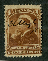
Most of the definitives, and all the postage dues from this period exist with shade variations. There are a few exceptions, but generally you can find between 2-6 varieties on almost every definitive stamp. Most of these are not as outstanding as some of the more prominent shade varieties on the classic pre-1897 issues. However, this is to be expected because the level of precision inherent in the printing process had improved leaps and bounds by this time. Despite this, there are many worthwhile varieties that can be found that are easily distinguishable as singles, and certainly as blocks. You can even find shade variations on some of the commemorative issues as well. The most notable example I can think of right now is the 1934 Founding of New Brunswick Issue that exists in a bright lake brown that is more red than brown and in a bright red-brown that is more brown than red. These two colours are completely different and are every bit as spectacular as some of the shades in the classic period. Another commemorative issue that shows some variation is the 1935 Silver Jubilee Issue, where you can find worthy variations on all values.
The use of the Stanley Gibbons colour key becomes invaluable in this regard in terms of identifying the shades. It is a matter of personal preference as to how many shade varieties you want to include in your collection. My rule of thumb is to include all the varieties that correspond to a different swatch on the colour key and can be distinguished according to intensity or the addition of another colour. For example, many of the blue stamps during this period are actually variations of Prussian blue and steel blue. There are very few pure dark blues or blues during this period. So for a shade like Prussian blue, I might distinguish between:
- Bright Prussian blue (saturated)
- Dull Prussian blue (addition of greyscale)
- Light Prussian blue (addition of white to the colour)
- Pale Prussian blue (less intense but nothing added to the pure colour)
- Deep Prussian blue (more intense than the pure colour but nothing added)
- Dark Prussian blue (addition of black to the pure colour)
where such variations exist, but no more detail than this. The good news is that for this period you generally won't find more detail than this, whereas in the classic period, for example, you could sort a 3c orange red Small Queen into bright, dull, light, pale, deep and dark and it still wouldn't be enough detail to adequately capture all the variations that exist.
What does become apparent as you look at the colour key names and the Unitrade catalogue colour names is how inaccurate the Unitrade catalogue colour names are. I already gave the example above for dark blue, but another example is the use of the name "Carmine". There are very few stamps that are truly carmine during this period. The closest one that comes to mind is the 4c Postes-Postage Issue, with all the other red stamps being variations of carmine-red, deep rose-red, scarlet or scarlet vermilion.
Variations in Paper
Close examination of the stamps issued during this period reveals that some of the issues exist with distinct variations in paper. The variations manifest themselves as:
- Differences in both the weave direction of the paper and how obvious the mesh pattern is to the naked eye when the stamp is viewed from the back or held up to a light source.
- Differences in the paper texture.
For the period from 1927-1934 the main difference that one finds is differences in how visible the mesh pattern is. Most of the stamps are printed on vertical wove paper during this period, with the 1934 New Brunswick Issue being a notable exception on horizontal wove paper. I have identified at least two basic types:
- Paper showing now clear mesh pattern unless held up to a strong light source.
- Paper showing a very clear mesh pattern when viewed from the back.
All the papers that I have seen during this period are smooth, so texture is not an issue, nor is thickness really that much of an issue.
However, starting with the Canadian Bank Note Company period from 1935-1952, there are both differences in weave, visibility of mesh and texture:
- The 1935-37 Dated Die Issue can be found with vertical wove paper that has clearly visible mesh, vertical wove with mesh that is only visible when held up to the light, horizontal wove paper, and horizontal wove paper with a ribbed texture.
- The 1937-42 Mufti Issue can be found with the same paper varieties as above, but in addition, a vertical ribbed paper can be found on the 10c Memorial Chamber definitive.
- The 1942-1949 War Issue can be found with the same paper varieties as above on the 1935-1937 issue, but in addition, the very last printings can be found on a smooth paper that shows no mesh pattern whatsoever, even when held up to the light.
- The 1946-51 Peace Issue can generally be found with the smooth no-mesh paper, and a horizontal wove paper that either shows light ribbing, distinct ribbing, or no ribbing. There is also a scarcer, thin paper that shows ribbing, and through which the design can be seen. Unitrade only lists this last type on the 14c and 7c values, but I suspect that it must exist on the other values as well.
- The 1950-1952 Natural Resources stamps can be found on the same range of papers as the Peace Issue, except for the thin paper.
- The 1949-1952 Postes Postage Issue can be found with the same range of papers as the Peace Issue, but there is also a thick, soft, ribbed paper, where the ribbing is very obvious on the face of the stamp. This paper continues in use for the early Elizabethan period and stamps on this paper often have ragged of short perforations due to the softness of the paper.
None of these variations are dealt with by Unitrade at all.
Variations in Gum
This is perhaps one of the most interesting aspects of these issues, which is mentioned in Unitrade, but not in any detail. There are clear variations in the type of gum used on the stamps printed between 1930 and 1952 that are clearly not due to climate or storage conditions. Indeed, many philatelists and dealers who are not familiar with Canadian material often erroneously describe many mint stamps as having "toned gum", not recognizing that some of the gums used were almost brown naturally.
For the BABN period, which lasted from 1930-1934, we see generally eight types of gum:
- A mottled, splotchy brownish yellow with a satin sheen.
- A smooth brownish yellow, or brownish cream that is very shiny.
- A deep yellowish cream with a stain sheen.
- A deep cream with a mottled appearance and a satin sheen.
- A transparent cream with a satin sheen.
- An opaque whitish cream with a satin sheen.
- A shiny cream gum showing vertical streaks used only on the low value rotary press stamps/
- A white gum showing bubbles and vertical streaks again used only on the low value rotary press stamps.
Examination of the gum found on the commemoratives during this period reveals that the gum used evolved over time:
- The mottled brownish yellow gum is only found on the 1932 Ottawa Conference Issue, so it is from before 1933.
- The smooth, brownish yellow, shiny gum is only found on some of the 1933 Grain Exhibition stamps.
- The deep yellowish cream, deep cream and transparent cream gums are found on the 1932 Ottawa Conference, 1933 UPU, Royal William, Grain Exhibition issues and some of the 1934 New Brunswick Issue. So it can be concluded that definitives airmails, special delivery stamps and postage dues with this gum are generally from 1932-1934.
- The opaque whitish cream gum is only found on the 1934 commemoratives, so again any definitives, postage dues, airmails and special delivery stamps with this gum are probably printed in 1934.
For the CBN period, we generally see ten types of gum again:
- Vertically streaky yellowish cream, with a stain sheen often found on the issues from 1935-1938.
- Smooth cream gum with a satin sheen found on the 1935-1938 issues.
- Mottled, smooth brownish yellow with a satin sheen found on the 1935-1938 issues.
- Smooth white gum found on the 1935-1938 issues.
- Shiny yellowish gum found on the 1935-1942 issues.
- Light cream gum with a satin sheen and finely crackly texture found on the 1938-1942 issues.
- Blotchy cream gum with a satin sheen found on some printings of the 1942 War issue and 1946 Peace Issue.
- Smooth shiny yellowish cream found on the 1946-51 issues
- Streaky cream gum with a satin sheen found on the 1946-1952 issues.
- Smooth yellowish cream gum that is extremely shiny, found on the 1950-1952 issues.
Most of the issues during this period will be found with as many as 3-4 types of gum. Like the previous period, the gum types evolved over time. The commemoratives issued during this period are generally confined to the 1947-1952 period, but we do have the 1937 Coronation and 1939 Royal Visit issues to provide some insight as to the gums that were in use in 1937 and 1939.
Dotted Dies Used on Booklet Covers
The booklets during this period were issued initially in English and French versions. Each booklet generally had a front cover and a back cover, which differed in design. Different dies were used to print the covers and Peter Harris has published a book identifying the different types. Generally the front covers exist in at least two versions each for the English and French versions, while in 1949, bilingual versions were also issued. However, these are usually only one cover type. The back covers were often printed from 4 different dies, or more in the case of the small "chewing gum" booklets. Every possible combination of front and back cover exists, so that there are 8 possible types for most English and French booklets. In addition, many of the booklets exist both with and without pages containing postal rate information, and when postal rates changed in 1943, many of the rate pages were surcharged or replaced with new rate information. Finally, the sizes of the staples used to make the booklets vary as well with 12 mm, 14 mm and 17 mm staples being possible. When you combine all these factors, a basic set of 5 or 6 booklets, can become a collection of 720 different booklets!(5 booklets x 2 languages x 8 cover types x 3 rate page types x 3 staple sizes). If you then factor in the paper and gum types that I just talked about above, that total can balloon up to over 2,000 different booklets!
Spacing and Other Varieties on Coil Stamps
The coil stamps issued during this period can be divided into three groups:
- The Scroll Issue coils printed by the CBN
- The BABN coils from the Arch and Medallion Issues.
- The remaining coils from 1935-1952 printed by the CBN.
The main varieties on the Scroll coils that one can collect would appear to be mainly precancels and paste-up pairs and strips. All of the coils can be collected in start and end strips, which are scarce. In the BABN period, one finds line pairs and strips, which are generally also jump strips as well. The normal spacing between impressions on these coils is between 2.5 mm and 3.25 mm, with most being 3 mm. On the line pairs and strips, the spacing is 3.5 mm. In the case of the Arch Issue, one finds the popular "Cockeyed King" varieties on the line pairs and strips.
Starting with the 1935 Dated die issue, the collecting of coils becomes much more interesting, with narrow and wide spacing strips being possible, jump strips, strips that show the cutting guidelines and plate flaws, as well as the usual range of papers and gums. Repair paste-ups also exist for virtually all the coils issued during this period as well, and these are generally quite scarce and desirable now.
Die Varieties on OHMS Perfins
This is beyond my expertise, so I won't go into all the different types here, but Unitrade does describe two basic types of perfin on the 4-hole types. On one type the seventh pin on the "S" is extended whereas on another type the seventh pin is not extended. Many of the issues during this period exist with both types. In addition the OHMS can be found horizontally, vertically reading down, vertically reading up, double punched, etc. The issues up to the War Issue can be found with the rare 5-hole OHMS pattern as well. Care has to be taken in collecting these, as many of these perfins have been faked.
Variations in the OHMS and G Overprints
This in my opinion is a very under-studied topic. I have noticed that there are definite differences in the thickness and size of the G's used in the G overprints. The position and spacing of these also varies as well. Over the last several years, varieties such as the Fishhook G and the blunt G are listed in Unitrade, as well as the "no period after S" varieties on the OHMS overprints. However, I wouldn't be surprised if many of these varieties exist on other stamps from the period and have yet to be discovered.
Plate and Die Flaws
This is the golden age of the plate flaws. The classic period was the golden age of the Re-Entry, but die to the durability of the printing plates used during this period re-entries are rare. However, there are a number of popular and prominent plate flaws listed in Unitrade:
- The extended mustache varieties on the Arch Issue.
- The cockeyed king varieties on the Arch Issue.
- The "broken E" on the 1932 Ottawa conference issue.
- The "scarface" and "burr over shoulder" on the 1934 Cartier issue.
- The "shilling mark" and "weeping princess" varieties on the 1935 Silver Jubilee issue.
- The "air" and "moulting wing" varieties on the 1935 airmail.
- The "narrow 1" and "damaged 2" varieties on the 1935 coils.
- The LL corner flaw on the 1949-52 Postes-postage coils.
In addition to the above, I have found other unlisted die flaws that are very similar to the shilling mark. A popular way to collect these is in blocks of 4 with three normal stamps and one with the flaw.
Plate Blocks
This is the golden age of plate blocks. It is a period where the plate block actually has philatelic significance and was not merely a collectible pushed aggressively on the public by the post office. Many plates were used to print the stamps of this period, with some stamps like the 1c and 4c War Issue having more than 30 plates each. The early blocks of this period are collected from the top centre of the sheet, but starting with the 1937 Mufti Issue, the plate inscriptions began to appear on the corners of the sheets and it is with this issue that the collecting of matched sets of corners becomes possible. When you factor in paper and gum differences, the number of possible blocks becomes staggering. In addition, most of the blocks during this period are not cheap: there is often a significant premium over the price of 4 mint singles for these. So assembling a complete collection is quite a challenge.
So in conclusion, if you collect only mint stamps there is enough material from any of the major definitive sets during this period to occupy you for years if not decades: issued stamps, plate blocks, complete sheets, booklets, OHMS perfins and the like. Even a seemingly innocuous set like the 1939 Royal Visit can be a huge challenge if you try to get all the possible plate blocks, full plate sheets, and the different 5 hole OHMS perfins. If you collect used, then you have a wonderful opportunity to assemble a collection of CDS town cancels, as the larger high value stamps take these cancels very nicely. It is my hope that collectors looking for a field in which to specialize will consider this period and not be put-off by the relative abundance of material on the market, but will see that instead as an unprecedented opportunity to build up comprehensive collections of very beautiful stamps for a price that will not break their budget.

Can not wait to read your analyses of the specialization possiblities of the stamps of this era. Does seem odd that the Late George V/George VI era has been rather neglected, considering how popular it has become in other areas of the Commonwealth. And the fact that especially the definitive issues of the 1930s are some of the most gorgeous stamps Canada has ever produced should make it an area ripe for study among collectors (I esp am fond of the Mufti issue low values, the image of George VI is just so iconic!)
ReplyDeleteThanks Gene, I am really looking forward to writing about my findings on here, as there is just so much to interest collectors - for every period of Canadian philately. I share your sentiment about the Mufti Low values and I have found that even the War Issue and the Postes-Postage issue has begun to grow on me.
DeleteReally Great and in depth summation of the 1927-1952 area, and I couldn't agree more, especially with the King George VI Mufti issues!
ReplyDeleteWhich brings me to an issue concerning my favourite Canada Stamp...namely C5 (Daedalus in flight).
The basic stamp itself is indeed listed as Red Brown, but I have a veritable plethora of shades of it in fact such as Dark Brown, Chocolate Brown, Brown, even Olive Brown, and within these, there exist shade variants such as Deep, Dark, Dull, and Bright, and so forth.
The only "Shade" Unitrade has listed other than Red Brown however is Yellow Brown (Sometimes referred to as the "Blonde Flyer")...and that brings me to another issue with C5.
What's this business with Yellow Brown being listed in Unitrade at all? This colour just plain does NOT exist with this stamp, or at least in the way that say Canada 27a Large Queen Victoria, 39 Small Queen Victoria, 55 Diamond Jubilee Issue, 108b King George V Admiral Issue, 118b King George V Admiral Issue, 129ii Perf. 8 Horizontal Coil of King George V Admiral Issue, or USA 205, 209 in Yellow Brown,234 Columbian in Yellow Brown,299 Pan-American Exposition,303 in Yellow Brown,503 in Yellow Brown,553 Warren G. Harding, 556 Martha Washington, 576 Warren G. Harding, 585 Martha Washington, 601 Martha Washington, 605 Warren G. Harding, 631 Warren G. Harding, 633 Warren G. Harding, 636 Martha Washington, etc. all do.
I've seen literally thousands of these both Mint and Used, and yet...No Yellow Brown!
I've even bought 2 online from a reputable Stamp Dealer whom I know well, and he says they're Yellow Brown, but again, not the Yellow Brown that I'm used to seeing!
What is the reasoning behind this Yellow Brown shade in Unitrade nonsense?
Does anyone else know what I'm talking about here?
Eustaquio, this is one of my biggest complaints about Unitrade's colour names: their inconsistency. Unitrade lists a shade of this as yellow brown, when in fact it is probably just plain old brown without the red. Some person looked at the shade and thought: "this looks really yellowish". Compared to the red brown, they would be right, but the problem is nobody bothered to compare it to an actual yellow brown stamp like the 6c jubilee, or 6c maple leaf etc. if they had, they would have realized that it is not yellow at all. So they name colours on a relative appearance basis, rather than an absolute one.
ReplyDeleteI'm really surprised to hear that you have seen this stamp in olive brown. I have never seen that shade on C5 and would love to see it.
Well, Ive just scanned the Olive Brown C5 stamp, but I can't find a place to insert it here in this blog box!
DeleteDr. Eustaquio Kirby, D.P.T.
The scan of Canada C5 in the Olive Brown shade was sent to your message box on eBay, as I couldn't find a way to put it into the blog box here.
DeleteThanks very much for showing me this shade. It is very interesting!
ReplyDeleteChris
You're welcome.
DeleteIf I find another one of these in Mint or Used in this Olive Brown shade (I have a used one as well), I'll send it your way.