The Postes-Postage Issue of 1949-1953
Overview
After World War II had ended, there was a strong desire to modernize stamp design. In the late 1940's the prevailing design trend was minimalist with sleek lines. This trend was very prevalent in the architecture of the period, and in product design. So it made sense that this design aesthetic would extend into the stamp realm as well. Indeed if one looks at the stamps of many countries issued during this time, one will see that many of them share this simplicity in common. Thus, this issue may not be for you if you like very ornate designs, with fancy scrollwork. However, without the distracting influence of all these embellishments, it stands as a showcase of engraver's skill in executing flawlessly five separate portraits of King George VI, all from photographs. The resemblance to the actual king is quite striking, and much better than what was later accomplished on the Queen Elizabeth II Karsh Issue.
This issue is much more straightforward than any issue that came either before it, or after it, which makes it ideal for a collector with simpler tastes who seeks a set that they can collect in a more controlled fashion on a limited budget. Except for the proof material, a few scarcer coils and a few scarcer plate blocks, all of the material for this issue is inexpensive and readily available.
One point of interest with this issue is that the stamps were originally designed without the words "Postes-Postage" in the design. I actually prefer the original design and am of the opinion that there is a simple, uncluttered elegance to the designs that is diminished somewhat when the words "Postes Postage" were added. The post office department decided to reject the designs in favour of a revised version that contained the bilingual inscriptions, but not before considerable quantities had been printed of all values, plus the 1c and 3c coil stamps. Initially, the post office department had intended to destroy the offending stamps, but instead they were held back and released after the revised designs had been in use for several months.
Finally, in 1951 the colours of the 2c and 4c values were changed from sepia and carmine to olive green and orange.
The set was designed by Herman Herbert Schwartz from photographs taken of King George VI by Dorothy Wilding. All values were engraved by John Hay.
The Stamp Designs, Quantities and Dates of Issue
The Revised Designs


The Unrevised Designs


Points of Interest
For such a small issue, there is a surprising amount of scope around which to form a specialized collection:
All the above aspects will be discussed in the remainder of this post.
Shade Varieties
This issue displays a somewhat disappointing regularity of colour, with very few if any shades to be found at all on the 1c, 2c sepia and 5c blue. However, the 3c rose violet and 2c olive green display a decent range of shades, and even both 4c stamps exist in at least 2 shades each.
2c Olive Green

This colour varies both in terms of its intensity as well as the balance between the amount of olive, and the amount of brown in the mix. The stamp on the left contains more olive than brown, while the stamp on the right contains more brown than olive. The two middle stamps contain an equal mix of olive and brown, but the left stamp is yellower than the stamp to its right.
3c Rose Violet


Paper and Gum Varieties
There are at least four different paper and gum type combinations on this issue:

The first type of paper is shown on the left stamp, while the second type is shown on the right stamp. Notice how much more fibrous the perforations on the right stamp are as compared to the one on the left. This a distinguishing characteristics of the later ribbed paper.


Plate blocks


Booklets and Booklet Panes
This issue continued to use the English and Bilingual covers for booklets, that were introduced during the War Issue. Although there are fewer varieties, compared to the War Issue, there are still a considerable number of them, once die type differences are factored in. Unlike the War Issue, there were no French booklets produced. Also, this was the first issue to experiment with the stitching of the booklet covers together instead of stapling. This was done on both booklets of the 4c value in carmine and orange. The staple sizes on nearly all the booklets of this issue is 17 mm, so this is one aspect that reduces the complexity of the booklet collecting to a more manageable level with this issue. The 4c orange chewing gum booklet is known with a 12 mm staple, though this is very rare. Chewing gum booklets, which had proven to be popular with the public, continued to be issued with this series as well.
There five basic booklet formats that were produced for this issue, each of which sold for 25c:


A typical 3c rose violet pane of 4 plus 2 labels. This one clearly shows the horizontal ribbing on the two blank labels.

Before I get into the specific booklets and varieties for this issue, lets start by taking a look at the various booklet covers and becoming familiar with them, as small differences in these are what lie behind the complexity of the booklets printed for this issue. I will start with the English covers, and then the bilingual covers.
Peter Harris, a well respected, and as far as I know, retired British dealer, has identified a number of different dies that were used to print the various front and back covers that were used for the booklets of this period. What makes the collecting of booklets from this period relatively complex, is that there were several dies used for each of the front and back covers, and in many cases, several permutations and combinations are possible for both English and bilingual covers. Harris wrote and published a book titled "Canadian Stamp Booklets, Dotted Cover Dies 1935-1955". It is available from most stamp dealers, and Phil Banser, the philatelic literature dealer in the US likely sells it also. So I do not wish to plagiarize his book by including scans of all his illustrations. However, I will provide a summary of the different types and describe how they can be identified. But if you want to see the easy to follow illustrations, you should obtain a copy of his book.
Now for the covers...
English Covers
Front Covers


All four of these types are known on both the 4c carmine and 4c orange English chewing gum booklets.


The first coil stamps to be issued for this issue were the 1c and 3c in the unrevised design. A few months later, the each value of the revised design was issued, except for the 5c, and then in 1951, both colour changes were also issued. The perforation for all coil stamps issued was 9.5 vertical.


OHMS Perfins and Private Perfins

This is the last issue to have any OHMS perfins. Only the 2c sepia and 3c rose violet revised design were so perforated. All genuine perfins are the second type with the wider "O" and with the seventh pin from the top of the "S" lining up vertically with the with the first and sixth holes.
In addition to the usual 8 positions that all three of these perforated initials can be found in, the initials can also be found with various errors like double perforating, as in the example shown above. For those of you who have not read my other posts in which I talk about the perforated official stamps, the 8 different positions that I am referring to are:
O.H.M.S Overprints and G Overprints
This was the first and only low value definitive issue to exist with both OHMS and G Overprints. The O.H.M.S overprints exist with some of the same narrow spacing varieties and missing period varieties as on the previous Peace Issue as well, though they are much more affordable on this issue.
OHMS Overprints
In late 1949, the Post Office Department decided to replace the method of production of the official stamps, from perforating to overprinting. An overprint forme was produced that applied the overprint "O.H.M.S." in a straight line across all five revised designs, though the 2c olive green and 4c orange are not found with this overprint. The spacing between the overprint between stamps in the horizontal direction was the same between all the stamps in columns 2 through 10, but was narrower between the stamps in column 1 and those in column 2 for the 1c, 4c and 5c. Thus one popular way to collect these, is in what is called "narrow spacing strips of three, which will show the normal spacing between the second and third stamps, and the narrower spacing between the first and second stamps. An example of a narrow spacing strip is shown below:

Note how last period of the the "S" on the left hand stamp is centered above the King's left shoulder, whereas on the other two stamps, it is at the top of his jacket lapel. In other words, the space between the overprints on the first two stamps is narrower than between the second and third stamps.
There also exists a "no period after s" variety that occurs on only one position, of the sheet. This variety is quite rare and desired by specialists. On this issue, it occurs on:
One final caution about these overprints is that in recent years, forgers have been faking them and using laser printing to overprint inexpensive sheets of stamps with the overprint. On this issue, it is less prevalent on the basic stamps, but for the plate blocks and the errors, as well as the narrow spacing varieties, care must be taken. There are several things to be on the lookout for in this regard:
1. The ink of the originals should be shiny and jet black. Dull ink is very likely to have come from a fake.
2. The left vertical bar of the "M" is much thinner than the right bar. On the forgeries the left and right bars often appear thick.
3. The action of overprinting the original stamps often left a light imprint of the overprint in the gum, so that you can just make out the overprint from the gummed side of genuine stamps. This will not be the case on the forgeries, which will be flat on the gummed side, with no sign of the overprint. However, this by itself is not a fail-safe test, as I have seen genuine stamps where no imprint of the overprint is visible in the gum. So to be certain, you really have to be familiar with the appearance of the genuine overprint:
G Overprints

The G overprint was introduced in 1950 to replace the O.H.M.S overprint as part of the ongoing efforts to make stamp inscriptions bilingual. Like the O.H.M.S. overprint, the G overprint is found on all five values, and the two 1951 colour changes. The genuine overprint, like the OHMS overprint uses similar ink, and often leaves an impression in the gum. The font is very distinct, and is known to collectors as the Casson font. Its distinguishing characteristic is that the top and bottom of the G are narrower than the sides, and there is a full horizontal cross stroke, as well as a barbed serif at the top of the G where it is open. The other characteristics are that the height and width are both 4 mm.
On all values except for the 5c, the G is usually located to the right of the King, and on the 5c it is usually to the King's left. There is a "misplaced G" variety of the 5c, in which the G is located to the King's right, as with the other values.
Although this overprints has been extensively forged, on the earlier Peace Issue, forgeries are not really an issue on these, except possibly on some of the plate blocks, where the unoverprinted blocks are so much cheaper, and on the misplace G variety of the 5c. They are usually made in a dull black ink and the letters are either the wrong proportions, of they lack the features described here. In recent years, fakers have been forging these overprints on the less expensive values using mint sheets or plate blocks. They have done this with laser printing. The easiest way to detect these again is that the sizes will be off and the ink will appear different.
Like the OHMS overprints, these can also be collected in plate blocks:

Notice how the horizontal crossbar of the G is almost entirely missing on the upper right stamp.
Proof Material

The postal stationery continued to use the same designs as the Mufti Issue. The major difference is that the dies, starting in 1943, incorporated the date, which makes them easy to distinguish from the earlier printings. I have already covered the basic types under the War Issue, though some of the colours are most likely to really be part of this issue rather than the War Issue:
Also, several items exist surcharged, and generally those items surcharged 2c will fall into this period.
The same range of #8 and #10 envelopes continued to be offered as before, and the postcards bore similar inscriptions to the earlier issues.
Pre-Stamped Envelopes
The envelopes issued during this period are all printed using the offset method, rather than typography. The date "19" and "43" appear in the lower corners instead of "19" and "38". The veins inside the leaf are weak, falling short of the outlines of the leaf. There is also a very small dot inside the "A" of "Postage".
The following #8 envelopes exist:


In addition to the wide variety of first day covers that can be found for this issue, there are many ways that one can approach the collecting of the postal history:

The last aspect of this issue are the precancels. This is another area that can get quite complicated, especially when you get into errors. There are many styles of precancels ranging from three sets of parallel horizontal bars, to numbers within 2 sets of bars. Each municipality had its own numeric code assigned to it, and some of the smaller towns are quite scarce. The premier reference work for these, is of course the "Walburn Specialized catalogue of Canadian Precancels". However, I will give a brief summary here of which values are known precancelled, and how many different styles are known to exist. Please bear in mind though, that any given style can exist inverted, badly slanted, doubled, etc. These are worth a considerable premium of course, over the basic Unitrade values. Also note that Unitrade generally only lists precancels in used condition, that is to say without gum. However, just as is the case with the later Elizabethan issues, it should, at least in theory, be possible to collect these in mint condition, with full gum, as well as in warning strips. A warning strip is a large block, usually either from the top of the sheet, or the sides. The selvage of these blocks would contain a warning message to the effect that the stamps were only to be used as authorized. The reason was that precancels were only sold by the P.O. to certain organizations or businesses, by the sheet, at a discount from face value. They were not available to the general public, and misuse by the public was actually illegal.
I have never actually seen any warning strip earlier than the 1953 Karsh issue, so unfortunately I cannot even describe what they would look like on this issue, if they do in fact exist.
The following values from this issue are known precancelled:
After World War II had ended, there was a strong desire to modernize stamp design. In the late 1940's the prevailing design trend was minimalist with sleek lines. This trend was very prevalent in the architecture of the period, and in product design. So it made sense that this design aesthetic would extend into the stamp realm as well. Indeed if one looks at the stamps of many countries issued during this time, one will see that many of them share this simplicity in common. Thus, this issue may not be for you if you like very ornate designs, with fancy scrollwork. However, without the distracting influence of all these embellishments, it stands as a showcase of engraver's skill in executing flawlessly five separate portraits of King George VI, all from photographs. The resemblance to the actual king is quite striking, and much better than what was later accomplished on the Queen Elizabeth II Karsh Issue.
This issue is much more straightforward than any issue that came either before it, or after it, which makes it ideal for a collector with simpler tastes who seeks a set that they can collect in a more controlled fashion on a limited budget. Except for the proof material, a few scarcer coils and a few scarcer plate blocks, all of the material for this issue is inexpensive and readily available.
One point of interest with this issue is that the stamps were originally designed without the words "Postes-Postage" in the design. I actually prefer the original design and am of the opinion that there is a simple, uncluttered elegance to the designs that is diminished somewhat when the words "Postes Postage" were added. The post office department decided to reject the designs in favour of a revised version that contained the bilingual inscriptions, but not before considerable quantities had been printed of all values, plus the 1c and 3c coil stamps. Initially, the post office department had intended to destroy the offending stamps, but instead they were held back and released after the revised designs had been in use for several months.
Finally, in 1951 the colours of the 2c and 4c values were changed from sepia and carmine to olive green and orange.
The set was designed by Herman Herbert Schwartz from photographs taken of King George VI by Dorothy Wilding. All values were engraved by John Hay.
The Stamp Designs, Quantities and Dates of Issue
The Revised Designs

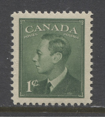
1c green.
Sheet stamps issued: November 15, 1949.
Replaced: May 1, 1953.
Booklet stamps issued: May 18, 1950.
Replaced: August 12, 1953.
Coils issued: May 18, 1950.
Not replaced.
803,000,000 sheet stamps.
7,332,075 booklet stamps.
8,675,000 coil stamps.

2c sepia.
Sheet stamps issued: November 15, 1949.
Replaced: July 25, 1951.
Coils issued: May 18, 1950.
Replaced: October 9, 1951.
202,000,000 sheet stamps.
3,195,000 coil stamps.

2c olive green.
Sheet stamps issued: July 25, 1951.
Replaced: May 1, 1953.
Coil stamps issued: October 9, 1951.
Replaced: July 30, 1953.
653,000,000 sheet stamps.
7,332,000 coil stamps.

3c rose-violet.
Sheet stamps issued: November 15, 1949.
Replaced: May 1, 1953.
Booklet stamps issued: April 12, 1950 and May 18, 1950.
Replaced: July 17, 1953 & August 12, 1953.
Coil stamps issued: May 18, 1950.
Replaced: July 27, 1953.
1,357,000,000 sheet stamps.
15,548,075 booklet stamps.
26,256,000 coil stamps.

4c carmine.
Sheet stamps issued: November 15, 1949.
Replaced: May 1, 1953.
Booklet stamps issued: May 5, 1950 & May 18, 1950.
Replaced: June 2, 1951 & October 25, 1951.
Coil stamps issued: April 20, 1950.
Replaced: November 27, 1951.
710,000,000 sheet stamps.
41,550,075 booklet stamps.
10,980,000 coil stamps.

4c orange.
Sheet stamps issued: July 25, 1951.
Replaced: May 1, 1953.
Booklet stamps issued: June 2, 1951 & October 25, 1951.
Replaced: July 6, 1953 & August 12, 1953.
Coil stamps issued: November 27, 1951.
Replaced: September 3, 1953.
791,000,000 sheet stamps.
44,866,275 booklet stamps.

5c blue.
Issued: November 15, 1949.
Replaced: May 1, 1953.
95,000,000 stamps.

1c green.
Issued: January 19, 1950.
84,000,000 stamps.

2c sepia.
Issued: January 19, 1950.
10,200,000 stamps.

3c rose-violet.
Issued: January 19, 1950.
101,300,000 stamps.

4c carmine.
Issued: January 19, 1950.
101,100,000 stamps.

5c deep blue.
Issued: January 19, 1950.
5,000,000 stamps.
Points of Interest
For such a small issue, there is a surprising amount of scope around which to form a specialized collection:
- Shade varieties.
- Paper and gum varieties.
- Plate blocks.
- Booklets and booklet panes.
- OHMS perfins and private perfins.
- OHMS overprints and G overprints.
- Proof material.
- Postal stationery.
- First Day Covers.
- Postal History.
- Cancellations.
- Precancels.
All the above aspects will be discussed in the remainder of this post.
Shade Varieties
This issue displays a somewhat disappointing regularity of colour, with very few if any shades to be found at all on the 1c, 2c sepia and 5c blue. However, the 3c rose violet and 2c olive green display a decent range of shades, and even both 4c stamps exist in at least 2 shades each.
2c Olive Green

3c Rose Violet

This colour varies from a very pale rose-violet, to true rose violet on the one hand, and pale claret and deep claret on the other.
4c Shades
I don't have examples to show here at the moment, but the two basic shades of the 4c carmine are the deep carmine red, which you can see if you look at the booklet pane of 6 that I have included further on, and then a bluish carmine shade that is cold in appearance. The orange also varies from a rich, bright, vibrant, warm orange, to a cold, pale orange.
The scan below shows two shades of the 4c orange, with the deeper orange on the right, and the paler, cooler orange on the left:

Paper and Gum Varieties
There are at least four different paper and gum type combinations on this issue:
- A smooth cream wove paper, showing no visible mesh or ribbing, and with slightly streaky cream gum that has a matte sheen.
- A white wove paper that is visibly horizontally ribbed on the face, with smooth cream gum that has a semi-gloss, or glossy sheen.
- A white wove paper that has the cream gum with a semi-gloss sheen, but no visible ribbing on the face.
- A thinner white wove that shows clear horizontal ribbing, and cream gum with a semi-gloss sheen.
Generally, the paper and gum follow a progression from the first type in late 1949 and early 1950, to the third type in 1950 and early 1951, and finally, the second and fourth types in late 1951 through 1953. I would expect that most, if not all values of the revised designs can be found with all four types, whereas the unrevised designs are generally found with the first type only.

The first type of paper is shown on the left stamp, while the second type is shown on the right stamp. Notice how much more fibrous the perforations on the right stamp are as compared to the one on the left. This a distinguishing characteristics of the later ribbed paper.

This scan shows the gum associated with both these paper types. As you can see, the gum and paper of the stamp on ribbed paper is much brighter and whiter than those with satin gum.

This scan shows the back of a plate block printed on the third type of paper. The gum is smooth, creamy and shows no ribbing.
The next two scans show the fourth type of paper. It is has very distinct horizontal ribbing, while being noticeably thinner than the other papers.

Here you can see the ribbing very clearly in the margins of this plate block.

The gum on this paper has the same colouring as the smooth paper with satin gum, but the semi-gloss sheen of the whiter gum.

A decent number of plates were used to print these stamps, with all values being printed from at least 2 plates, and may with several more. There is a very significant number of plate blocks required to form a complete collection, once you factor in the OHMS overprints, perfins, and G overprints. However, here I will summarize just the basic blocks without overprint:
- 1c green revised design - plates 1-2, 4-9 plus UL cracked plate for plate 5 - 33 blocks.
- 2c sepia revised design - plates 1-4 - 16 blocks.
- 3c rose-violet revised design - plates 1-14 plus cracked plates on plates 4, 9-11 - 62 blocks.
- 4c carmine revised design - plates 1-11 plus cracked plates for plates 6 &9 - 46 blocks.
- 5c blue revised design - plates 1-3 - 12 blocks.
- 1c green unrevised design - plates 1-2 - 8 blocks.
- 2c sepia unrevised design - plates 1-2 - 8 blocks.
- 3c rose-violet unrevised design - plates 1-2 - 8 blocks.
- 4c dark carmine unrevised design - plates 1-2 - 8 blocks.
- 5c blue unrevised design - plates 1-2 - 8 blocks.
- 2c olive green - plates 3-8 - 24 blocks.
- 4c orange - plate 6, 11-15, 17-18 - 32 blocks. The plate 6 blocks are all very scarce.
So without taking into account variations in paper, shade and gum, or the overprints there are 265 different plate blocks required to form a complete collection of this issue. If you display 4 blocks on a page, then it will take almost 67 pages to display them all.
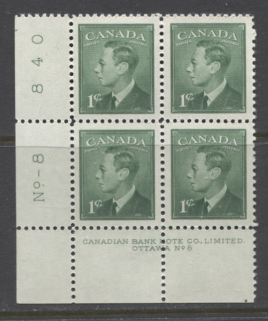
Order Numbers

Like the other issues printed by the Canadian Bank Note Company, the lower left plate blocks contain the plate number, and a printing order umber in the left selvage tab reading upwards. I have not seen enough plate blocks to be able to list all known order numbers, but here is what I have seen so far:
- 1c green plate 8 - 840 - I have seen examples with faint shadow numerals that indicate erasure and re-placement of the numerals.
- 3c rose violet plate 5 - 541.
- 3c rose violet plate 8 - 968.
- 3c rose violet plate 14 - 1080.
- 4c carmine plate 4 - 542.
- 5c blue plate 1 & plate 3- 543 (numerals 9.5 mm wide).
- 2c olive green plate 3 - 540.
- 4c orange plate 11 - 791.
- 4c orange plate 12 & 13 - 928.
- 4c orange plate 14 & 15 - 935.
- 4c orange plate 17 - 1066.
- 4c orange plate 18 - 1096.
Position Dots

On most issues printed by the Canadian Bank Note Company, the lower left and lower right blocks can be found with one or more coloured dots in the selvage. It is not known why these dots were placed in the selvage, but different configurations have been found. A study would be needed to determine whether or not more than one dot configuration exists for both lower left and lower right positions.
Most lower right blocks show a single coloured dot below the "C" of "Canadian" of the inscription. Most lower left blocks will show a single coloured dot below the "D" of "Limited".
If you look at the scan of the lower left block above, you can see one dot in the lower selvage tab, just below the "D" of "Limited".
This issue continued to use the English and Bilingual covers for booklets, that were introduced during the War Issue. Although there are fewer varieties, compared to the War Issue, there are still a considerable number of them, once die type differences are factored in. Unlike the War Issue, there were no French booklets produced. Also, this was the first issue to experiment with the stitching of the booklet covers together instead of stapling. This was done on both booklets of the 4c value in carmine and orange. The staple sizes on nearly all the booklets of this issue is 17 mm, so this is one aspect that reduces the complexity of the booklet collecting to a more manageable level with this issue. The 4c orange chewing gum booklet is known with a 12 mm staple, though this is very rare. Chewing gum booklets, which had proven to be popular with the public, continued to be issued with this series as well.
There five basic booklet formats that were produced for this issue, each of which sold for 25c:
- 3c rose-violet in 2 panes of four stamps each, with 2 blank labels on each pane.
- 4c carmine in 1 pane of 6.
- 4c orange in 1 pane of 6.
- 1c green, 3c rose-violet and 4c carmine in 1 pane of 3 each.
- 1c green, 3c rose-violet and 4c orange in 1 pane of 3 each.
The scans below show examples of the booklet panes contained in these booklets:

A typical chewing gum booklet pane of 3.


An example of the 4c carmine stapled booklet pane of 6.
Before I get into the specific booklets and varieties for this issue, lets start by taking a look at the various booklet covers and becoming familiar with them, as small differences in these are what lie behind the complexity of the booklets printed for this issue. I will start with the English covers, and then the bilingual covers.
Peter Harris, a well respected, and as far as I know, retired British dealer, has identified a number of different dies that were used to print the various front and back covers that were used for the booklets of this period. What makes the collecting of booklets from this period relatively complex, is that there were several dies used for each of the front and back covers, and in many cases, several permutations and combinations are possible for both English and bilingual covers. Harris wrote and published a book titled "Canadian Stamp Booklets, Dotted Cover Dies 1935-1955". It is available from most stamp dealers, and Phil Banser, the philatelic literature dealer in the US likely sells it also. So I do not wish to plagiarize his book by including scans of all his illustrations. However, I will provide a summary of the different types and describe how they can be identified. But if you want to see the easy to follow illustrations, you should obtain a copy of his book.
Now for the covers...
English Covers
Front Covers

This is what Harris refers to as a type II front cover. It basically consists of the Canadian coat of arms surrounded by the words "Canada Postage", A description of the contents, and the price. For this issue, there were no green covers like the one shown above, instead:
- 3c rose-violet had a mauve cover.
- 4c carmine had a salmon-red cover.
- 4c orange had an orange cover.
Harris identifies two different dies for each of these covers, except for the four cent booklets, of which there is only one type. To identify these types, you have to look at the "P" of "Postage" on the cover. You will see that there are a number of dots inside the P. The number of dots inside the P and their arrangement will dictate what type of booklet cover you have. The different types can be summarized as follows:
- 3c rose-violet - One type has two dots in the P, while the other has three dots.
- 4c carmine & 4c orange - All have two dots inside the P.

This is the front cover that was used for the so called "chewing gum" booklets. Looking at the above scan, it is easy to see why they were referred to as chewing gum booklets. Harris refers to these as type IV front covers. He has identified no fewer than four different die types for these covers. To identify them you need to look carefully at the scroll containing the word "Postage" and then look at the dot pattern that lies directly below the P:
- One type has four dots arranged in an oblique square.
- A second type has five dots arranged to form a rectangle.
- A third type has three dots in the shape of a triangle, whose apex points to the right.
- The fourth type has three dots that form a triangle, whose apex points downwards.
Back Covers

This back cover type is referred to by Harris as a type C back cover. Again, the illustration above is from the War Issue, but the basic appearance is the same for this issue, except that the colour is different, and there is no space between "Post" and "Master". There are four dotted dies. To distinguish the 4 die types you have to look at the arrangement of the dots inside the concave upper left corner of the text panel:
- One type has 4 dots arranged in a convex arc.
- A second type has 8 dots arranged in a sideways "Y", pointing outwards.
- A third type has three dots arranged in a convex arc.
- The fourth type has 5 dots arranged in an "L" shape that encloses a triangle of three dots.
These covers can be found on the different booklets as follows:
- 3c rose-violet booklets - all four types, with both types of front cover.
- 4c carmine booklets - all four types, with one type of front cover.

Harris refers to this cover, as a Type E back cover. There are four die types which are the same as the type C covers discussed above. It is found on the following booklets:
- 3c rose-violet booklets - all four types, with both types of front cover.
- 4c carmine stapled booklet - all four types with one type of front cover.
- 4c carmine stitched booklet - all four types with one type of front cover.
- 4c orange booklet - all four types with one type of front cover, both stapled and stitched.

This back cover, used for the chewing gum booklets is referred to by Harris as a Type H cover. Like the front cover, Harris has identified 4 different die types. There is also an I type cover, which has exactly the same 4 die types, except that the text inside the panel reads "Avoid Loss Use Postal Money Orders". To distinguish the different die types for each type of cover, you need to look at the dot pattern of the dots just outside the bottom left of the text panel. These are hard to describe, but can be summarized as follows:
- The first type shows a large sideways "Y" opening outwards.
- The second type shows a cluster of three rows of dots that resemble a broad upward stroke.
- The third type as an almost completely random pattern.
- The fourth type is a pattern of three parallel horizontal rows of dots.
The type H covers are found on the 4c carmine chewing gum booklets that contained rate pages (to be discussed further) as follows:
- The type IVa and type IVd front covers are found with the third and fourth H types of back cover.
- The type IVb and IVc front covers are found with the first and second H types of back cover.
The type I covers are found on both the 4c carmine chewing gum booklets with no rate pages inside, and the 4c orange chewing gum booklets with no rate pages inside, as follows:
- The type IVa and type IVd front covers are found with the third and fourth I types of back cover.
- The type IVb and IVc front covers are found with the first and second I types of back cover.
Bilingual Covers
Front Covers


Rate Pages
Once you understand the differences in the booklet covers, the next aspect that contributes to the complexity of the booklets is the rate pages. A rate page is simply one of the two or three printed pages inside the booklet that contains information about the postage rates. Typically it will give the domestic airmail rate for the first two weight steps, and then the U.S rates for the first two weight steps as well. Typically, the standard convention is to refer to the rate page according to the rate on the last line of the rate page. So following that naming convention, the scan below shows a 7c & 6c rate page:

When the different cover types, staple sizes, stapled versus stitched, and rate pages versus no rate pages are taken into account, there are 119 different types of booklets:
Front Covers

This is the bilingual front cover found on the chewing gum booklets that were issued in bilingual form. Harris refers to these as type VI covers. There were no fewer than 15 different dies used for these. Of the 15 known dies, 14 have been reported on the 4c carmine chewing gum booklets that contain a rate page. On the 4c carmine chewing gum booklets that do not contain a rate page, only six of these dies have bee reported. The 4c orange chewing gum booklet with no rate pages and 17 mm staple is known with 10 of these dies. Finally, the 4c orange chewing gum booklet with 12 mm staple is only known with one front cover and one back cover type, and as stated earlier, it is very rare. The types are distinguished by the dot pattern to the left of the half circle at the top of the coat of arms.

This is an example of the bilingual front cover that was used for three different booklets:
- 3c rose violet booklets.
- 4c carmine stapled booklets.
- 4c orange stapled booklets
Harris refers to these as Type III front covers. In all three cases, he has identified two different die types of each:
- On the 3c booklets, you have to look at the "NE" of the word "Carnet". On one type, the E has a very thick serif between the "E" and the "N". On the second type, the "N" and the "E" are joined by a very thin serif.
- On the 4c stapled booklets you have to look at the upper inscription where it says "Timbres-Poste" and pay attention to the shape of the hyphen between those two words. On the first type, the hyphen is pointed, while on the second, it is squared off.
Back Covers

This is the back cover of the bilingual chewing gum booklet, which Harris refers to as type K. There is also a type L, which shares exactly the same die type characteristics, except that the text inside the box reads "Avoid Loss Use Postal Money Orders" on the left side of the panel, and then "Evitez Les Pertes Servez-Vous de Mandats de Poste" on the right. Harris has identified up to 15 different dies for each type, and these are distinguished by looking at the dot pattern to the left of the upper left corner of the text panel. The difference between these different dies is too difficult to describe here, so you will have to simply compare and contrast the booklets that you have, or refer to a copy of Harris's book that contains the full pictorial chart.
The 4c carmine chewing gum booklets containing a rate page are known with 14 of the 15 known die types, though most of these are only found with one type of front cover, though some are known with two types. In all, 20 different front cover and back cover combinations have been reported for this type. For the 4c carmine chewing gum booklet without a rate page, only five of the 15 dies have been reported. All of these except for one are known with only one front cover type, making for a total of 6 reported front and back cover combinations. The 4c orange chewing gum booklet is known with 9 of the reported 15 dies, with several having 2 different possible front covers, so that there are a total of 12 different front and back cover combinations known.
This concludes my discussion of the different cover types, and gives you some insight as to why the collecting of the booklets from this issue is still fairly complicated, though not to the same extent as the previous War Issue.
Rate Pages
Once you understand the differences in the booklet covers, the next aspect that contributes to the complexity of the booklets is the rate pages. A rate page is simply one of the two or three printed pages inside the booklet that contains information about the postage rates. Typically it will give the domestic airmail rate for the first two weight steps, and then the U.S rates for the first two weight steps as well. Typically, the standard convention is to refer to the rate page according to the rate on the last line of the rate page. So following that naming convention, the scan below shows a 7c & 6c rate page:

Not all of the booklets issued during the life of this issue contain a rate page. The following booklets exist with no rate page:
- 3c rose violet English and bilingual booklets.
- 4c carmine English and bilingual stapled booklets.
- 4c carmine stitched English booklets.
- All the 4c orange booklets only exist this way.
For those booklets that do have rate pages, the all the rates are the 7c and 5c US rates. Those are found on all of the basic booklets except those containing a 4c orange stamp i.e:
- 3c rose-violet English and bilingual booklets.
- 4c carmine English and bilingual booklets.
- 4c carmine English and bilingual chewing gum booklets.
Bringing It All Together
When the different cover types, staple sizes, stapled versus stitched, and rate pages versus no rate pages are taken into account, there are 119 different types of booklets:
- 24 different 3c rose violet booklets, including 16 different English booklets and 8 different bilingual booklets.
- 20 different 4c carmine booklets, including 12 different English booklets and 8 different bilingual booklets.
- 12 different 4c orange booklets, including 8 different English booklets and 4 different bilingual booklets.
- 42 different 4c carmine chewing gum booklets, including 16 different English, and 26 different bilingual booklets.
- 21 different 4c orange chewing gum booklets including 8 different English booklets and 13 different bilingual booklets.
Coil Stamps

In common with all coils printed by the Canadian Bank Note Company, there are several ways that these can be collected:
- Jump strips exist for all values.
- Wide and narrow spacing strips can be found for all values.
- Cutting guideline strips can also be found, though these are rare.
- Repair paste-up pairs or strips can be found for all values.
- Start and end strips of 4, plus 10 blank tabs exist for all. The strips that contain four stamps with 10 blanks are premium items and are much scarcer than the strips of 4, which consist of two stamps and two tabs.
- Shade, paper and gum variations are also possible.
- The 1c coils in both perforations exist pre-cancelled, with three sets of parallel, horizontal bars.
- The 3c claret perf. 9.5 coil has been reported in a strip of 4, that is partially imperforate vertically, so that the bottom 1 or 2 perforation holes are missing.
The 2c coils in addition to the above, exist with a blurry lower left corner ornament that has been nicknamed the "lower left corner flaw". It can be found on both the sepia and olive-green stamps, and is usually collected as a single, or as regular strips of 4 or jump strips of 4.
The scans below show examples of some of these varieties:

A typical repair paste-up strip as seen from the front, and back below:


A pair of the 2c olive green showing a prominent jump and the lower left corner flaw on the right stamp.
OHMS Perfins and Private Perfins

This is the last issue to have any OHMS perfins. Only the 2c sepia and 3c rose violet revised design were so perforated. All genuine perfins are the second type with the wider "O" and with the seventh pin from the top of the "S" lining up vertically with the with the first and sixth holes.
In addition to the usual 8 positions that all three of these perforated initials can be found in, the initials can also be found with various errors like double perforating, as in the example shown above. For those of you who have not read my other posts in which I talk about the perforated official stamps, the 8 different positions that I am referring to are:
- Upright, reading from left to right.
- Upright reading from right to left.
- Inverted, reading from left to right,
- Inverted, reading from right to left.
- Sideways, with the OH on the right reading upwards.
- Sideways, with the OH on the right reading downwards.
- Sideways, with the OH on the left reading upwards.
- Sideways, with the OH on the left reading downwards.
In terms of authenticity, these stamps are not really a problem, as the catalogue values in both mint and used condition are very modest at $1 each for fine. You may have to be more careful when buying the double perforated errors, but the basic stamps will generally be genuine when you find them.
A large number of private perfins exist too, with "PS" (Province of Saskatchewan) and "CNR" (Canadian National Railway) being the most common.
A large number of private perfins exist too, with "PS" (Province of Saskatchewan) and "CNR" (Canadian National Railway) being the most common.
O.H.M.S Overprints and G Overprints
This was the first and only low value definitive issue to exist with both OHMS and G Overprints. The O.H.M.S overprints exist with some of the same narrow spacing varieties and missing period varieties as on the previous Peace Issue as well, though they are much more affordable on this issue.
OHMS Overprints
In late 1949, the Post Office Department decided to replace the method of production of the official stamps, from perforating to overprinting. An overprint forme was produced that applied the overprint "O.H.M.S." in a straight line across all five revised designs, though the 2c olive green and 4c orange are not found with this overprint. The spacing between the overprint between stamps in the horizontal direction was the same between all the stamps in columns 2 through 10, but was narrower between the stamps in column 1 and those in column 2 for the 1c, 4c and 5c. Thus one popular way to collect these, is in what is called "narrow spacing strips of three, which will show the normal spacing between the second and third stamps, and the narrower spacing between the first and second stamps. An example of a narrow spacing strip is shown below:

Note how last period of the the "S" on the left hand stamp is centered above the King's left shoulder, whereas on the other two stamps, it is at the top of his jacket lapel. In other words, the space between the overprints on the first two stamps is narrower than between the second and third stamps.
There also exists a "no period after s" variety that occurs on only one position, of the sheet. This variety is quite rare and desired by specialists. On this issue, it occurs on:
- The 4c carmine from position 52 of the lower left pane of plate 6.
- The 5c blue from plates 1 and 2, position 52 from the lower left panes and position 78 of the upper left panes.
- 1c green - plates 1 & 2 - 8 different blocks.
- 2c sepia - plates 1 & 2 - 8 different blocks.
- 3c rose violet - plates 1 & 2 - 8 different blocks.
- 4c carmine - plates 2, 3, 4 and 6 and 6 with cracked plate - 17 different blocks. The lower positions of plates 2 &3 are rare and list for hundreds of dollars each in Unitrade.
- 5c blue plates 1 & 2 plus no period varieties - 12 different blocks.
Of course, the actual number of blocks can be higher if shade, paper and gum variations are included as well.
One final caution about these overprints is that in recent years, forgers have been faking them and using laser printing to overprint inexpensive sheets of stamps with the overprint. On this issue, it is less prevalent on the basic stamps, but for the plate blocks and the errors, as well as the narrow spacing varieties, care must be taken. There are several things to be on the lookout for in this regard:
1. The ink of the originals should be shiny and jet black. Dull ink is very likely to have come from a fake.
2. The left vertical bar of the "M" is much thinner than the right bar. On the forgeries the left and right bars often appear thick.
3. The action of overprinting the original stamps often left a light imprint of the overprint in the gum, so that you can just make out the overprint from the gummed side of genuine stamps. This will not be the case on the forgeries, which will be flat on the gummed side, with no sign of the overprint. However, this by itself is not a fail-safe test, as I have seen genuine stamps where no imprint of the overprint is visible in the gum. So to be certain, you really have to be familiar with the appearance of the genuine overprint:
- The entire overprint, from the left side of the "O" to the end of the right period, should be 12 mm long.
- The "O" should be thinner at the top and bottom than it is on the sides.
- The two vertical bars of the "H" should be the same thickness.
- The left vertical bar of the "M" should be noticeably thinner than the right vertical bar.
- The "S" should be noticeably thinner at the top and bottom.
- The letters should be just under 2 mm high.

The G overprint was introduced in 1950 to replace the O.H.M.S overprint as part of the ongoing efforts to make stamp inscriptions bilingual. Like the O.H.M.S. overprint, the G overprint is found on all five values, and the two 1951 colour changes. The genuine overprint, like the OHMS overprint uses similar ink, and often leaves an impression in the gum. The font is very distinct, and is known to collectors as the Casson font. Its distinguishing characteristic is that the top and bottom of the G are narrower than the sides, and there is a full horizontal cross stroke, as well as a barbed serif at the top of the G where it is open. The other characteristics are that the height and width are both 4 mm.
On all values except for the 5c, the G is usually located to the right of the King, and on the 5c it is usually to the King's left. There is a "misplaced G" variety of the 5c, in which the G is located to the King's right, as with the other values.
Although this overprints has been extensively forged, on the earlier Peace Issue, forgeries are not really an issue on these, except possibly on some of the plate blocks, where the unoverprinted blocks are so much cheaper, and on the misplace G variety of the 5c. They are usually made in a dull black ink and the letters are either the wrong proportions, of they lack the features described here. In recent years, fakers have been forging these overprints on the less expensive values using mint sheets or plate blocks. They have done this with laser printing. The easiest way to detect these again is that the sizes will be off and the ink will appear different.
Like the OHMS overprints, these can also be collected in plate blocks:
- 1c green - plates 1, 2, 4-8 - 28 different blocks.
- 2c sepia - plates 1 & 2 - 8 different blocks.
- 3c rose violet - plates 3-4, 6-8, & 10 - 24 different blocks.
- 4c carmine - plates 4, 6, 8, 9, 11 & 6 with hairlines - 21 different blocks
- 5c blue plates 1-3 - 12 different blocks.
- 2c olive green - plates 3, 4 & 7 - 12 different blocks.
- 4c orange - plates 17 & 18 - 8 different blocks.
Of course the actual number of blocks that you could collect could be higher if you collect shade, paper and gum varieties. The 3c rose violet, 4c carmine and 2c olive green exhibit the most variation of the issue.
Finally, although Unitrade does not list the blunt G and fishhook G varieties until the Wilding issues of the 1950's, I am at least convinced that the blunt G exists on at least one value of this issue, and possibly several. Below is a lower sheet margin block of 4 showing the blunt G on the upper right stamp:

Notice how the horizontal crossbar of the G is almost entirely missing on the upper right stamp.
Proof Material
The BNA proofs website lists 23 proof items of this issue, which is quite a bit less than most of the previous issues, but not that much less when you consider that there were no high values to this set. In terms of scarcity, they are all extremely scarce to unique, but despite this, these are much more affordable compared to proof material of the previous issues, with most items having an estimated value of between $400-$1,000. However, don't let these lower values fool you into thinking that you will be able to assemble this material quickly. I have very rarely seen these come up for sale at auction, which leads me to conclude that it is lower demand from collectors that is behind the lower prices, rather than abundance.
The existing material can be summarized as follows:
- 2 essays of the head in profile, as shown above, one in grey-brown and one in green.
- 1 CBN photographic essay.
- 1 black and white photograph used for the vignette of the 2c
- 1 black progressive proof of the 2c on India paper.
- 1 stamp sized progressive proof on card of the 5c value in blue.
- 4 large hardened die proofs on India paper in the issued colors. Curiously, there is no proof for the 1c green.
- 1 large hardened die proof on India paper of the 4c value in rose-carmine instead of carmine.
- 1 large unhardened die proof on India paper of the 5c value in blue, signed John Hay in mirror image (i.e. reading right to left).
- 6 large trial colour proofs on India paper in various colours for the 2c-5c values.
- 1 large trial colour proof on India paper of the 5c in black, signed John Hay in mirror image.
- 1 stamp sized trial colour proof on India paper of the 4c in black.
- 1 stamp sized die proof on card of the 5c in the issued blue colour.
- 2 small die proofs on India paper of the 4c & 5c in issued colours.
All of the proofs are of the unrevised design, without postes-postage. There are no proofs as far as I know of the corrected designs.
You can view these items in more detail by clicking on the following link:
When you go to the page you will see white rectangles on the right side of the page next to most items. These are links to images of each item.
Postal Stationery
The postal stationery continued to use the same designs as the Mufti Issue. The major difference is that the dies, starting in 1943, incorporated the date, which makes them easy to distinguish from the earlier printings. I have already covered the basic types under the War Issue, though some of the colours are most likely to really be part of this issue rather than the War Issue:
- 2c olive green
- 4c orange
Also, several items exist surcharged, and generally those items surcharged 2c will fall into this period.
The same range of #8 and #10 envelopes continued to be offered as before, and the postcards bore similar inscriptions to the earlier issues.
Pre-Stamped Envelopes
The envelopes issued during this period are all printed using the offset method, rather than typography. The date "19" and "43" appear in the lower corners instead of "19" and "38". The veins inside the leaf are weak, falling short of the outlines of the leaf. There is also a very small dot inside the "A" of "Postage".
The following #8 envelopes exist:
- 2c olive green
- 2c on 1c blue green #10 envelope - this is the 1938 die
- 2c on 1c yellow green - again, this is the 1938 die.
- 2c on 1c pale green
- 2c grey brown
- 3c light mauve
- 4c pale rose
- 4c orange
All the above envelopes also exist in the #10 size. The 4c orange #8 size exists with a constant plate flaw which resembles a hole in the king's forehead. Finally, the 3c light mauve exists watermarked "Victory Bond".
Private Order Envelopes
In addition to the regular pre-stamped envelopes, there are also a number of private-order envelopes known that while similar to the regular envelopes differ in some way, usually in terms of size. The following envelopes are known from this issue:
Private Order Envelopes
In addition to the regular pre-stamped envelopes, there are also a number of private-order envelopes known that while similar to the regular envelopes differ in some way, usually in terms of size. The following envelopes are known from this issue:
- 1c green
- 2c brown
- 2c green
- 3c purple
- 4c red
- 4c orange
- 2c on 1c green
- 2c brown + 1c green
- 2c brown + 2c brown
- 3c red + 1c green
Post Bands and Wrappers
A 2c post band was issued in olive green, and this exists precancelled with three sets of horizontal bars. In addition, a wrapper was also issued in olive green, but this is not known precancelled.
Post Cards
There were a small handful of cards issued during this period:
- 2c sepia card, dated 1943 with no inscription. This is known precancelled with three sets of parallel bars.
- 2c on 1c green card with no inscription. This also exists with the surcharge inverted so that it appears in the lower left corner of the card.
- 2c on 1c green card with "Canada Post Card" in the top centre, on mimeographed stock, rouletted.
- 2c sepia + 2c sepia reply card. There are two types. One has "Canada Post Card" in English on the message portion, while the other is bilingual.
- 2c on 1c green + 2c on 1c green. There are three types. One has "Canada Post Card" in English on the message portion in black, another has the same inscription in green while the third type is bilingual.
- 2c olive green card, dated 1943 with no inscription. This is known precancelled with three sets of parallel bars.
- 2c olive-green + 2c olive-green reply card. There are two types. One has "Canada Post Card" in English on the message portion, while the other is bilingual.
- 3c mauve typographed card. This exists in three types. The first has no inscription. The second has "Canada Post Card" in the top centre, and the third has a bilingual inscription.
- 3c pale mauve offset card. This type only comes without inscription.
- 4c on 3c mauve, with the boxed violet surcharge. There are five types of this card. Three types have no inscription, and differ mainly in shade, with two being mauve, and the other being pale mauve. The mauve cards exist on thin and thicker card stocks. The fourth type has "Canada Post Card" in English in the top centre. Finally, the fifth type has "Canada/Post Card" in French and English at the top centre of the card.
- 4c on 3c mauve with black one line surcharge. This is found only on the 3c pale mauve card with no inscription.
First Day Covers
Postal History and Cancellations

In addition to the wide variety of first day covers that can be found for this issue, there are many ways that one can approach the collecting of the postal history:
- A wide variety of advertising covers, corner card covers and hotel covers can be collected for the printed matter and local domestic rates. Alternatively, you could focus on obtaining covers from small town post offices, that are either closed now, or those that opened or closed during the life of the issue.
- You could focus on exotic foreign destination covers, including airmail covers.
- Another really attractive topic shown in the scan above are humorous and racy postcards. There were many risque topics that usually had sexy or sexist undertones produced during this period. I really like these and think that they make a very interesting topic.
As with all the definitive issues of this period, you can build very extensive and lovely collections of CDS town cancellations. They will be tricky to get complete on single copies. However, many of these low values were used in multiples, and thus it is possible to collect them this way. There will be a lot of post offices that opened during the life of this issue that are closed today, or that closed while this issue was current, and you could focus on collecting those. Finally, each major province had a few thousand post offices each by the 1940's, so one collecting idea would be to get as many different Alberta cancels as possible on this issue for example. That would be a fun pursuit that wouldn't cost too much money.
Precancels
Precancels

The last aspect of this issue are the precancels. This is another area that can get quite complicated, especially when you get into errors. There are many styles of precancels ranging from three sets of parallel horizontal bars, to numbers within 2 sets of bars. Each municipality had its own numeric code assigned to it, and some of the smaller towns are quite scarce. The premier reference work for these, is of course the "Walburn Specialized catalogue of Canadian Precancels". However, I will give a brief summary here of which values are known precancelled, and how many different styles are known to exist. Please bear in mind though, that any given style can exist inverted, badly slanted, doubled, etc. These are worth a considerable premium of course, over the basic Unitrade values. Also note that Unitrade generally only lists precancels in used condition, that is to say without gum. However, just as is the case with the later Elizabethan issues, it should, at least in theory, be possible to collect these in mint condition, with full gum, as well as in warning strips. A warning strip is a large block, usually either from the top of the sheet, or the sides. The selvage of these blocks would contain a warning message to the effect that the stamps were only to be used as authorized. The reason was that precancels were only sold by the P.O. to certain organizations or businesses, by the sheet, at a discount from face value. They were not available to the general public, and misuse by the public was actually illegal.
I have never actually seen any warning strip earlier than the 1953 Karsh issue, so unfortunately I cannot even describe what they would look like on this issue, if they do in fact exist.
The following values from this issue are known precancelled:
- 1c green revised design - 23 different styles.
- 2c sepia revised design - 13 styles.
- 3c rose-violet revised design - 5 styles.
- 1c green unrevised coil - 1 style.
- 1c green revised coil - 1 style.
- 2c sepia revised coil - 1 style.
- 2c olive green - 11 styles.
- 2c olive green coil - 1 style.
This concludes my discussion of this surprisingly interesting issue. There is a lot more to it than you would think just from looking at Unitrade. Next week I will discuss the Natural Resource high values that appeared between 1950 and 1952 to replace the Peace Issue.

Warning strips do exist for the Revised issue.
ReplyDeleteThanks for letting me know. Would you be able to send me a scan of one? Then I can update this entry to include more information about them.
Delete