The Cello Paqs and Official Stamps of the Wilding Issue 1954-1963 and Frequency of Posts
Today's post will look at the cello-paq miniature panes and official stamps of this issue. The cello paqs were a completely new format of issuing stamps that were introduced with this issue, while this was the second last issue to receive the "G" overprints for official use, as official stamps were discontinued in 1963.
The Cello Paq Panes of 25 and 20


The High Values

The Cello Paq Panes of 25 and 20

In 1961 the post office introduced the above Cello Paq Panes as a convenient way for the public to carry a larger supply of stamps with them than was possible with the 25c booklets. The packs were to be sold for $1 and were contained inside cellophane wrappers that look like this:

The wrappers as you can see have perforated edges that can be detached to open the pack. Instructions for opening the pack are printed along the right side of this pack, but a second type is known with the instructions along the top. Not much has been studied with respect to the lettering printed on the outside of these packs in terms of size and colour, so some study of this aspect would be welcome as well.
Two denominations were issued in this format: the 2c green and the 5c blue. The 2c green was used for third class mail and to pay the additional postage on the second weight step for local forwarded (domestic) letters. It is curious to me that the 4c value, which would have been a very common usage, for local letters was not issued thus. The packs either contained one 5c pane or two 2c panes.
The exact issue date of the panes is not known, so one project that could be very worthwhile is a study of used panes and singles to find the earliest known cancellation dates.
This is another aspect of this issue that has not received much attention from specialists that I am aware of. Unitrade lists no paper varieties on these panes, even though they were printed after 1960, which makes it very likely that at least some of these must exist on different types of fluorescent paper. From what I have seen subtle shade varieties also exist on these panes as well.
These panes were all printed on vertically wove paper, so that singles from them can easily be distinguished from singles that come from the 25c booklets, as none of these are known on vertically ribbed paper. In any event, the only singles that may require a bit of experience to distinguish from the booklet stamps are the upper right, lower right, and any bottom or top edge single with only straight edge. Any single from the left of the pane with a straight edge can only be from these panes, as the booklet panes did not have straight edges on the left side. The six stamps from the centre of the pane, for the 5c panes and the centre nine stamps from the 2c panes are not individually distinguishable from the sheet stamps at the present time.
The Official Stamps
All of the denominations of these stamps except for the 3c, 6c, 15c and 25c were issued with the "G" overprint in the 14 point Casson font, and then sometime in 1961, the 10c Inuk and Kayak and 20c paper industry were issued with the 14 point Bold (flying G) font.
The Low Values


The low values were issued on both the horizontal wove and vertical wove papers. In addition shade varieties exist on all the values. Unitrade just recently started listing the vertical wove papers, but they do not as yet list any fluorescent papers, nor do they list any shades. The exact issue dates and the quantities issued are not currently mentioned in Unitrade either.
I do not currently have any multiples or plate blocks of these so that I cannot give you the normal spacing measurements for the overprints. But I can tell you that the G normally appears over the Queen's neck just to the left of the jaw. A badly misplaced overprint is listed by Unitrade for the 1c, where the G appears over the Queen's mouth. It seems to me that such misplacements should exist on the other values as well. In addition, Unitrade lists wide spacing strips of three for all the above four values. I will update this post with the exact spacing measurements as they become available to me.
As with the Karsh Issue, I have seen variations in the appearance of the G overprint itself. If you look at the above scans, you will notice that the G on the 5c blue is slightly thinner than the other three stamps. This appears to be due to wear of the typeface, although it could well indicate that more than one sub-type of movable typeface was used. No blunt G's have been listed for these as yet, but it would be interesting to find an old bundleware hoard and study it to see what turns up.
The number of plates listed in Unitrade is very limited and naturally leads one to wonder whether or not there are any undiscovered plates:
1c - plates 4, 5 and 8n
2c - plates 1,2,5,6,7 and 8
4c - plates 1 and 2 only
5c - plates 1, 2, 5, 7, 10 and 11.
What is interesting here is the vertical ribbed papers do not generally come into use until plate 9 for the 1c and plates above 10 for the other values. Yet the only value listed with a plate above 9 is the 5c, with plate 10, and all of the values are listed on vertical wove paper.
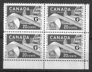
The High Values

The 10c Inuk and kayak and 20c pulp and paper industry are the only two high values of this set that were issued with the G overprint. Both values are known with the "flying G"overprint. As you can see from the scans the normal positioning of the overprint was in the middle of the iceberg on the 10c and in the middle of the press rollers on the right side, just to the left of the right frameline, about mid-way up the stamp.
A few varieties are listed on these values, which suggests that more should exist on the other values:
- The 20c is known with a "high flying G" from the right of the sheet. This is usually collected in margin pairs.
- The 20c is known with blunt G from positions 49 or 7 of the sheet.
However, no fishhook G overprints have been noted on any of the 10c or 20c values, even though this variety ins known on the flying G overprints of the Karsh Issue. These would be fantastic discoveries when they are eventually made.
I do have plate blocks of some of these, and can give you the following spacing measurements for the overprints:
10c flying G: 34 mm horizontally and 22 mm vertically.
20c Casson: 34 mm horizontally and 22 mm vertically.
So although I do not have blocks of the 10c Casson font, or the 20c flying G, it would appear thaat the spacing is the same for both fonts. Unitrade does not list any spacing varieties on these overprints and a dedicated study of them may yet reveal some such varieties.
The range of plates used for the overprints on these stamps is as follows:
10c Inuk and kayak Casson font: plates 1-4
20c paper industry Casson font: plates 1, 2, 2n
10c Inuk and kayak 14 point Bold: plates 3 and 4
20c paper industry 14 point bold: blank and plate 2n
As far as I know, all of the official overprints on these high values are on stamps printed on horizontal wove paper only. So I don't think there are going to be any fluorescent paper varieties to be found. However, it is still worth investigating, as the 50c textile from the Karsh issue is known on fluorescent paper, and it was never issued on vertical wove paper. You should still be able to see the same range of shades with the purple brown and the green that you see on the un-overprinted regular issues.
This concludes my discussion of these two aspects of this very much under-appreciated issue.
I am beginning to find 5 posts a week to be a bit more work than I can handle as I do not have currently have any employees to help me with my business. So I am considering cutting back to three posts a week - Monday, Wednesday and Friday. I'd like to hear your thoughts on this - whether I am posting too much now or whether you want me to continue with daily posts.
My next post will deal with the various errors on this issue as well as the proof material.


compliatrac-ko Joel Marcellus link
ReplyDeletereiransiri
Thank you so much Chris for all this work. You are my mentor in this disciple. I would like to do as you in french and concernig Quebec Revenue stamps. I have a group on Facebook like you know, "Discussion, échanges, vente et enchères sur les Timbres fiscaux du Québec", but will like to do a blog like you but don't have your ability to does it.
ReplyDelete